Bible Scholars Stunned: Forbidden Fruit May Have Been… A Shoe!
And now for something completely different, as Python’s brother Monty used to say.
I shy away from contests because they tend to be exploitative: artists get taken advantage of. On the other hand, a contest can provide an artist with valuable publicity– so there’s room for debate.
Back in August, I surprised myself by entering a contest sponsored by Fluevog Shoes. The challenge: design an ad for their new shoe, Truth Genevieve. Including copy was optional, since the winning ad would be run inside a frame which contained all pertinent written information.
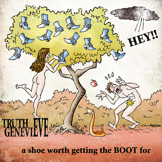
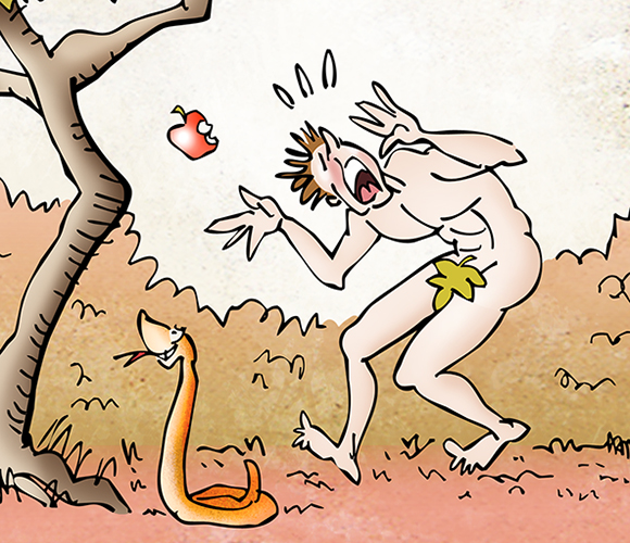
Without further ado, here’s my entry:
It’s a takeoff, of course, on the story of Adam and Eve, as recorded in Genesis, the first book of the Bible. Before going further, I must emphasize that it is not meant to ridicule the Bible or religion in any way.
Most cartoonists have, at some point, tried their hand at an Adam and Eve cartoon. Most of these cartoons are affectionate parodies. I intended my Fluevog ad to be exactly that.
So why did I decide to enter the contest? I received an email from Claire Porter, a friend of mine who also happens to be one of the world’s most inventive performance artists.
Turns out Claire likes Fluevog shoes, and actually wears them in some of her routines. She had heard about the contest, and urged me to enter, saying she thought my design “would be THE BEST!!!” Blush! Nothing like flattery to make a guy reckless. I decided to jump in.
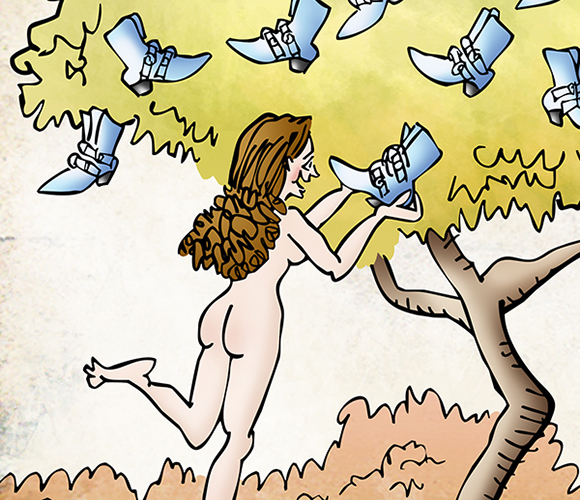
I’ve always been a fan of retro art which tends to employ very distinctive color palettes. I decided to give the ad a retro look, hence the unusual color scheme. Here’s a detail image:
Fluevog contests are ongoing. They run for about 4 weeks. Artists submit their designs during this period. Once the deadline passes, John, the owner, picks his four favorites. These are moved onto a separate page, and “Fluevogers” then vote and determine the winner.
Fluevog provides all participating artists with a “toolkit” which contains high-res images of the featured shoe. You can use them in your ad, or simply for reference– it’s strictly up to you. Here’s what the Truth Genevieve shoe actually looks like: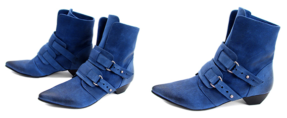
So what exactly do you win if your design is chosen? To quote from the official contest rules:![]()
If your artwork is chosen, you will become an official FluevogCreative, receive a bio on Fluevog.com, have your ad, name, & URL showcased with a minimum of 250,000 printed impressions in classy magazines, and receive a $1,000 Gift Certificate to John Fluevog Shoes.![]()
And what exactly is Fluevog getting in return? Fluevog spells this out on its Design Submission Terms and Conditions page:![]()
If your Design is selected for use by Fluevog, you acknowledge that you assign to John Fluevog Shoes & Boots Ltd. and its subsidiaries and affiliates (hereinafter collectively “Fluevog”) the entire right, title, and interest in and to the copyright in your Design including the right to sue for past infringement and the right to further sublicense the Design, for its sole and exclusive use on and in connection with the Items. You also acknowledge that you waive all “moral” rights that you may have in and to your Design.![]()
You get publicity and $1000 worth of shoes. You give up all rights to your work.
Here’s another detail image:
So I won the contest, right? Uh, no.
But I did get selected as one of the finalists, right? Uh… sadly, no.
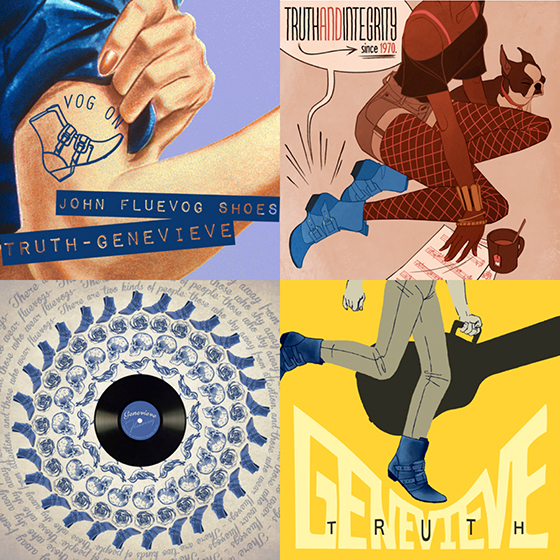
There were a total of 56 entries, these were the four finalists. Take a look, then scroll down to see the winner.
Here’s the winner, and I did vote for it myself. Simple, striking, colorful.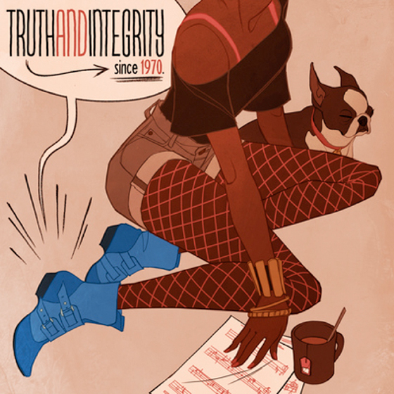
Re the copy used in the winning ad: the creative brief for the contest stated that no copy was required, but:![]()
if you are looking for some, here are some words/copy we have used in the past, which you are free to use.![]()
It went on to list Truth and Integrity since 1970, Unique Soles for Unique Souls, and several other catch-phrases.
Most of the designers used one of these phrases, I did not. I doubt it was a factor in my getting passed over. Nudity? A religious reference? What was I thinking?? Also: most of the entries featured a large central image, with prominent placement given to the shoe,
in contrast to my own “long shot” image. Ah, well– a good learning experience.
You can see all 56 entries in this Truth Genevieve gallery.
What do you think? Is it worthwhile for an artist to enter this kind of contest? Ever entered a similar contest yourself? Hope you’ll leave a comment.![]()
If you enjoyed this post, I invite you to get updates. Just click the Get Updates button in the sidebar below the Portfolio Thumbnails, or click + Follow in the blog menu bar.![]()
Other Posts You Might Enjoy:
A Dam Fine Post: Happy Canada Day!
Birthday Tribute: Monkee Meets Blonde, Gets Vertigo, Goes Gothic


I think your cartoon is the best of the bunch. I’m still laughing. 😀
LikeLike
Ha! Thanks, TT– your delightful comment brought me more pleasure than winning the contest ever could. This way I get happiness without getting stuck with $1000 worth of shoes that would pinch my toes and make it hard to draw… : P
Thanks so much for all your support!! : )
LikeLike
Well, Mark, I think they were a heel to have bypassed your wonderful illustration. OK, you didn’t toe the line on including their copy… Just tell them your boots were made for walking… and that’s just what you’ll do…
(Sorry, you didn’t win. You’ll get that pot at the end of the rainbow real soon.)
LikeLike
Ha! And you, madam, are a shoe-in for Punster Of The Year! And I certainly get a kick out of all of ’em… : )
A pot at the end of the rainbow… that would be great! That way, if I ever win $1000 worth of old sneakers, I’ll have a place to put ’em! Excellent!!
Many thanks for pulling on your ruby slippers and hiking over to pay me a visit, Judy! : )
LikeLike
Absolutely, I think it’s worthwhile for you to enter contests. You are an amazing illustrator. I love your ad, and I was sure you were going to tell us you won.
I think your final evaluation was spot on – the “long shot” and prominent placement to the shoe. A good learning experience indeed. Nice job, Mark.
LikeLike
Well… I was going to tell everybody I won, but then I thought: think how you’ll look like a complete weasel when everyone finds out you were lying… : P
Sincere thanks for your very kind comment, Maddie, much appreciated. It seems clear that winning a contest can raise one’s profile. Heck, even losing one makes for a good blog post! I’ll definitely have another go sometime… : )
There’s no escaping the fact that my “long shot” design resulted in very small images of the shoe. A risky approach, visually, when one’s aim is to sell the shoe. So yes, a good reminder: commercial art has to deliver the goods, make the sale. There’s nothing unfair about it, that’s the nature of the business– even when that business takes the form of a contest.
Thanks again for your very kind support! : )
LikeLike
A big you’re welcome to a very kind guy! It’s easy to show support when the work is outstanding.
LikeLike
Blush, blush, and double-blush!!
Thank you, dear Maddie! : )
LikeLike
Well Mark, if it was a funny illustration wanted, yours would have won hands-down…! Very, very funny indeed…! However; seems they were after a more ‘serious’ and conservative design.
In answer to your question: I would think it a good idea to ‘put yourself out there’; you never know who may be watching…!
LikeLike
Ah! Excellent point, Carolyn. I always enjoy humorous ads myself, but it’s easy to forget that someone is trying to sell something. An ad can hardly be considered a success if people laugh uproariously, then turn the page and forget about your product… : (
OK, another vote for yes, enter them, contests can boost your profile. Very good. And you’re right: who knows who might see your work and say: that’s just the style I’m looking for.
Many thanks for your feedback, Carolyn, and your good-humored support! : )
LikeLike
I chuckled. I do know some women that really love their shoes, and would probably utter something like “those are so cute,” too.
I wasn’t offended in any way. I thought the reference was clever, but I am a religious and Bible-reading sort, so I have room to relate, I suppose. No, really, what I gathered from three of the four finalist illustrations was a message of creativity and power– and I think that’s part of what propelled the winning pick.
It’s probably easiest for me to speculate what other things helped that pick– a bold and very prominent placement of the shoe, an Art Deco meets Punk sort of look that seems to mesh well with the Art Deco designs on their website, and a VERY catchy phrase they might well pick as their new slogan.
Then I would say the others had feminist and folk singer girl vibes, somewhat in common. The winning pick, though, wasn’t too kitschy, political, or niche.
Now, Mark, I do love your design and I liked your retro theme. I don’t think I’m old enough to have seen ads like this when they were new, but it really does look like something that could have come out in the late ’60s or early ’70s, compared to some examples I’ve seen.
But I have a feeling Fluevog Shoes wants to make sure they appeal to their younger demographic and that therefore they wouldn’t be able to appreciate your design as much. Really, I think that’s the main thing, if I fancied myself a marketer.
Yes, maybe you too saw the New Yorker cartoon on this very theme, that was banned because the artist dared to show understated cartoon boobies and a lot of leg… but I sincerely doubt that much crossed the minds at Fluevog. Nor do I think they were terribly worried about it being a Biblical reference, unless some have become a lot more hypersensitive these days.
LikeLike
Some very astute observations, Jak, thank you very much indeed.
Your point about the winning design meshing well with the designs already on the Fluevog website really jumped out at me. In retrospect, that seems like something I should have done first: check out the existing Fluevog “look.” Stands to reason that having established a visual identity, Fluevog would hardly be inclined to pick a design that deviated radically from its established look. I missed something very obvious there (insert numerous head slaps here).
And that ties in directly with your point about Fluevog targeting the “younger demographic.” I do think Retro has a lot of cross-generational appeal, but Fluevog’s youngest, most enthusiastic customers might well find it dated and unhip… : (
I appreciate your thoughtful analysis very much, Jak, ditto your kind support! : )
LikeLike
You’re quite welcome. Hindsight is 20/20. I had a somewhat similar experience with a buddy that I’d paint the town red with. A local bar needed a logo design and I came up with a very classy picture of a pool table with a rose on it. I went back and found out they decided to go with a cartoony-looking tequila worm. So… been there, done that!
LikeLike
I love shoes
I need shoes
I buy shoes
I wear shoes
My favorite are exotic Indian sandals, bought them four weeks ago in South India, they remind me how I spent two fantastic weeks in Varkala.
regards 😉 magdalena
LikeLike
Hmm… I could be wrong, but I’m getting the impression you’re rather fond of shoes… : )
Thank you for putting on your special sandals and walking over here to visit my blog. Always a pleasure to see you, Magdalena!! : )
LikeLike
Hi, Mark, Bob just sent this piece to me, and I did not know that you were the artist until I had puzzled over why Bob would send me this funny cartoon about really ugly shoes. (Shows how fashion conscious I am.) It was great fun to meet you.
Rosie Wilson
LikeLike
Rosie! What a delight to see you here– like getting hit with a croquet mallet! : )
I should explain to other readers that we only recently met at a young chap’s 91st birthday party, and that you marshalled a bunch of us out to the croquet court and proceeded to instruct us in the fine points of the game. Most fun I’ve had in ages, and I’m glad I wore sneakers instead of Fluevogs… : )
I’m still laughing over your “ugly shoes” quip. Thanks so much for stopping by, you’re a treasure!
LikeLike
OK, I’m not totally objective but I do think you portrayed the message better than the finalists/winners. It was funny to have Eve with the shoes because we know women just cannot resist those darn shoes 🙂
And the “boot” phasing was brilliant. The only word of advice I can give you is that the winner had a dog in their ad and the other thing folks can’t resist from a marketing perspective is anything with a dog in it 🙂
But then again, you knew I’d say that!
LikeLike
OK, as one of my most esteemed clients, you’re not totally objective, but I’m accepting your comment anyway. I think it shows very astute judgement… : P
Must confess, I did like “worth getting the boot for.” In fact, you could say I got quite a kick out of it… : )
Have to tell you, I let out a great whoop when I read your line about the dog!! I never even saw it comin’!! Since the World Canine Society consistently votes you their Favorite Human year after year, I should have known you would hone in on that key point!! LOL
Thanks as ever for your jolly support! : )
LikeLike
I enjoyed your illustration and thought the drawing was superb and the humor great. I’m not attracted to the winning entry or its drab color palette (which, of those colors, seems to be popular right now with graphic artists).
I didn’t notice the dog until I had a third look, and now I’m wondering why it’s in the illustration. What was John, the company’s owner, thinking?
Oh well, things that make you go “HUH?”
Keep up the great work!
LikeLike
Many thanks, Steven, very sincerely appreciated. Coming from a wonderful painter and artist like yourself, that means a lot.
Your point about the color palette of the winning design was interesting. I liked the colors– they remind me of the rusts and deep reds you see on mums (chrysanthemums), a very popular fall flower here in New Hampshire. But the overall color scheme seemed dark. In fact, there wasn’t any white space on any of the four finalists– which seems both odd and significant somehow.
You’re the second commenter to mention the dog, and both times it’s made me laugh. The first commenter is a dog lover who saw the dog as a plus, from a marketing standpoint: people like dogs, they generate warm feelings. Admittedly, she’s biased. : )
I do take your point, however: the dog could easily have been left out. One could even argue that he’s a distraction. Perhaps he’s intended to help balance the cup of tea? Or extend the color scheme? Dunno. Gonna have to put that one in the head-scratch column… : )
Again, many thanks for your wonderfully supportive comment!
LikeLike
Ah! I loved yours Mark! I love that God is saying Hey! And I really got a kick out of your slogan!! And I never saw a snake with such a cute puppy dog look before. That almost makes me want to get a snake like that for a pet. (Oh how interesting I just scrolled up and was reading the comments about the dog.)
I would think that this kind of a contest would be very educational. But it would be even more educational if the person who chose it was an artist himself. I liked the winning piece. The rust colors somehow made the blue boots stand out. (I didn’t even notice the dog until I read the comments.)
It doesn’t seem like the dog adds anything to the story. It seems more like the artist needed something in that space! Anyway Mark, this was a fascinating breakdown and I found it very interesting indeed! 😀
LikeLike
Huh. I didn’t realize my snakes were so cute. No wonder Slytherin House didn’t ask me to design their logo… : P
Interesting point about the rust color complementing the blue boots in the winning design. Come to think of it, the rust stains in my toilet look pretty good when I pour in the blue bowl cleaner. I shoulda picked up on that and used that color combo in my own entry… : P
Poor extraneous doggie! He’s taking some hits here. He certainly blends in well, though– so well that apparently most people can’t see him!
Many thanks for your kind words, Linda– always a delight to see you here! : )
LikeLike
Great post, good food for thought, especially for young artists trying to figure things out. Like you stated, there are pros and cons.
It can be good publicity but aside from that you can feel real cheated and used. There should have been much more offered for such creativity expressed toward their product. I have entered contest/competitions in the past, I only enter the ones that are beneficial. Currently I have entered the Bombay Sapphire Gins contest, which I am waiting on the voting to end in mid-November.
Your ad was dope! You went there.
LikeLike
Many thanks, I’m very happy you enjoyed the post.
One thing’s for sure: a contest can provide motivation, and it forces us to focus on designing for a third party, rather than creating something self-indulgent for our own amusement. A good commercial artist has to develop a strong client focus. And even if we lose the contest, we’ll have an interesting portfolio piece– and maybe even an amusing blog post! : )
Must tell you, your comment was educational and made me laugh. Being Mr. Not-So-Hip, I did a bit of a double-take when I read: “Your ad was dope!” I’ve been called a dope, but I’ve never had my work described as “dope”… : )
So I googled it and found that the Urban Dictionary defines dope as “extremely cool”– this was welcome news!!
Good luck in that contest, many thanks for stopping by– your comment was dope!! : )
LikeLike
I’m not surprised the winning entry won– it feeds the egos of the chic and those who think they are daring… fashion-wise.
I enjoyed your entry… certainly way more spirited than some others!! And John Fluevog is a bit of a shoe design maverick. He’s based in Vancouver, BC I believe. Movie stars sometimes want his shoes.
As for entering contest, only each illustrator can judge the time-worthiness by pondering over the subject, intent, etc.
LikeLike
Many thanks, Jean, I really enjoyed your forthright analysis… : )
Your comment about Vancouver prompted me to take a look at Fluevog’s About page. Sure enough, John Fluevog and his ex-partner got their start in Vancouver, working at Sheppard’s, a “venerable Vancouver shoe emporium,” before opening their own store there. So you may have cycled past their current location, en route to a store that sells biking shoes… : )
Many thanks for stopping by, I sincerely appreciate your kind support! : )
LikeLike
I’ve also learned that art contests can be subjectively maddening. I once lost a contest to a rock with a ceramic tile glued to the top. You never know.
I did like your message and the way you conveyed it. Keep up the great work.
LikeLike
A rock with a ceramic tile glued to the top… I keep trying to picture that, but my imagination is waving a white flag, saying it must surrender. Clearly some form of self-protection, and I appreciate it… : P
You’ve shone a shocking new light on contests, and the big laugh and the head-slap did me a world of good. Thanks for the kind words, and for sharing that very funny story! : )
LikeLike
I agree with you that it’s a bit iffy when a company says they’re somehow doing you a favor by making you submit your work for free. I’ve been offered several opportunities to sign over the rights to my work for stuff like this, and I would rather not. (That is if I’m understanding the offer correctly). They do appear to give a form of “payment” via shoes, but who would use that much?
I think the winning artists portrayed modern, independent women, and that certainly appeals to a woman in 2012 who wants to be appreciated not as a googly-eyed girly girl wanting shoes, but rather a working person who likes to buy things just like anyone else.
LikeLike
Who would spend that much ($1000) on shoes? Well, as someone who spent over $2000 last week on monogrammed elastic support hose alone, I can only say, uh… that I’m lying… : P
Well, I suspect the average price of a pair of Fluevogs is probably a good bit more than the $2.99 I pay for my sneakers, so perhaps the $1000 wouldn’t go very far. Dunno.
Hm. Interesting thought about a modern class of women who take a more utilitarian view of shoes. I did get the impression from the testimonials on their site that Fluevog customers are very enthusiastic about the product. Hard to imagine the company only targeting a particular type of customer with their ads. Seems they’d want to cast their net as widely as possible, and reel in girly-girls, working girls, and anyone else with a fistful of cash. Which lets me out… : (
Many thanks for stopping by, Amelie, always glad to see you! : )
LikeLike
Wow, your work is brilliant!!! Simply inspiring, i’ve never seen the retro created in a way that I actually find pleasing… You should have won from what I can see!!
Also, wow, on the fact of ‘moral’ rights! What are they saying… this is ludicrous… i’m not sure I could enter a contest with losing all rights to my own work… hard choice.
LikeLike
I’m saying Wow, too– as in: Wow! thanks for that lovely comment!! : )
Funny thing about “retro.” I feel like I know it when I see it, but I think everyone interprets it a bit differently. I’m sure there’d be conflicting opinions about whether a particular piece qualifies as retro, whether retro equates to certain color palettes, etc. Ah, well! Very glad you liked the illo! : )
I must agree with you that there is something particularly off-putting about Fluevog requiring designers to give up all “moral rights” to their work. I’d never even heard that term before in connection with artwork. Couldn’t begin to define it. But forcing artists to give up “moral rights” of any kind sounds downright sinister. I definitely hear warning bells going off there…
Delighted to meet you, Cilla, and thanks again for your comment and very kind words. : )
LikeLike
You’re very welcome 🙂
I’ve never taken the time to sit and study retro works before, more of a passing glance kind of thing, but your work is brilliant…
Thank you for taking the time to reply to me, 🙂 Best regards
LikeLike
My pleasure, Cilla. Thank you again for your very kind support! : )
LikeLike
Good for you to enter the contest, Mark!
Yours is quite intriguing and paradoxical at the same time perhaps. As we all know, Adam and Eve were punished in the Bible stories. And therefore your illustration seems to tell the audience that it’s wrong to have the Truth Genevieve shoe.
So maybe that’s why you didn’t win, since it worried them that it would send a wrong message to people/customers. But as for me, I love your work and your idea because there’s no need to spend lots of money for buying shoes. 😀
Well done, Mark! 🙂
LikeLike
You know, Inge, that is a very intriguing point– it never occurred to me that on some level, my ad might be equating Fluevog shoes with a forbidden act. Whoa!! Not the sort of message any company would want to send!! : P
Your comment about being able to enjoy the whole thing because you saw absolutely no need to spend lots of money on shoes, made me roar with laughter– excellent!! I must agree! : )
Thank you for a wonderful comment, a very interesting observation, and your good-humored support!! : )
LikeLike
Even if you didn’t make it to the final cut Mark, your illustration still has the amazing factor it always has!
The temptation of shoe buying is definitely reflected based on the Biblical story and just women in general (perhaps not me though — my money goes elsewhere!). I like how you incorporated word play with “Truth Genevieve”. It’s certainly something different on the take of illustrating the shoes : )
When I saw the final entrants I felt the winning one was really well done as well. The subtle colours with the striking blue, I wouldn’t think brown and blue would ever go together!
As you know I have entered two illustration based competitions (one was the Penguin book cover and the other was based on a topic — was one of the first posts you commented on on my blog). Unfortunately, I didn’t win either of them. It’s does get you down a bit but you realise why and you make sure to do and be better next time. ^^
LikeLike
Thank you, dear Sabine! Your lovely comment has me grinning like a samurai who just won the big jack o’lantern carving contest… : )
You make a great point about brown and blue. I don’t think I’d have considered that color combo in a million years! Startling to see what works sometimes. Conclusion: it pays to experiment and check out other people’s work.
Yes, I do remember your entering those competitions, and how hard you worked on your entries. No doubt about it: takes a good bit of nerve to put the ol’ ego on the line and compete. You’ve summed it up beautifully: treat competitions as an opportunity to learn, bring your new skills to the next round, keep getting better.
Oh, I forgot one part: finally win, get a check for a million pounds sterling, and be acclaimed The Greatest Artist In The World!! : P
Thanks as ever for your wonderful support! : )
LikeLike