Alas, I Failed To Win The Big New York Comic Con Poster Contest
I entered a poster design contest last fall. Alas, I didn’t win. Years ago, I would have labeled this a failure. Now I’m smarter: I call it a “learning experience.” : )
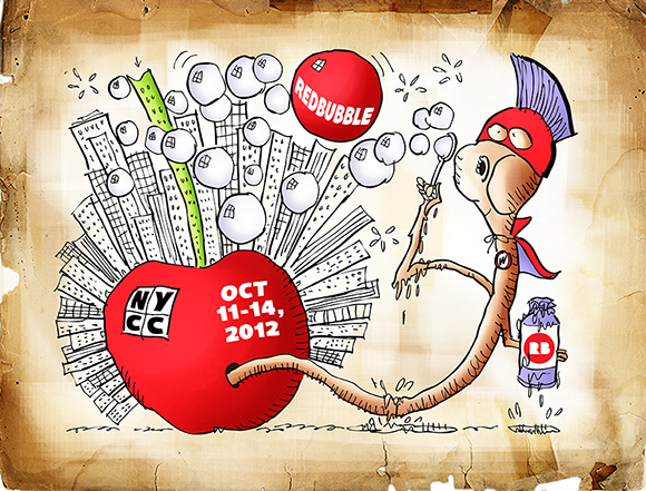
Here’s my losing entry:
It’s the sort of thing that begs an explanation, isn’t it??
I’ll start by telling you that Redbubble is an online store for artists and illustrators. I have a Redbubble account, but I’ve been using Fine Art America to sell my work. There are many such online stores. They handle the printing, framing, and mailing, and they take the lion’s share of the sale price.
The New York Comic Con is an annual convention in New York City for fans of comics and pop culture. Redbubble is one of many exhibitors at this convention.
Redbubble held a show poster challenge: design a poster to publicize Redbubble’s presence at the 2012 New York Comic Con. The only requirements were that it mention Redbubble, New York Comic Con or NYCC, and the convention dates, October 11-14, 2012.
I did some research, and learned that much of the focus at the convention is on superhero comics. My brilliant concept: a Superworm emerging from a Big Apple covered with skyscrapers, and blowing soap bubbles– especially a big red one. Here’s a larger detail image:

There were 69 entries. Redbubble awarded first, second, and third prizes. The winner (left) and the runner-up are shown below:
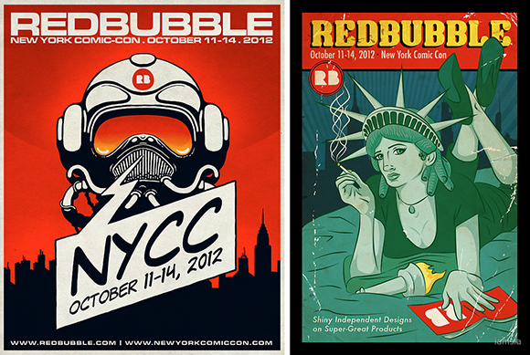
Below, left: the third place winner. On the right: the most popular entry, which received the most votes from Redbubble members themselves. I really admire the bold design and energy of the latter, and I like it much better than the three winners.

So what did I learn from my learning experience? My conclusions:![]()
A poster is usually vertical. My horizontal design was a mistake.
A poster is supposed to promote. My text was much too small.
Most entries had a single bold image. Mine lacked focus.
Mine was the most “cartoony” image. It may have appeared trite or disrespectful.
Giving my poster an “old paper” look made no sense– what was I thinking??
![]()
* * * * * * * * * * * ![]()
Attendance at the 2012 conference over its 4-day run was 116,000. Here’s a shot of fans pouring into the convention center. I suspect there may have been a rumor that I’d be making a personal appearance… : )

A lot of fans dress as their favorite superheroes. These people look like they’re from New Hampshire.
So do these people…
And here I am, making my personal appearance. Just kidding. I’m not that muscular… : )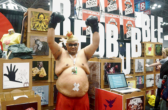
Note: the above four photos courtesy of Redbubble.![]()
What do you think? Did you like any of the NYCC posters? Ever had a poster that really caught your eye and stands out in your memory? Ever been to a fan convention or dressed up as a superhero? Hope you’ll leave a comment.![]()
If you enjoyed this post, I invite you to get updates. Just click the Get Updates button in the sidebar below the Portfolio Thumbnails, or click + Follow in the blog menu bar.![]()
Other Posts You Might Enjoy:
Hollywood Blood & Gore: America’s Founding Fathers Would Be… Proud?
When Lawyers Take The Stand: Don’t Be Shy, You Must Testify
Mark Armstrong And His 7 Dark Secrets


That’s the spirit. Keep up the good work.
LikeLike
That is very sincerely appreciated. Great to see you here, and thanks so much for the encouragement! : )
LikeLike
“Ever been to a fan convention or dressed up as a superhero?”
🙂
No one needs to know.
LikeLike
Ha! That made me laugh so hard, my cape and utility belt fell off (which caused other problems I can’t go into).
I’m going to take your answer as a Yes, and let my imagination run wild! : )
LikeLike
Stars and stripes with golden bracelets and lariat. 😉
LikeLike
Woman, you’re a wonder– and I’m not a bit surprised! : )
LikeLike
I never really dissected what makes a poster “poster like”. Very interesting – because billboards are supposed to do the same thing, capture our attention and give us information almost instantly. And billboards format is almost always horizontal. As always, Mark, you give us lots to think about. Great post.
LikeLike
Thanks for that very interesting comment, Jayne. I’ve never once considered that billboards are big horizontal posters, designed to attract attention and promote something. I wonder if it’s all a matter of utility or fit– billboards being horizontal because it would be a lot harder to construct them vertically, and posters being vertical so you can squeeze more of them across a bulletin board or slap ’em on telephone poles! At any rate, I guess the norm has been established in both cases, and you’re taking a chance if you decide to deviate from it…
I always appreciate your kind support, Jayne– thank you!!
LikeLike
Sorry to hear you didn’t win Mark. But it is always good to learn from one’s mistakes. Seeing the winners obviously gives an idea of what they were looking for.
As for your design I love the idea of the Super Worm coming out of the apple, obviously representing NYC as the ‘Big Apple’. And him blowing bubbles, it’s like it is his attack! : )
In my personal opinion I’m not too keen on the third place design.The one which got voted a lot I really think should have won. But the 1st place design I can see why it did come in that position, although it is not my favourite either. It’s bold, contrasting colours with a very comic feel to it, especially with the typeface. The one with the lots of votes seems quite retro in some ways, don’t know how to explain it..
I’m jealous though at the Comic Con, I wish I was there, along with my non-existent cosplay outfit!
LikeLike
Ha! Yes, I thought of you immediately when I saw those costumes! Just your cup of manga tea!
Definitely a good learning experience, seeing other people’s take on a project always expands one’s vision. I’ve never been able to define “retro” either, but I know it when I see it, and I love that look. Not sure why– it would take years of psychoanalysis to explain!! : P
Always a pleasure, Sabine, and thanks for that lovely comment! : )
LikeLike
I am assuming that the crucial criteria that sealed the winning entry was something streamlined, iconic, easy to see, and lends itself very, very well to being mass produced.
While I agree with Redbubble users that their choice is most representative, I think the winning entry was picked according to the above criteria. Sometimes more simple is better.
LikeLike
A sound analysis, Jak, thanks. Hmm… if “more simpleton were better,” I might have won… : P
LikeLike
Aww. You’ve got a great style, Mark; I guess it just doesn’t mesh so well with certain kinds of projects.
Have a look at this: http://jaklumen.wordpress.com/2009/12/21/get-the-balance-right/ and this: http://jaklumen.deviantart.com/art/Get-The-Balance-Right-v-201230800
LOLBeeeze (LBeeeze) pointed out something I’d rather taken for granted: “I’m sure you realize it’s much harder to design a simple logo/symbol rather than one with lots of flourish.” Keep that in mind, especially as I say my wife’s doing a lot better, I think, than I. She’s not an employed artist but she’s done quite a bit of artwork for our kids’ education (not to mention she rather inspired our daughter to start learning the craft of freehand drawing). I need to get her to share more of it…
LikeLike
Good advice, Jak, and thanks for the links! : )
LikeLike
Fully agree with you Mark, the most popular entry is bold, eye-catching, and economical. The runner-up too is excellent — subtle, suggestive, and sensitively rendered. Not to suggest that you should have won, but why are so many judges in so many fields so incompetent?
LikeLike
Gee, if you want to suggest I should have won, that’s fine with me… : P
Just kidding. In fairness, being a judge is a thankless job. It’s like being an umpire or a referee. No matter what you decide, there will always be someone who will dispute your call. I’m always ready to praise someone’s sound judgement when they decide in my favor. : )
Thanks so much for stopping by, and I really appreciate your comment! : )
LikeLike
The last photo? What’s that?:p
LikeLike
That was my grandmother. I hadn’t seen her in years. You just never know where she’ll turn up… : P
Just kidding. I’m totally stumped on the last photo. If he’s supposed to represent some comic book character, I don’t know who it is. Perhaps some other visitor can enlighten us.
Good to see you, many thanks for stopping by!
LikeLike
King Hippo from Nintendo’s Punch Out!! video game series.
LikeLike
Whoa! King Hippo!! That’s him– the mystery guy in the last photo!! Definitely a new one for me. Many thanks for the ID, Jak! : )
LikeLike
This really made me think. It’s quite amazing how much you can learn from any little experience if you think about it. I liked your idea of Superworm and the Big Apple – thought that was very clever 🙂 Out of the other four, I agree the fourth one stood out more for me.
Coincidentally, I’ve just made plans to go to my first Comic Con in a couple of weeks. It’s also going to be a joint event with another fan convention happening at the same time – so that’ll be interesting!
Thanks for another great post 🙂
LikeLike
Thank you, Lily, for that very kind comment. Wow, your first Comic Con. I’ve never actually been to one myself, and they certainly sound like a unique experience! You’ll be going as yourself, of course? I’m sure you’ll cause a sensation! : )
Have fun, and thanks as always for your cheery support.
LikeLike
Indeed, I’ll be going as myself 😛 though I look forward to seeing what everyone else dresses up as!
I’ll be sure to have fun, thanks! 🙂
LikeLike
I liked yours Mark, and I think you have to be true to yourself as an artist, don’t you? Not at all “trite or disrespectful”, I see you bending over backwards to consider your stakeholder. But contests are strange. The only thing I’d say is that a worm evokes disgust, and maybe that could drive people away rather than draw them in.
But my first reaction to your poster was “is that the jabberwocky?” LOL so I loved it! 😀
I didn’t like the winners at all. Redbubble was goofy with their picks. But I agree with the majority for once – that statue of liberty chick rocked it. I found it inspiring. Anyway, proves that the good ones hardly ever win – look at the Academy……..
And to answer, if I ever dress up for Comic Con, I promise to share the pictures!
LikeLike
Many thanks, Amelie, your kind words mean a lot. You’re right about worms– they get no respect! And after all they do to help break down soil and contribute to a sustainable world… : )
That was funny about the Jabberwocky– I completely missed the resemblance. I guess some “worms” can achieve fame and success!
If you go to a Comic Con, you should wear your Tough Mudder outfit– then they’d know what a real Superwoman looks like! Thanks for all your support! : )
LikeLike
How come Toothsome missed this contest? Perhaps she could have won the first prize! LOL
Better luck next time Mark, just keep up the good work 🙂 Anyways you’ve got that Mac Giggles’ spirit with you so no one could ever stop you to win one day… not even Toothsome! 🙂 hahaha
I admire the later one too, it got more energy and boldness than the three winners.
And I guess the last photo portrays one of the 3 stooges in the Mulan movie? hahaha
LikeLike
I asked the Redbubble people why you weren’t informed about the contest. They said: “It’s very simple– she’s brilliant– a genius!! If we told her about our contests and she decided to enter, she’d win every time!! She’s too good! Everyone else would suffer by comparison…”
Well, you have to admit, that makes sense… : P
Yes, I’ve got spirit! Someday I’ll win!! Someday people will point at me and say: “There he is– that’s Toothsome’s assistant!!” : )
The guy in the last photo has been identified as King Hippo. I never would have guessed he was a member of the Royal Family… : P
Speaking of royalty, thank you for honoring us with your presence!! : )
LikeLike
There is no justice, Mark. You’ve always been the apple of my eye. I’ll worm in on the convention to get the low down … and get back to you.
P.S. I love your attitude. The selection is a learning experience that I’m sure you will profit from on the next go-round.
LikeLike
Haw! Who needs to win a contest when he can “win” great puns from the Punmeister Herself?? Yes, I enjoy a good learning experience– which explains why I’m always covered with bumps and bruises… : (
Thanks so much, Judy, for your jolly support!! : )
LikeLike
I actually liked the Statute of Liberty having a smoke… We’ve become lazy about liberty or she needs a break from her role. 🙂
Anyway, it appears that contest would have required entrants to understand the “culture” of the event to figure out a “winning” design.
LikeLike
Hi, Jean! Say, Ms. Liberty better give up the smokes, or she’s gonna have a tough time cycling up in Canada! You make an excellent point about understanding the culture or milieu associated with a contest, event, assignment, before trying to interpret same. There are always parameters, often they’re invisible. One needs to ferret them out before proceeding with any “artistic statement.” Ignore them, and your chances of success are greatly diminished.
Always good to see you, many thanks for your comment! : )
LikeLike
I like all the styles of the posters above and you had a tough time indeed attempting to defeat the competition. You did a good job and I like the cartoony style you implemented.
LikeLike
Seth, your kind comment made my day. Great to see you here, and thanks so much for your support! : )
LikeLike
No problem. I find that showing support between fellow illustrators helps the both of us. Your style is definitely rustic (in a good sense) and I like it.
LikeLike
Comic Con is just starting to make their appearance here in Oz, Mark…! What an incredible following they have!
As for the ‘Redbubble entries’; I believe the ‘people’ gave evidence to the fact that ‘humour’ in contrast to ‘seriousness’ wins the day. Alas though Mark, yours was maybe just a little too humourous. You have such a way with this style of work… Well done to you.!
As for dressing up like a super-hero. No, Mark, not as yet. But there’s always hope…!
LikeLike
I’m a little too humorous for my own good?? Ah yes, I seem to recall some of my teachers saying that as they directed me to the principal’s office for a kick in the pants… : (
Oh, well. At least I grew up to be a famous illustrator who gets lovely comments from beautiful women residing in Oz. I think it worked out very well… : )
You may not have a proper costume, dear Carolyn, but you’re still a superhero to me!! : )
LikeLike
Mark, I think your self critique is right given the winners, except for two things – I really really like the old paper look and cartoony is perfect for this type of competition.
LikeLike
Lesley, your wonderful comment made me laugh with delight. I’m taking it all back (my analysis), and we’ve clearly got to get you on the panel of judges for the next contest!! : )
I’m glad you liked my entry, and again, my sincere thanks for your very kind comment.
LikeLike
(((((((hugs)))))))
You didn’t have a LOSING entry! No…you had a winning-challenged entry!
And I like the “old paper” look: it stands out! But yes, the lanscape orientation is unusual for a poster. The other entries — the “winners” — you posted were VERY tightly focused on their messages (even though some of the messages were nearly nonexistent).
Yours is multifaceted and engaging AND wonderful.
It’ll always be a winner.
Superhero worms RULE.
How do you like FAA? No need to reply if you don’t want to. I’m just curious. There are a lot of RB people there.
This is a fav of mine:

🙂
LikeLike
A winning-challenged entry– HAW!!! Did you hear that bell ring?? That just won Quip Of The Day!!!
Many, many thanks, Robin. Your comments always combine such cheerful good humor with unflagging support– thank you!
I’ve sold a few greeting cars on FAA, but not a single print. I’m currently rethinking my approach. I don’t think the site matters so much– whether it’s FAA or Redbubble or one of the others. The work I’m currently trying to sell on FAA lacks unity. I think there’s some pretty good stuff there, but it’s all over the map. There’s nothing wrong with diverse subject matter– I think that’s good. But there has to be a single, readily identifiable style that unites all the pieces. I think that’s one of your own great strengths, if I may say so.
I clicked on that link and checked out the Nosferatu poster– very striking! Looks a lot like me en route to the upstairs bathroom!!
Thanks again for all your support! : )
LikeLike
Hi. I think your illustrations is great. Clever and creative, it does evoke comic books and New York City well.
I don’t know if it was a part of the decision, but did you know that there has long been another comic book convention in NYC called the Big Apple Comic Con? It was an independent convention that ran several times a year from 1995-2009, when it was sold to Wizard World, who has run it since, and is planning on another one June 28-30. Perhaps there was a thought that having a Big Apple on the NYCC poster might bring up trademark issues.
Maybe you should submit the poster to the Big Apple Comic Con?
LikeLike
Hi, Zorikh. Many thanks for your kind and very informative comment.
I’ve just been reading about the history of the Big Apple Comic Con, now renamed the Wizard World New York City Experience (I definitely prefer the original name, but– what can one do?). I see you’ve had a long association with the show, specifically with its costume contest. I also took a look at your site, and I see you are a true costume maven, in addition to being a consummate entertainer. I really must hear “The Ballad of Bilbo Baggins in the Style of Arlo Guthrie” sometime– it sounds like one of life’s essential experiences!! : )
I sincerely appreciate your suggestion. Not sure Wizard would be particularly interested in a “Big Apple” poster, since they’ve discarded the original name, but I shall drop them a line nonetheless and inquire. Thanks again, here’s wishing you much future success! : )
LikeLike
Nosferatu … LOL!
Me? A style? Thank you!!! That’s wonderful to hear!!!!! I didn’t think I had a style. I didn’t even know if I did or not. I think you do. But maybe I don’t know what style is? That’s possible. A lot of this is still a mystery to me.
I did buy an easel this weekend, though.
🙂
::waves and runs home::
LikeLike
Yes indeed, my dear Tuna, you’ve got one of the most distinctive styles in ye olde art world today. I can’t define “style,” or “art” either, but I knows it when I sees it, as Reeses said to Pieces…
You bought an easel?? Why next you’ll be buying a beret and a smock– then you’ll really have style!! : P
::drops rock in puddle and “waves”::
LikeLike
I like your illustration, Mark. I couldn’t see what was “wrong” until you told me. Next year, you will be in like skin!
I don’t care for any of the top three entries. Art, like books, is subjective, but none of them do anything for me, and I find the Statue of Liberty makes me sad (even though she might be fun to hang out with). And the most popular entry reminds me of something else – I can’t quite put my finger on it. The Kool Aid guy, the Seven-Up red dot, the Domino’s Pizza Yo Noid guy … something.
LikeLike
Well, if you didn’t see anything wrong with my design, my dear Maddie, that settles it– it was about as right as it could get!! : )
As you probably know, the Statue of Liberty design was a parody of the Uma Thurman character in the movie Pulp Fiction– it’s the exact same pose and attitude, cigarette and all. I don’t like films that glamorize evil and violence, so I found myself disliking that design by association. You’ve got me wondering now about that Most Popular guy– was he a riff on some other character? Come to think of it, that superhero costume looks a lot like the one I wear… : P
That as always for your super support!! : )
LikeLike
Ah! Mark! You should have won. I think the Big Apple Worm as a super hero was a stellar idea. Okay okay, maybe it should have been vertical, but that’s easily fixed! Why else be called Red Bubble if your not going to have a Red Bubble doing something? Where do I file my complaint? The Big Apple Bubble Department? I wish I knew their address I’d give them a piece of my mind/bubblegum!
I agree with you that the most popular one should have won (if yours wasn’t going to). I wonder what they were thinking? The winning poster looks like a motorcycle helmet. Now maybe if Al Gore’s head would have been inside that motorcycle helmet eating a Funyun, well now that would have been something to get excited about! But as it is . . . meh. 😀
LikeLike
Thank you, dear Linda, for awarding me the Golden Worm. It means a lot to me, even tho second prize was a package of Funyuns… : P
Al Gore wearing a motorcycle helmet… and he’s got the visor down and he’s eating Funyuns… Hey, does it stink in here, or is it me?? Al, I hate to tell ya, but… : P
Your font of cheerful support has, once again, revived my spirits– thank you, Mighty Humorist!! : )
LikeLike