How To Rescue Poor Jennifer Aniston From A Horrible Color Scheme
This is a mini Photoshop tutorial that contains a larger lesson: when you paint yourself into a corner, you can sometimes paint your way out of it. That’s good to know if you’re
an illustrator who sometimes makes poor color choices. Like me, for example… : (
I featured a caricature of Jennifer Aniston in a recent post. The colors of the original were so ghastly, however, that I adjusted them prior to the post. Here’s the Before and After: 
Yes, a change for the better, I think.
It was done with a single adjustment layer and a mask– one of my favorite combinations for achieving effects in Photoshop.
I began by first duplicating my Background Layer. (First rule of Photoshop: always protect your original in case disaster ensues.)
Then I selected Layer>New Adjustment Layer>Hue/Saturation. This causes two things to happen: a new layer appears in my Layers Window (below, left), and the Hue/Saturation Window displays (below, right). I’ll be using the sliders in this second window to adjust the colors.

When it first pops up, the Hue/Saturation Window shows an Edit setting of “Master.” The Master setting will affect all colors.
I want to be more precise, however, so instead of using Master, I use the drop-down menu to select individual color channels, starting with the Reds.
Are there any rules for using the sliders? Not that I’m aware of. I slide them right and left until I get the effect I want. As you can see below, I got decidedly mixed results.
I changed her dress from red to blue, and I also destroyed her complexion. Was I worried? Not really. Because I know I can always mask out color changes to specific areas.

Next, I adjusted the Yellows and got rid of that awful green tinge in her hair.
Finally, I adjusted the Cyans, changing that garish aquamarine to light blue.
At this point you may be raising your hand and saying, “But sir–! There were three other color channels: Greens, Blues, and Magentas. What about those??”
Good question, glad you asked. I did tinker with those other three channels, and got negligible results. So I left all their settings at zero. It’s surprising, but individual channels often contribute little or nothing to the colors in a photo or illustration.

So we’ve achieved a much nicer color combination than the original red, greenish yellow, and aquamarine. All that’s left is to recover her original skin tones using a layer mask.
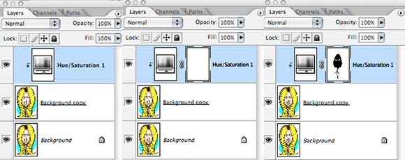
With my adjustment layer active, I select Layer>Layer Mask>Reveal All. The last part– Reveal All– simply means create the mask, but leave it transparent (i.e., it’s not actually masking anything yet).
Below we see the Layers Window before the mask is added (left); immediately after the transparent mask is added (middle); and what the mask looks like after we’ve applied black to the areas where we want to mask out the color change (adjustment).
With the mask selected, I use the Pen tool to careful select those areas where I want to mask out the change and recover my original color.
Below, you can see a portion of the face selected with the Pen tool (left), and the result (right) when that area is then filled with black. I repeat this process until I’ve masked out all unwanted portions of the color change.
Point of interest: see the “jags” in the magnified images below? That’s because I was working with a very small JPEG at 72 dpi. (I lost my 300 dpi original in a computer crash many years ago.)
What this means: you can apply a color adjustment and a mask to even small, low-quality images, and still get pretty good results. (Admittedly, this is a simple image. It would be harder to achieve good results with a complex image with many color gradations.)

Here’s the Before and After again. If you look closely, you’ll see her eye color is different.
I liked her “corrected” eye color better, and decided not to mask it out. Nice to think one can be that precise, even with a low-res image.
What do you think? Any color theory people out there? Can anyone explain why Cyans are a big factor in this illo, but not Blues?
Does a post like this boost your appreciation for non-digital artists (think of someone splashing real watercolor onto watercolor paper) who can’t change their colors by clicking on a few computer keys? (Me, I’m ready to kiss their feet.)
Hope you’ll leave a comment.![]()
If you enjoyed this post, I invite you to get updates. Just click the Get Updates button in the sidebar below the Portfolio Thumbnails, or click + Follow in the blog menu bar.![]()
Other Posts You Might Enjoy:![]()
Creation + Evolution = Illustration
Tear Gas Is No Match For Genie Gas
What Kind Of Man Inserts Himself Into Old Print Ads??


Who’d a thunk that you could improve on perfection? Jennifer Anniston owes you a ‘bon mot,’ moolah and dark chocolates (they’re more heart-healthy). Great job as always, Mark. I love her in a red dress or blue, but the hair coloring was spot on. (She does need to see her hairdresser post haste though. Her roots are showing.)
LikeLike
A bon mot, moolah, and chocolates… yes… yes, I think that would work… : )
It’s funny: I don’t think I’ve ever seen a picture of JA where her hair didn’t appear darker where it’s parted. I was just trying to simulate that, as Doc Frankenstein said about human life. Sometimes it pays to show your roots– at least that’s what the guy selling carrots at the farmers market told me… : P
Thanks as always, Judy, for your wonderful support! : )
LikeLike
Mark, Jennifer Anniston is so cool that she doesn’t worry about her roots showing. Maybe we should all get back to our roots. 🙂
LikeLike
Hmmm… I probably should get back to my roots, but that would mean shoveling an awful lot of dandruff… : (
LikeLike
You’re right, the new color scheme is much snappier! 🙂
LikeLike
Many thanks– I sincerely appreciate that affirming and very snappy comment!! : )
LikeLike
Mark,
I always like when you break down your digital process, and I always learn something that I did not know before – like Jennifer Anniston doesn’t like red dresses. (Clearly, I am joking.) Great post!
LikeLike
Ha!! Thanks, Jayne! Your delightful quip made me smile down to my roots!! Yes, poor Jennifer will have to clean all the red out of her closet now– Armstrong The Mighty Fashion Guru has spoken… : P
Glad the post was helpful, and thanks so much for your good-humored support! : )
LikeLike
Aha! You like to play with those sliders, too! I love them. No masks in Photoshop Elements 8, but plenty of opportunities to adjust things anyway. Jennifer Anniston looks great!!! I wish haircolor colors were as easy to “fix” in real life…LOL
Cyan!! Wow! I was trying to scan a painting the other day and no matter what adjustments I made, the “turquoise-y” parts came out wrong. No turquoise to be found, without messing up the other colors. Maybe cyan is shy?
I’ve talked to tother people who’ve had trouble coaxing cyan into the mix when scanning.
“Does a post like this boost your appreciation for non-digital artists?” Whoa. Seriously. One of the major drawbacks of real paint is that it has no sliders. I went from digital to paint and it’s still annoying me…LOL
You’re a wizard, Mr Armstrong!
LikeLike
And you, my dear Tuna, are a wizard when it comes to writing comments which make me laugh with delight– thank you!!
As inferred in the post, I’m not the hottest bunsen burner on ye olde lab table when it comes to color sense. My earliest introduction to the problematic nature of cyan was seeing a distinct greenish cast in a broad swath of yellow in a published illustration. I was mortified. Took me awhile to understand that in CYMK color mode, even the faintest trace of cyan will turn yellow greenish– ugh!!
Yes, I know you’re a real painter, and how you do it, I don’t know!! I can only bow and scatter Reeses Pieces in your wake… : )
::waits till she’s gone, runs over, picks up Reeses Pieces, skedaddles::
LikeLike
::looks around for the Reeses::
Real painter. Hmmm. I do use real paint. But I think I’m still to new at it, still too awestruck by the difficulties in involved, to think of myself as a painter. The best I can do is think I’m a person who puts paint on surfaces, hopes for the best, and often ends up with the worst. Digital is still more comfy. It’s so…uh…forgiving. And there’s such an incredible toolbox to use! So many options!!! Now that I can scan cast off parts of paintings and incorporate them in the images I’m very happy.
🙂
I do love drawing with pencils but my drawings are still way too “line-y” — ? — messy? — to be useful. Think of PigPen, trying to draw…LOL
Thank you, Mark. You made my day wonderful, with your reply!!!!
LikeLike
Congrats on an excellent tutorial – well beyond my skills, but interesting none the less!
LikeLike
What??? It was way beyond your skills?? Gosh!– I didn’t think it was that advanced… : )
Thanks, Margie!!
LikeLike
That headline is a sure-fire winner, Mr. Armstrong.
LikeLike
Ha!! As is your delightful comment, my dear fellow, and your own delightful self! Thank you, Doctor!! : )
LikeLike
Cyan is supposed to add warmth to Jen. Blue would turn her shrill violet /purple.
You know, unlike you I’m pretty short on time for photo-adjusting my photos. I start off in this order:
*Crop photo
*Resize photo (for a blog post or whatever)
*Adjust exposure
*Adjust blue
*Adjust green
*Adjust red
*Sharpen photo
*Save with renaming
I don’t touch the hue, brightness button, etc. I just haven’t taken the time…. I’m cranky and impatient!
Yea, I did take some colour theory in my painting classes and enjoyed it. Yes, some of it helps. You’ll see the colour theory ..when I get around to featuring more of my paintings in the future. (It’ll be awhile. I got posts standing in line, to get to the stage curtain.)
Yes, I do like yummy, thick paints for changing colours. 🙂
LikeLike
Ha! Many thanks for sharing your approach, Jean. You obviously took some time to type all that, which proves you’re not a cranky, impatient person at all!! : )
Yes, I remember your saying you’d be doing more painting in future. Excellent. I really liked the last one I saw on your blog, and am very much looking forward to seeing more of your work. Done with yummy, thick paints, naturally. : )
Always a pleasure, many thanks for your kind comment!
LikeLike
I recommend colour theory for anyone –it’s just a helpful thing for several different reasons and not just for visual arts. But learning how to put colours together for aesthetic purposes from painting, dress wear, cake decorating to colour finish for a exterior/interior of a building/furniture.
LikeLike
As a traditional illustrator just wrapping my mind around masks, this helps alot! I put my brush down and appaud you! Thank you!
Kathleen
LikeLike
Thank you, Kathleen!– or should I say Fred?? Well, you’re clearly a delightful person either way. : )
Many thanks for that very kind comment. I’m glad the post was helpful. Very happy to meet you, and thanks so much for stopping by!
LikeLike
Firstly Mark; that’s a great likeness to Jennifer; you are very clever…! 😉
Well, this is another page for bookmarking; you know – the ones that sit in the Favourite Bookmark arena awaiting their time in the sun… (If only I had the time, Mark. I need more time. I’m never going to learn all the things I’d like to know, ’cause there’s just not enough time.) And yet, I’m happy… I know that you know everything, Mark; and that thought sustains me… 😉 😉
LikeLike
Ah, dear Carolyn! I roared with joy at that outrageous closing line!! Alas, my knowledge banks are always in arrears, but I do know this: you and your wonderful comment will sustain me for a long, long time!! Thank you, Most Kind Dispenser Of Delightfully Supportive Lunacy!! : )
LikeLike
Very prettiful, Mark. I love the way you done the roots. I need to try this out at some point since I’ve never been great at using the Hues/Saturation sliders.
Colour changes certainly for the better. : )
LikeLike
Many thanks, Sabine! Yes, I may have missed my calling. I could have been a great hairdresser. Assuming there’s a version of Photoshop that comes in a bottle… : P
LikeLike
I missed this one! I wish I could hire you to teach me Photoshop, Mark. I’m awful at it. I’m sure Anniston would be glad her hair is the subject of the caricature, not her nose or something. LOL!
LikeLike
Ha! Thanks, Amelie. Photoshop is a challenge, no doubt about it, and it’s come slowly to me over a long period. Between reading old PS manuals picked up in used bookstores and scrolling thru online tutorials, every so often something will click and fall into place– I wish it happened more frequently!!
Yes, hair is pretty safe. I know from long experience that when it comes to caricatures, the thing people worry about most is their noses!!
Many thanks for your kind comment! : )
LikeLike
Thanks for your reassurance Mark, I felt like a real loser after trying to master Photoshop. It really dragged me down. Hearing that it took you time and patience makes me feel better – you’re clearly excellent at it. Keep on, my friend.
LikeLike
I shall pass that suggestion along to the Great Armstrong. He might be agreeable. He’s really not a bad chap once you get to know him… : )
LikeLike