If There’s A Buzzard Watching You, You’re Not Drinking Enough Water
For the past couple of years, I’ve been experimenting with photo-illustrations. I’ve
had a lot of fun, learned some tricks, and I’ve gotten pretty good at them. However, I’ve decided they’re not for me. Why not? Two reasons:![]()
You’re no longer in control. You can’t sketch out a idea, submit it to an art director for approval, and be sure you can create a photo-illustration that matches your sketch.
Rather than just draw what you need, you become dependent on photos. If you can’t find the photos you need (specific subjects, poses), and obtain commercial rights to them, you have to modify your original vision.
And once you’re forced to modify an element in your design, there’s a good chance you’ll need to make other changes. Pretty soon you’re ad-libbing, hoping it will all turn out right somehow.![]()
![]() Second reason: a commercial illustrator needs a single established style. Ironically perhaps, portfolios with multiple styles foster doubts. An art director needs to be confident that when he gives an illustrator an assignment, the final art will have a certain look: a look consistent with the illustrator’s portfolio.
Second reason: a commercial illustrator needs a single established style. Ironically perhaps, portfolios with multiple styles foster doubts. An art director needs to be confident that when he gives an illustrator an assignment, the final art will have a certain look: a look consistent with the illustrator’s portfolio.
Does this mean an illustrator can’t experiment with other styles for his own amusement or pleasure? Not at all. Experience has taught me, however, that an illustrator will have more credibility with a single-style portfolio.![]()
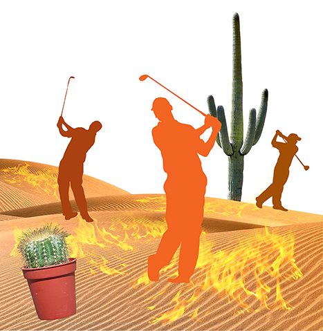
Having said all that (rather pompously), here’s my last 2012 photo-illustration experiment. It was done purely for my own amusement. I had only a vague idea of “golfers melting in the sun.” I broke the first rule of illustration by not doing a preliminary sketch, and I ad-libbed my way from start to finish (blush).

Here’s a quick look at how the piece evolved.![]()
I extracted sands from a desert photo, and pasted in golfer silhouettes that I found
on Stock.XCHNG, a free photo site. Then I pasted in cacti on different layers.
The original silhouettes were black. I dubbed in various “hot” colors.
I extracted flames from a campfire photo, pasted them in, and experimented with different layer blending modes.
I extracted cliffs and a stormy sky from different photos. I made the sky menacing
by filling a separate layer with red and using blending mode = Multiply, which has
a darkening effect.
I used the Warp and Pen tools to distort the silhouettes, and added some additional props. I also enlarged the flames and made them whiter and more transparent.
Is that a buzzard or a vulture? I can’t remember. But I must have given him some
growth hormone… 
Finally: I added text, pasted in photos of water and dried mud, and used masks and blending modes to give the text a parched look.
I added a top-down gradated “burn” to the silhouettes, and created “cast shadows”
for the golfers and all the props. The shadows help convey the idea that the sun is
beating down. Here’s the final again:
Here’s a close-up of the text. I pasted my “cracked mud” photo over the white text, and
my “water” photo over the mud. I masked out most of the water, then experimented with blending modes and opacity to create the effect of being able to see the mud cracks thru the water.
The bird looks a lot like me when I first get up in the morning…

I found a good photo of a water pump, but it looked too pretty to have been lying out in the desert. So I added corrosion by pasting a “rusty metal” texture above it, and adjusting the blending mode and opacity.
I masked out parts of the pump to partially bury it in the sand.
This last detail image shows how the quality of individual photos can differ.
The potted cactus is very sharp, clearly from a high-res (resolution) image. By contrast, the “Wicked Witch puddle” was extracted from a grainy 72 dpi JPEG. I sharpened it and cleaned it up, but alas, there’s only so much one can do with a low-res image.
![]()
* * * * * * * * * * * * * * * *![]()
Are you a fan of photo-illustrations?
Do you have a portfolio? If so, do you restrict it to a single style?
Did this post make you thirsty??
Hope you’ll leave a comment.![]()
If you enjoyed this post and would like to let me know, please click the Like button below.
If you’d like to share this post with others, please click Tweet or Facebook or one of the other Share buttons.
I also invite you to get updates. Just click the Get Updates button in the sidebar below the Portfolio Thumbnails, or click + Follow in the blog menu bar.![]()
Other Photo-Illustration Posts You Might Enjoy:![]()
Steve “Adam” Jobs Offers Eve An Apple In A Previously “Gated” Community
Once Upon A Time At Westminster Cathedral
The Shocking Truth: Whistler Had A Tiger Mother


I certainly do not stick to one genre. This one is fun. I adore the witch’s puddle. Great touch.
LikeLike
Makes sense– how could a multi-talented person like yourself stick to only one genre?? Impossible!! : )
Must confess, that witch’s puddle still makes me laugh today. The Wizard Of Oz is, what– almost 75 years old?? Talk about an enduring image!
Well, I’m off to see the Wizard– thanks for your kind comment, Red! : )
LikeLike
I take it the witch did not survive the blazing sun. Beautiful work. Your how-to is well done.
That vulture/buzzard would scare the living daylights out of me. Excuse me while I follow your subliminal message and go get some MORE water. 🙂
LikeLike
Which witch are you referring to, my dear Judy? Oh wait, I guess we’d better not get into that… : )
Yes, vulture-buzzards, or whatever the heck they are, have a very unnerving stare. I stay inside whenever I see one of them at our feeder… : P
Sorry to make you so thirsty– thanks as always for your energetic support! : )
LikeLike
This is really interesting, you make photoshop look easy.
LikeLike
What a nice comment– thank you very much. I really appreciate your stopping by, and I must tell you, your gravatar really made me laugh. Drive safe, and happy hunting!! : )
LikeLike
Thanks, it’s from a recent blog post of mine.
LikeLike
Photo illustrations are great when done right. Like you said it can be hard to find the right one, composition, lighting et al. The way you did it is wonderful and all fits together so well. Back in my first uni year we had to make an old art piece modern by combining illustration and photography. It wasn’t the best, but for my skills at that time with a software I never had before and it getting top marks, I was happy : )
As you know I have a portfolio but my style ranges, which I do worry about, but my use of colour is mainly the same in all my works. It all depends on the project I work on really. Sometimes it can or can’t work to our advantage.
But I can really feel the heat from your work, especially with that lava background! Wouldn’t like to be in those melting golfer’s shoes right now! It seems like the buzzard/vulture is intently watching until it can swoop in D:
Love the cracked mud text, the ground texture really looks parched!
Great job Mark! It’s always nice to see other bits of work and experimentation you do ^_^
LikeLike
Thanks for that wonderful comment, Sabine– really appreciate the kind words and all your input. : )
Mixing illustration and photos can be a lot of fun. I’ve tried my hand at a few, including one about Harry Potter and his favorite candy. I’m not surprised you have a knack for it, nor your getting those top marks, either! : )
I wouldn’t worry too much about having mixed styles in your portfolio at this point. That’s very natural for a university student whose just completed her design degree. I’m sure your style(s) will continue to evolve as you work thru various projects.
I agree: it’s always fun to see artists’ experiments, and how they put things together. Glad you enjoyed the post, and thanks for stopping by and staring down that vulture. Or buzzard. Or whatever that beady-eyed villain is!! : )
LikeLike
Very interesting… How long did it take you to do the whole illustration?
LikeLike
How long did I work on it altogether? Boy, that’s a tough one, Teasa.
I checked the “created” and “last modified” dates on the snapshot images in the post. I started it way back on June 21, 2011, and it looks like I did most of the work between then and June 28, 2011. However, I see my final had a “last modified” date of January 18, 2012– so it looks like I did some additional tweaking. A lot of hours, that’s for sure.
That’s a point worth thinking about: manipulating a lot of outside elements takes time; and without a plan, one can waste a lot of time on failed experiments. Having a sketch and a plan makes you a lot more efficient. So does drawing all the elements yourself.
Many thanks for your interest, and for a good question.
LikeLike
Thanks for the reply, it’s very interesting. I agree with your comments about having a plan- I can waste infinite amounts of time without actually meaning to – unless I have a plan and stick to it!
LikeLike
Ditto, ditto, Teasa. Just sitting down at a computer with no plan is apt to lead to many wasted hours– and I speak from sad experience… : (
I sincerely appreciate your kind feedback and support– thank you! : )
LikeLike
Photo-illustration strikes me as derivative work, and while that’s not necessarily bad, I think many folks see derivative as lesser or inferior.
LikeLike
An excellent point, Jak. Photo-illustrations are a bit like music sampling. There’s definitely skill involved, but you’re using bits and pieces of other people’s work. That’s a far cry from creating something wholly original.
Always good to see you, and many thanks for your comment, sir! : )
LikeLike
Thank god I kept a glass of water close by. Is it just me, or is the vulture peering into my soul?
LikeLike
Ha! Good thing I wasn’t drinking water when I read your comment– I’d’ve probably spit it out!! : P
Yes, that vulture is peering into your soul, and whatever it is he’s seeing there, is clearly giving him pause!! : )
Personally, I think you have a beautiful soul– thanks a lot for that very funny comment! : )
LikeLike
LOL!!! LOVE this! It has a tippy, whoozy, wildly spinning vibe to it, like when we feel faint – or when we’re MELTING! You’re a real master with Photoshop, Mark, and it shows here.
You’ve integrated all the various components beautifully! ::applause:: for the flames and golfers AND that magical font.
😀
LikeLike
Thank you, O Warbling Wonderfish Of The Sea!! Since I’ve been tippy and whoozy and wildly spinning all my life, I suppose it’s not too surprising that those excellent qualities should find their way into my work… : P
Photoshop has had me bangin’ my head against the wall more than a few times over the years, but occasionally I get it to behave. Thanks for that lovely comment and for your wunnaful whoozy support!! : )
LikeLike
Can’t deny it Mark, you have to find your own path and walk it too!
But, I quite liked what you did with the photo-illustration described, except I would have liked the cactus pot buried deeper in the sand to reduce some of its high-rez obtrusiveness, and sand grains on the witch’s puddle blown over by the wind.
Please don’t mind the comments. Even Picasso’s work is not perfect.
Maybe, somewhere there is a middle road, where you can merge the best of both worlds (cut-and-paste photo elements and hand-drawn illustration), and create some magic out of it.
Life is a constant struggle, but you’re surely putting up a good fight! All the best.
LikeLike
What a great comment: wit, charm, and an excellent critique– thank you!
Loved your point about having to find one’s own path– how often we forget that basic truth.
You’re absolutely right about the cactus pot. Now why did I think to partially bury the water pump, but not the cactus pot?? And some grains of sand on the hat would have added credibility to the scene, and helped relieve the hat’s dull blackness. Your suggestions are excellent, many thanks for sharing them.
As mentioned in another comment reply, I have tried combining hand-drawn and photo elements, as you can see in this Harry Potter tribute. I did like the result, and I think it had a lot more energy than a composite using photo elements alone.
Buoyed by your encouragement, I shall continue to fight on!! Thanks again for your delightful comment. : )
LikeLike
What a handsome bird 🙂 – So Wonderful and generous of you to take your readers through the process. The mud is the perfect candle on the cake.
LikeLike
Handsome or not, what kind of illustrator would give his readers the bird?? Seems rude, say I… : )
Well, it’s certainly a lucky illustrator who gets nice comments like yours, Lesley– thank you very much for your kindness and support! : )
LikeLike
Glug glug glug glug glug …..aaaaaah, whew, hot stuff this post, lucky the tap is near, ummmm, faucet? Your illustrative style is, well, stylish, instantly recognisable and shows your ability as a draftsman. Good decision to leave the photo-illustration to the photo-illustrationists.
LikeLike
I’m nominating this comment for Best Soundtrack– thanks for all the beautiful noise, glug, glug! Now I’m thirsty… : (
I sincerely appreciate this kind feedback from artistic luminaries like yourselves. It is both reassuring, and, to use an overworked buzzword, empowering. I’ve developed a style that works and feels natural– why dilute it with elements that seem artificial? I shall leave photo-illustration to true enthusiasts, and wish them well.
Many thanks, o salty sailors of the blue sea!! : )
LikeLike