Lurching Towards A Logo
![]() A couple of months ago, I launched a new Substack newsletter exclusively for my fiction. I decided to call it As The Word Churns since I like to do the funny stuff. I needed a logo for it.
A couple of months ago, I launched a new Substack newsletter exclusively for my fiction. I decided to call it As The Word Churns since I like to do the funny stuff. I needed a logo for it.
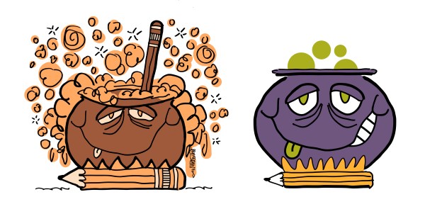
![]() My first idea (above left) was a bubbling cauldron sitting on a pencil fire. Lots of noxious bubbles, and a second pencil to stir the pot. Naturally you’re saying to yourself: What a terrible color scheme!!— whatever possessed you??
My first idea (above left) was a bubbling cauldron sitting on a pencil fire. Lots of noxious bubbles, and a second pencil to stir the pot. Naturally you’re saying to yourself: What a terrible color scheme!!— whatever possessed you??![]()
I had previously designed a “sleeping baby” logo for a newsletter about my in-progress children’s book. I guess I was on auto-pilot. I decided to use the same colors for the new logo.![]()
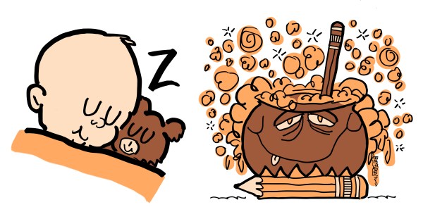
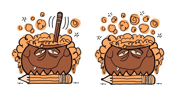
Did I quickly realize brown and orange didn’t work for a bubbling cauldron? No. But I was smart enough to see the cauldron had way too much detail. I reduced the number of bubbles, then I got rid of the “stir pencil.”![]()
Then my eyes (and maybe my nose) were opened: a bubbling cauldron should have sickly colors, right? How about purple and green? I decided to use the familiar No. 2 pencil colors for my “fire.”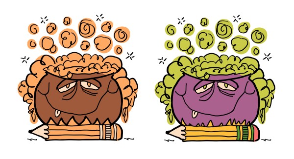
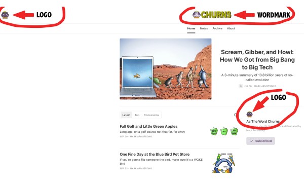
At this point, I finally asked myself a question I should have asked at the beginning: Where’s this logo going to appear, and how big will it display? (OK, that’s two questions.)
![]() The answers: Substack logos appear on your newsletter homepage— and they’re very small, as you can see in this screenshot:
The answers: Substack logos appear on your newsletter homepage— and they’re very small, as you can see in this screenshot:![]()
![]() So it was time to simplify the logo even more. I also chose a darker purple for the cauldron, and a single color for the pencil.
So it was time to simplify the logo even more. I also chose a darker purple for the cauldron, and a single color for the pencil.![]()

![]() I decided the purple was too dark.
I decided the purple was too dark.![]()

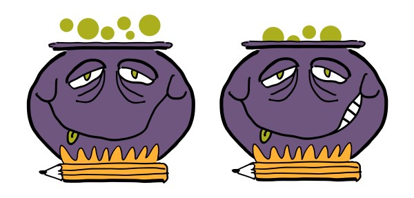
![]() Then I decided the cauldron had too much unrelieved purple. So I stuck in some white teeth for contrast. I also simplified the bubbles.
Then I decided the cauldron had too much unrelieved purple. So I stuck in some white teeth for contrast. I also simplified the bubbles.![]()
![]() I uploaded the new version to my Substack newsletter homepage to see how it looked. Because the display size is so small, I couldn’t really see the tongue. So I made it bigger.
I uploaded the new version to my Substack newsletter homepage to see how it looked. Because the display size is so small, I couldn’t really see the tongue. So I made it bigger.![]()

I did another display check and decided there was still too much purple. It made it hard to see the cauldron face’s features. So I made the teeth and the whites of the eyes bigger. I also enlarged the bubbles for better visibility. Ta-dah!!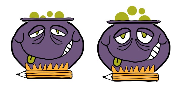
![]() It was time to cry, “Enough!!” Hope you enjoyed this look at the process, and thanks for joining me on this stroll down Logo Lane.
It was time to cry, “Enough!!” Hope you enjoyed this look at the process, and thanks for joining me on this stroll down Logo Lane.
![]()
* * * * * * * * * * * * * ![]()
About Mark: I’m an illustrator specializing in humor, branding, social media, and content marketing. My images are different, like your brand needs to be.![]()
You can view my portfolio, and connect with me on Twitter, Facebook, and LinkedIn.![]()
Questions? Send me an email.![]()
![]()


