Mr. Puddle Opens A Store
It’s been awhile since I worked on a new header, but I had occasion to design one recently.
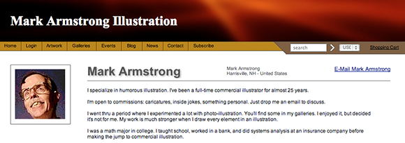
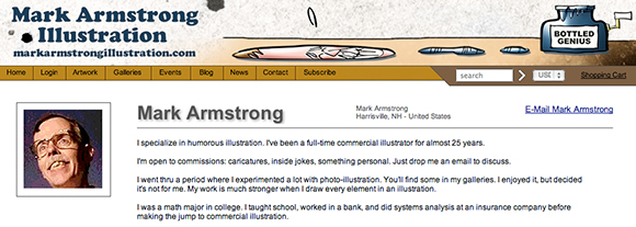
I joined Fine Art America last year. It’s one of many sites where an artist can sell prints and greeting cards online.
For a $25 annual fee, you get your own store— basically a site which you can personalize, including the header.
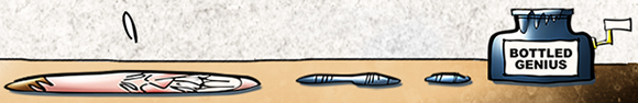
Here’s what the default header looked like:
Pretty simple, pretty boring, a typical default.
Also: extremely narrow. Its dimensions are 970 pixels by 100 pixels. (My blog header, by contrast, is 920 pixels by 180 pixels.)
Not much room to work, but I decided to give it a shot. I wanted to add a bit of humor, and the blog’s URL. Here’s the result:
Here are two larger detail images. That’s a little caricature of me as a puddle. Yes, I’m a man who knows how to relax.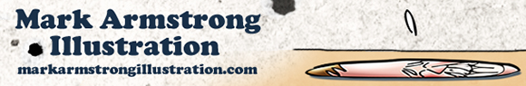
I drew the graphic elements at approximately double-size. I was pretty sure I’d have to make adjustments when I pasted them into the allotted space, so I didn’t worry too much about trying to get the sizes and perspective exactly right. Here’s the finish.
I included some extra jokes: a little umbrella and a straw. I thought I’d have room for them. I was wrong. 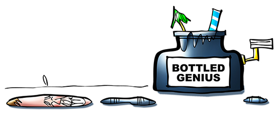
Adding a black border shows how very narrow the allotted space is. I had to delete the umbrella and straw, and you can see that my head is now longer and flatter.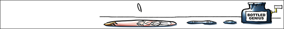
How do you squash a head and keep things proportionate? In Photoshop, it’s the easiest thing in the world: you select it, then apply Transform>Distort. I clicked on the upper center handle, then pulled down and to the right. You can always Undo and try again until you like the result.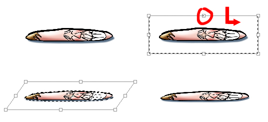
After positioning the elements, I added some flat color, using a darker brown to suggest a table surface.
I used three separate text layers for maximum control, and a layer mask to eliminate the hard edges between the two colors.
To finish up: a bit of grainy texture, some shading, and a few ink blots.
Here’s the finished header again, in context. If you’re an art lover, I invite you to drop by the store! : )
![]()
* * * * * * * * * * * * * * * *![]()
Do you pay much attention to headers? Ever tried to design one yourself?
Is it dignified for an artist to portray himself as a puddle? Does it suggest he likes to lay down on the job??
Hope you’ll leave a comment.![]()
If you enjoyed this post, please click the Like button below.
If you’d like to share this post with others, please click Tweet or Facebook or StumbleUpon or one of the other Share buttons.
I also invite you to get updates. Just click the Get Updates button in the sidebar below the Portfolio Thumbnails, or click + Follow in the blog menu bar.![]()
Other Posts You Might Enjoy:![]()
Header Look Better When Color Picks Click
Creation + Evolution = Illustration
Gypsy In The Morning: Django Reinhardt Alarm Clock