Look Out, Supe– That’s Taxregonite!!
I recently did a sketch for The Anvil, a very amusing “fake news” site. It was for this
post about doing one’s taxes, and how super powers are no match for the evil
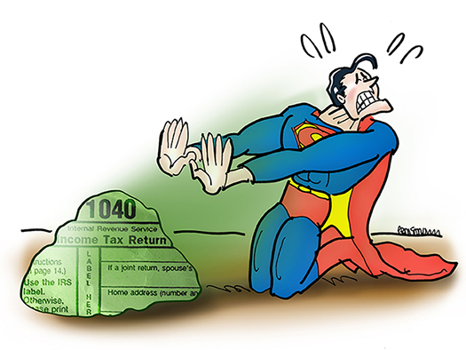
and diabolical complexity of tax regulations. Here’s the final. Scroll down to see the construction sequence.
It’s just a simple cartoon image, but it incorporates what’s called a displacement map,
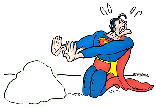
a Photoshop trick that allows you to superimpose text, an image, or both, onto a second image in such a way that the first image clings to the natural contours of the second; text following the craggy surface of a rock, for example. I began by scanning my line drawing into Photoshop, and coloring the Superman figure.
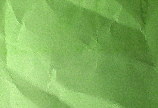
Then I opened this wrinkled paper image, a free Photoshop texture I’d downoaded at some point. Here it is:
I applied a Hue/Saturation color adjustment, moving the sliders until I achieved a
nice Kryptonite Green. You can always apply Curves and Brightness/Contrast adjustments to lighten or darken the tone.
I did a search for tax forms, and found a decent JPEG of a 1040 Form at 72 dpi. I downloaded a copy, converted it to a Photoshop Document (.psd), boosted it to 300 dpi, and applied the Unsharp Mask Filter. I then did a Brightness/Contrast color adjustment, which sharpened the blacks and wiped out any grey specs. I only needed the top corner of the form, like so:
At this point, I needed to superimpose the tax form onto the wrinkled paper. Luckily for me, I was able to google my way to this perfect tutorial on creating displacement maps by amazing Photoshop guru Colin Smith. I worked through the tutorial and followed it exactly, including the last step. Here’s the result.
I copied the above image and pasted it into my Superman image, which positions it on
a new layer. Then I scaled it down and trimmed away the excess. 
Being a fussbudget, I decided to add some glare on the rock. I did this by creating a new layer above the Kryptonite Text, and applying a radial gradient using the color White at low opacity (trial and error). In retrospect, this was a mistake, as it makes the text harder to read.
To finish up, I added some “grounding” color and a blast of Kryptonite radiation. For
the latter, I used a Foreground to Transparent gradient within a pre-selected area, then a 0% Hardness Eraser to soften the outside edges of the radiation. I also used
a layer mask so I could control the extent to which the Kryptonite Green overpowered the primary colors of Superman’s costume. Here’s the final again:


I really like this. The steps you’ve taken to have the final outcome is really interesting. Definitely going to take a look at the displacement map technique. It made the rock/Kryptonite more realistic with that effect and the textured paper you used. Very amazing stuff : )
LikeLike
Many thanks for your kind words. Coming from someone with your artistic sensibilities, it means a lot. Glad you found the post useful, always nice to see you here! : )
LikeLike
Great stuff sir, see everyone thought Superman’s arch-enemy was always Lex Luthor.. but they never thought of The Taxman! 🙂
Also ive been looking for a displacement map tutorial for a while now and that one is a keeper, thanks for the link.
LikeLike
Yes, ol’ Lex looks pretty tame next to The Taxman (shudder!). Glad you found the post helpful, sir, and thanks for dusting off your cape and flying in for a visit! : )
LikeLike