Giving The Supreme Court An Art Deco Makeover, And Why Sometimes A Little Blur Is A Good Thing
As mentioned in the previous post, I recently had to give the United States Supreme Court Building a makeover. Fortunately, this did not involve any scaffolding or heavy lifting, I could do it all in Photoshop… : )
So this post will be a little on the technical side, but I hope it will encourage you to experiment with your own image-editing software and try enhancing some of your own photos.
Let’s start with a Before and After comparison. That’s the original photo on the left, and the Photoshopped image on the right.
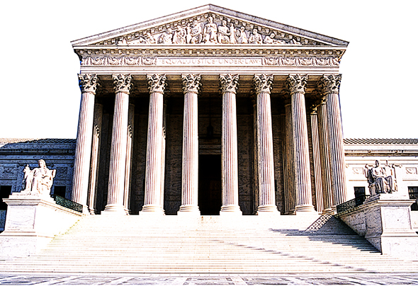
Here’s the original photo in its entirety. The sky looks oddly conflicted, and the building itself is dull and flat.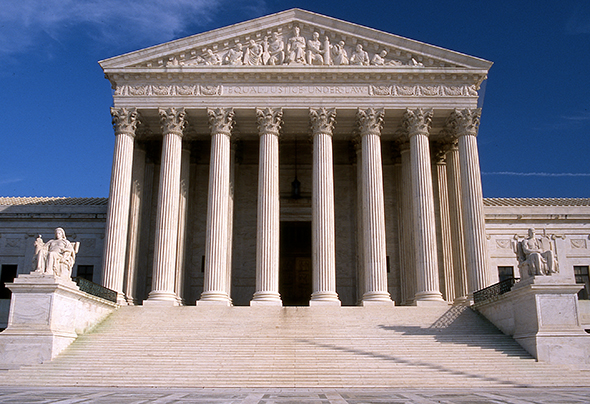
My first step was to use the Pen tool to select and delete the sky (I replaced it with a light, uniform blue later on). I used a simple Levels adjustment to brighten the entire building. It looks a lot better already.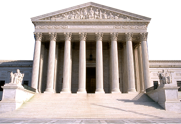
Before getting into the remaining steps, here’s the entire sequence, read from bottom to top, as seen in the Layers Window. In previous posts, I’ve included this window in each step, but I’ve had to reduce it down, making it hard to read. I think placing it here at full size will work better. Just scroll back up and check the Layers Window as needed, as we go through the steps below.
If you’re a Photoshop user, you know the Layers Window only displays the Blending Mode and the Opacity for the selected layer (the one you’re currently working in, which is highlighted in blue). You can see that the selected layer below has a blending mode of Overlay, and an opacity of 46%. I’ve noted the action taken, along with the blending mode and opacity settings for each of the layers in our sequence.
Second step: duplicate the background (starting) layer, apply Filter>Sketch>Photocopy, set the blending mode to Overlay, leave the opacity at 100%. This produces a lightening effect.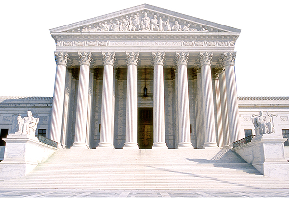
Third step: duplicate the background layer again and move the resulting copy above the layer we just applied the Photocopy filter to. Set the blending mode of this new layer to Overlay (i.e., change Normal, the default blending mode, to Overlay), leave the opacity at 100%. The result: a significant improvement in contrast.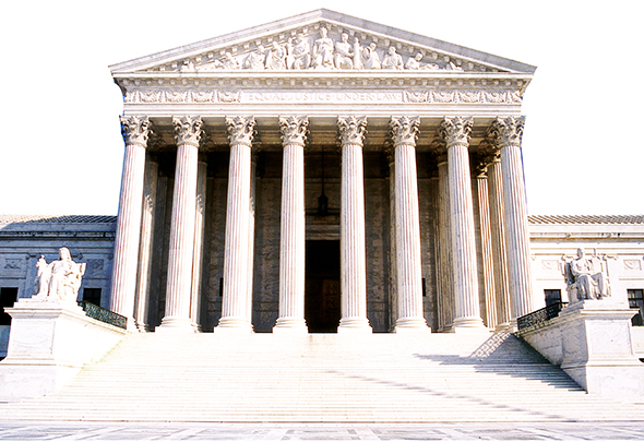
Fourth step: duplicate the 3rd layer (the one we just worked on), and apply the Poster Edges filter (Filter>Artistic>Poster Edges). Once again, set the blending mode to Overlay. The Poster Edges filter darkens the edges of an image, which gives it more of an illustrated look. In this instance, the combination of Poster Edges and Overlay darkened the image too much– so I reduced the opacity to 51%, stopping when things “looked right.”
I should mention here that this whole process was guesswork. It was based on instinct and experience, true, but it was still guesswork. There’s no magic formula. I guessed a little bit on every step, and undid the things that didn’t work (and there are always plenty of things that don’t work, believe me).
Step 5: I played a hunch and duplicated my original background layer again, moved the new copy up to the top so it became the topmost layer, then applied the Poster Edges filter again. I set the blending mode to Overlay, and reduced the opacity, again stopping when things looked right (at opacity=46% this time). Result: a nice sharpening effect, especially for the sculpted figures.
Sixth step: I applied a simple Photo Filter: a light brown to give the building and steps a warmer tone. Layer mode=Normal, opacity=100%.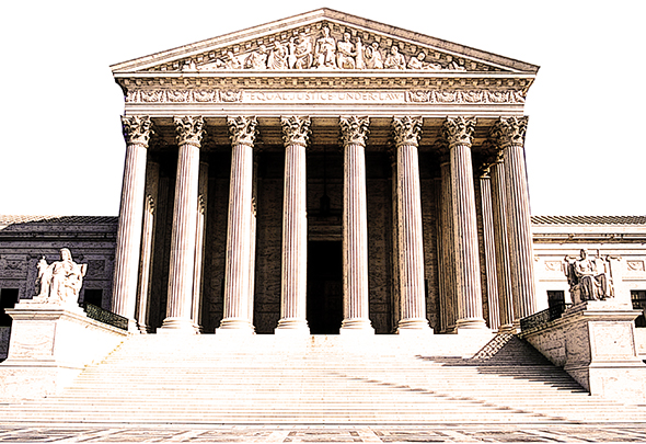
Step 7: Parts of the building and steps still seemed too pale to me. So I selected everything except the sky, filled the entire area with a warm brown, and experimented with layer modes. I finally opted for mode=Linear Burn, and reduced the opacity all the way down to 8%. The result is a slight darkening of building and steps, that’s felt more than it is seen.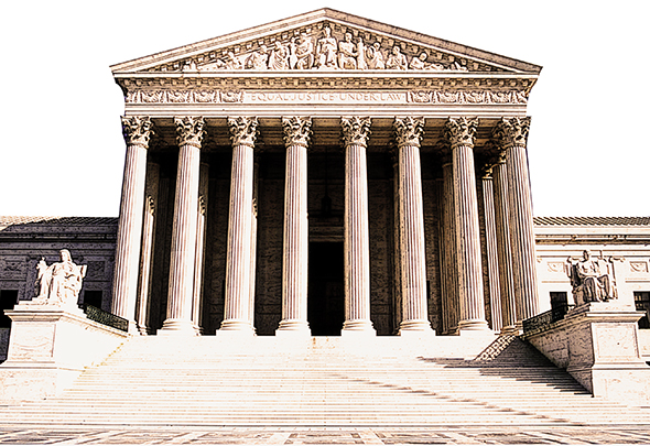
Finally (Step 8), the fussbudget in me decided the image needed a bit of extra color in the foreground. I used a color-to-transparent Linear Gradient, color=light brown, applied bottom to top. Layer mode=Overlay, opacity=100%. 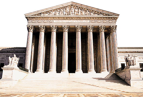
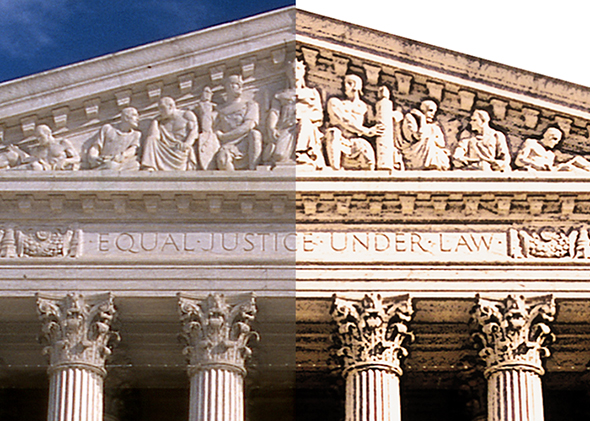
OK. Time to stop fussing and see what we’ve got. Here’s a Before and After compare of the sculpted figures at the top: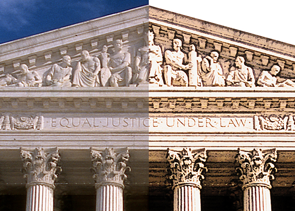
I did one last thing. Experience has taught me that adding a little blur can sometimes be helpful. The idea here was to give a photo an illustrated look. But filters and other post-processing techniques can leave edges that are a little too sharp. Softening them with a slight blur often enhances the hoped-for illustrated look.
Here’s the same detail compare after giving the right side image a 0.5 pixel Gaussian blur. Can you see a difference?
A larger compare, with no blurring applied to the right side image: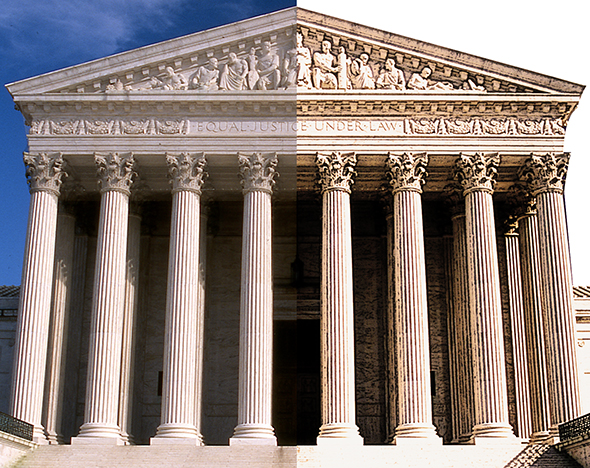
Same again, after applying a 1.2 pixel Gaussian blur to the right hand side. I think the blur is easier to pick up in this longer-range view.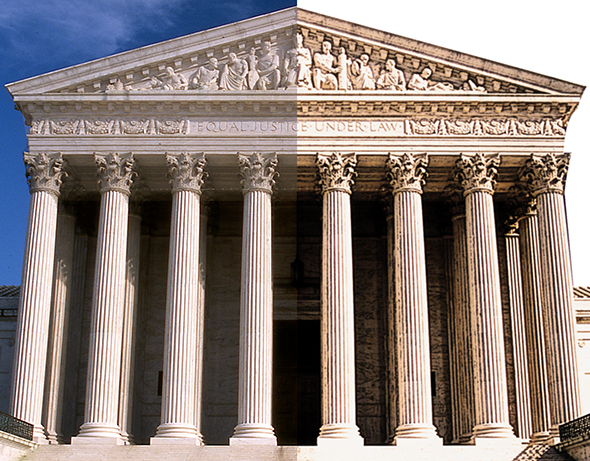
What do you think? Do digital artists have it too easy nowadays? Did the blurring work to advantage? Hope you’ll leave a comment.![]()
If you enjoyed this post, I invite you to subscribe. You can either leave a comment and click the box that says Notify me of new posts via email, or click on the Subscribe button below the Portfolio Thumbnails in the sidebar at the top right of this page.![]()
Other Posts You Might Enjoy:
And For Her Birthday, Lola Wants… A Leg Lamp??
Once Upon A Time At Westminster Cathedral



Thanks, Mark! I have photoshop elements and I have so much to to learn. I appreciate that you pass your knowledge. Great post!
LikeLike
So much to learn… that makes two of us, Jayne! Man, somedays ol’ Knowledge Mountain seems lost way up in the clouds. But we shall climb on, and we shall reach the top!! I’m speaking theoretically, of course… : )
Glad you liked the post, and thanks so much for your support!
LikeLike
Very interesting Mark, I would be interested in knowing if you use a pretty standard set of steps– in other words, do you look and it and know right away what you need to do or do you have to mess around with it and kind of see what it looks like as you go along? I’ve seen that blur option and I’ve always wondered what it was for. Well now I know. I gotta say, that blur tool would be the most inmportant tool for my drawings!
LikeLike
No, no, no!!– we must keep the Blur tool far away from your wonderful doodles! They are Excellence in its, uh, purest form… : )
I do work these Photoshop effects out as I go along. Don’t want to mislead you. It’s not totally blind guesswork. I know, for example, that the Cutout and Poster Edges filters will always give a photo an illustrated look. I know the Multiply and Burn blending modes will darken an image, and that the Screen and Dodge modes will lighten one– that sort of thing. But there’s always a lot of experimenting. In this particular case, I was using the Sketch>Photocopy filter for the first time– definitely opened up some new possibilities for me. So that’s the really important lesson of a post like this: experimenting is worthwhile because it always expands your knowledge.
Same as reading your blog. It always expands my knowledge. And makes my head spin. In a good way, I mean… : )
Thanks as ever, Linda, for your cheery support!
LikeLike
You are brilliant because you can do a makeover of a building without involving scaffolding or heavy lifting. What magic!
I think Photoshop is very helpful and useful for digital artists. It may make their work a lot easier but that doesn’t mean they have it too easy because at the end it’s about creating a concept. A good concept is developed based on how creative you are. That’s my humble opinion anyway. 😀
Yes, the blurring worked to advantage very well. Nicely executed! 🙂
Great tutorial and thanks for sharing it! 🙂
LikeLike
Ha! Yes, lucky for me no scaffolding or heavy lifting was involved– or I’d be typing this from the hospital!! : (
Hey, I like that humble opinion– it helps give me a very good not-so-humble opinion of myself!! : P
Thank you so much, Inge, for your very kind support– most sincerely appreciated!! : )
LikeLike
mmmm, what else could I say? Impressive! Bravo Mark! You really are learning a lot from Toothsome 🙂
You’re so brilliant, I learned a lot with this post. “Don’t be afraid to experiment!” heheheI Seriously thanks so much and I need some more! 🙂
LikeLike
Wait a minute! How could you have learned a lot from this post? You’re the one who’s taught me everything I know!!
And because of that, I should really rename this blog Toothsome’s Tutorials, or better yet, Toothsome’s Tutes: Tutorials You Can Really Sink Your Teeth Into!! Yes, I like that! It’s the least your faithful apprentice can do… : )
Many thanks for your most delightful support!! : )
LikeLike
You’re very welcome Mark. You are really brilliant and great with your profession 🙂 Plus I love, love so much your sense of humor, you’re like a virus, I get a flu in every comment that you write in my posts… hhhha- at- chuuu! 🙂 🙂 🙂
mmmwaahh!
LikeLike
I’ve often been compared to a virus, but no one has ever done it so charmingly… haaaaaaaaaaaaaa-CHUUUUU!! : )
Thank you, my dear Dolly!! : )
LikeLike
Being rather fond of the sharpen tools means total avoidance of the blur option … up till now. Step 8, linear gradient warms the building, invites you right up those steps and in that door. Many thanks, Professor Armstrong, for sharing and showing us Photoshop pre-schoolers how it’s done.
LikeLike
Professor Armstrong?? Man, it’s a good thing I was wearing my academic gown and mortar board when I read this– darn lucky, that!! : P
There are a lot of days when I’d put myself in the Photoshop pre-schooler category. You think you’re finally making progress, then you read thru some incredible tutorial and feel like you’re a million miles behind… : ( Oh, well– we must soldier on to glory or a heroic hash, as the case may be!! : )
Many thanks for your very kind words and support!
LikeLike
Wow! I’m so impressed with how structured this post is and how you make it sound so easy to master photoshop. I’ve never tried to use it.
LikeLike
Many thanks, TT. Photoshop’s definitely a challenge, I can’t really sugar-coat that. But it’s like so many other things: it helps a lot if someone walks you thru some of it. There are some wonderful online tutorials out there, much superior to mine, and that’s where I’ve picked up a lot of my own knowledge. Most of all, I try to encourage a willingness to experiment. It’s amazing what one can learn by accident. Yes, that’ll be the title of my book: The Accidental Photoshop Guru… : )
Thanks as ever for your encouragement and support! : )
LikeLike