It Pays To Use Your Interior Page Art to Create Your Children’s Book Cover
![]()
* * * * * * * ![]()
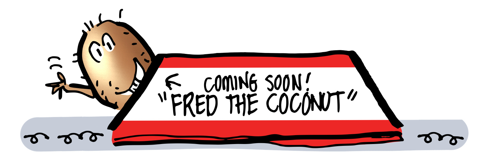
As mentioned in my last post, I’ve been working on a children’s book called Fred The Coconut.![]()
Hard to believe, but Fred’s Big Day is almost here!!![]()
This coming Friday, June 26, 2026, you’ll be able to go to Amazon, type “Fred The Coconut” in the Search field, and find Fred’s book page.![]()
Then you’ll wanna take out your credit card and, well… I shall say no more… 😅![]()
* * * * * * * ![]()
In this post, I want to make the case for using some of your story illustrations to help build your cover and title page, rather than trying to create the latter entirely from scratch.![]()
Doing so helps give your book a unified look. Also, by creatively recycling a dynamic scene from your story for the cover, you create anticipation in the reader. You’re giving him an exciting preview of things to come.![]()
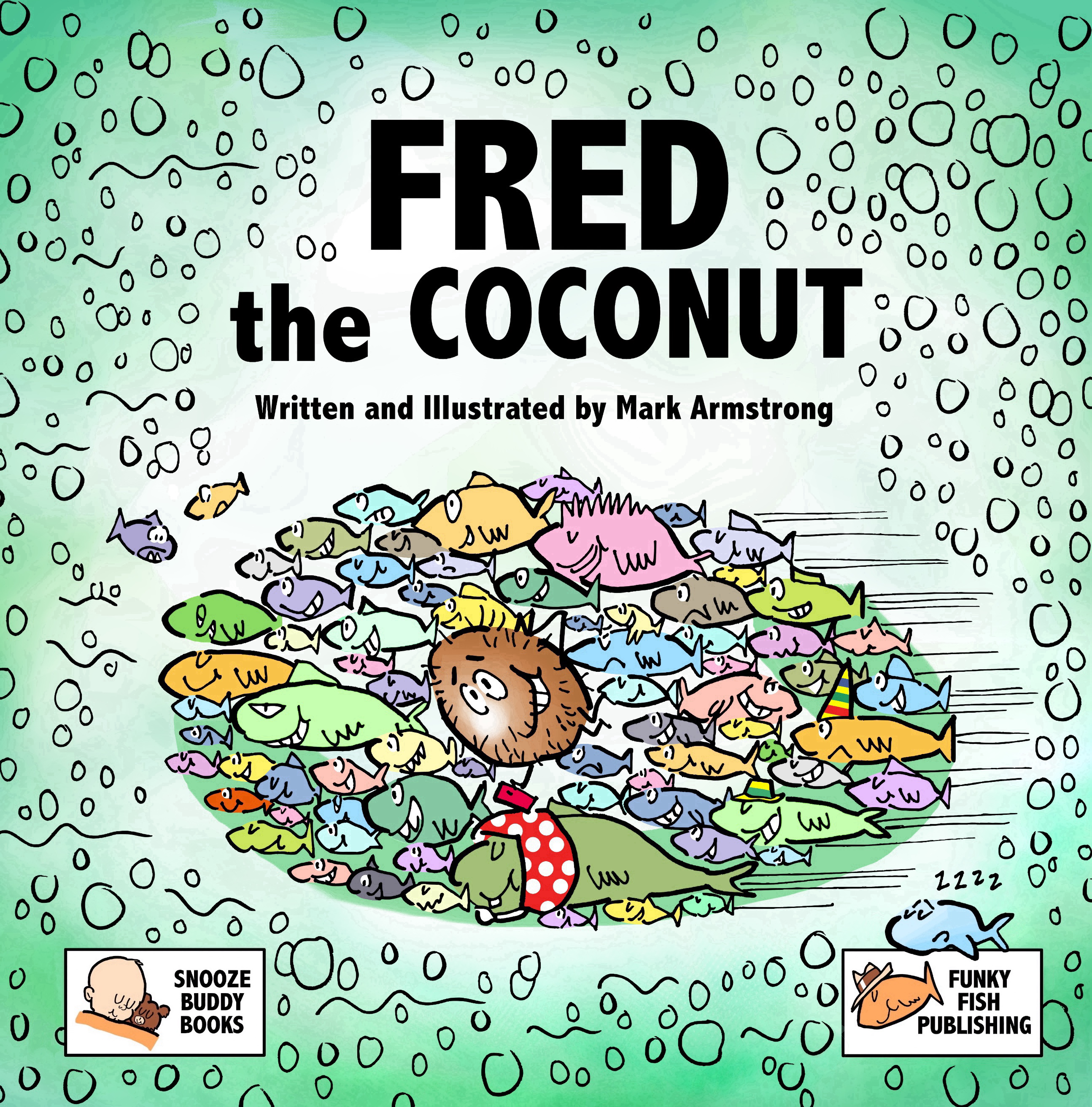
For example: Here’s my cover for Fred The Coconut:![]()
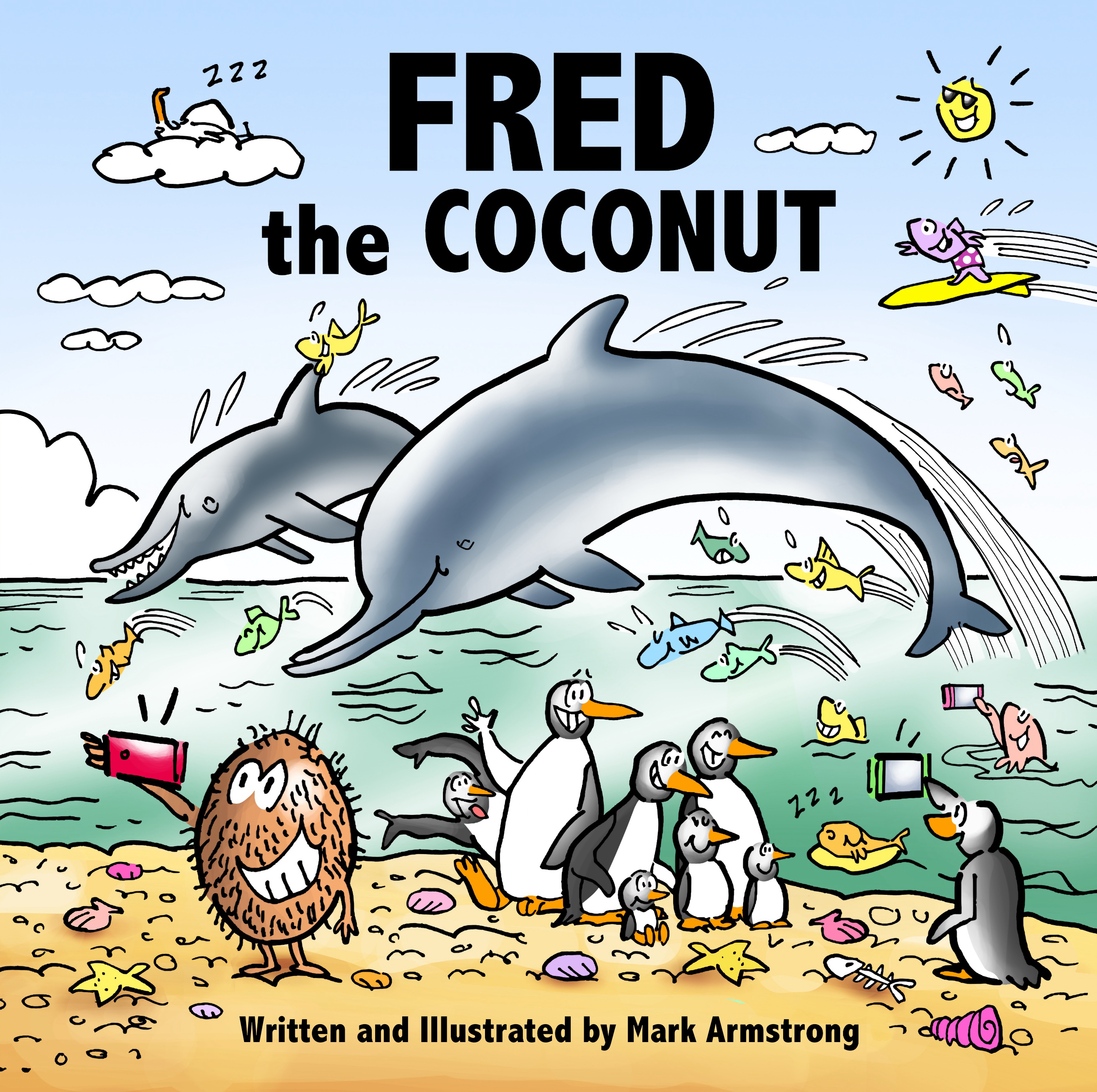
![]() I drew a new picture of Fred, standing on a beach, taking a selfie for the cover, but all the other elements were recycled from two interior pages.
I drew a new picture of Fred, standing on a beach, taking a selfie for the cover, but all the other elements were recycled from two interior pages.![]()
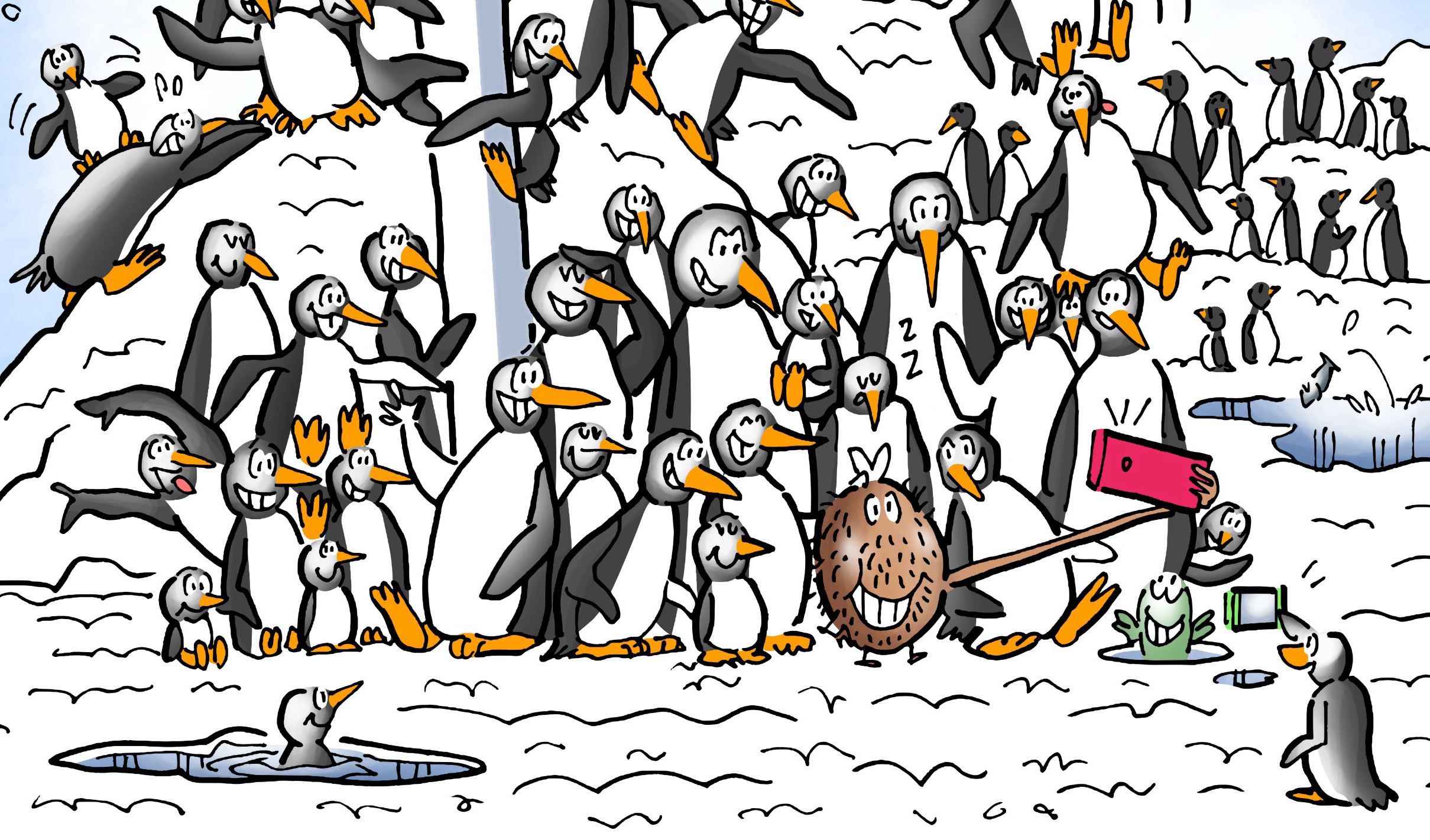
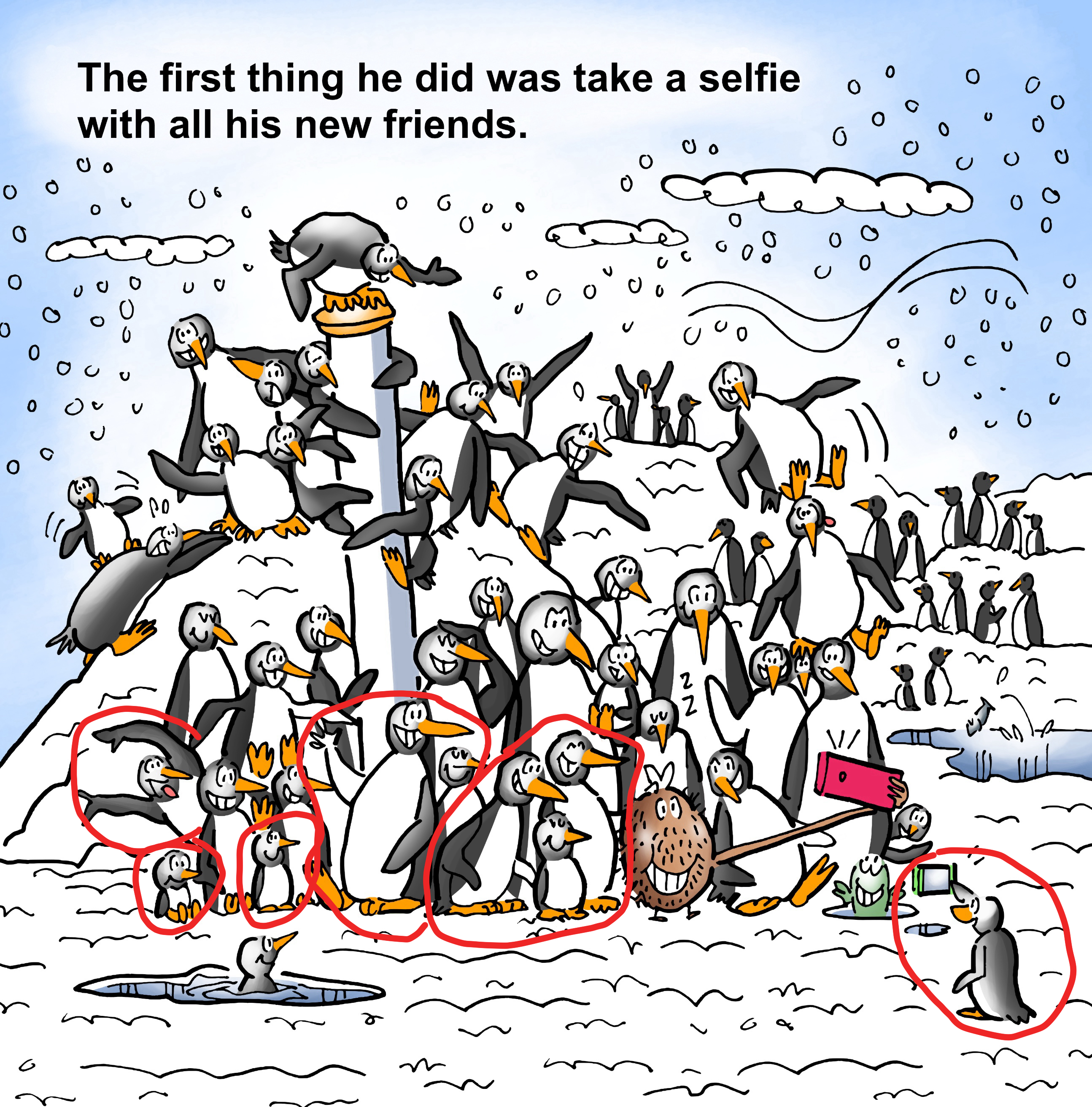
I took the penguins from the interior page shown below. The red lines indicate the penguins I “cut out” and reassembled.![]()
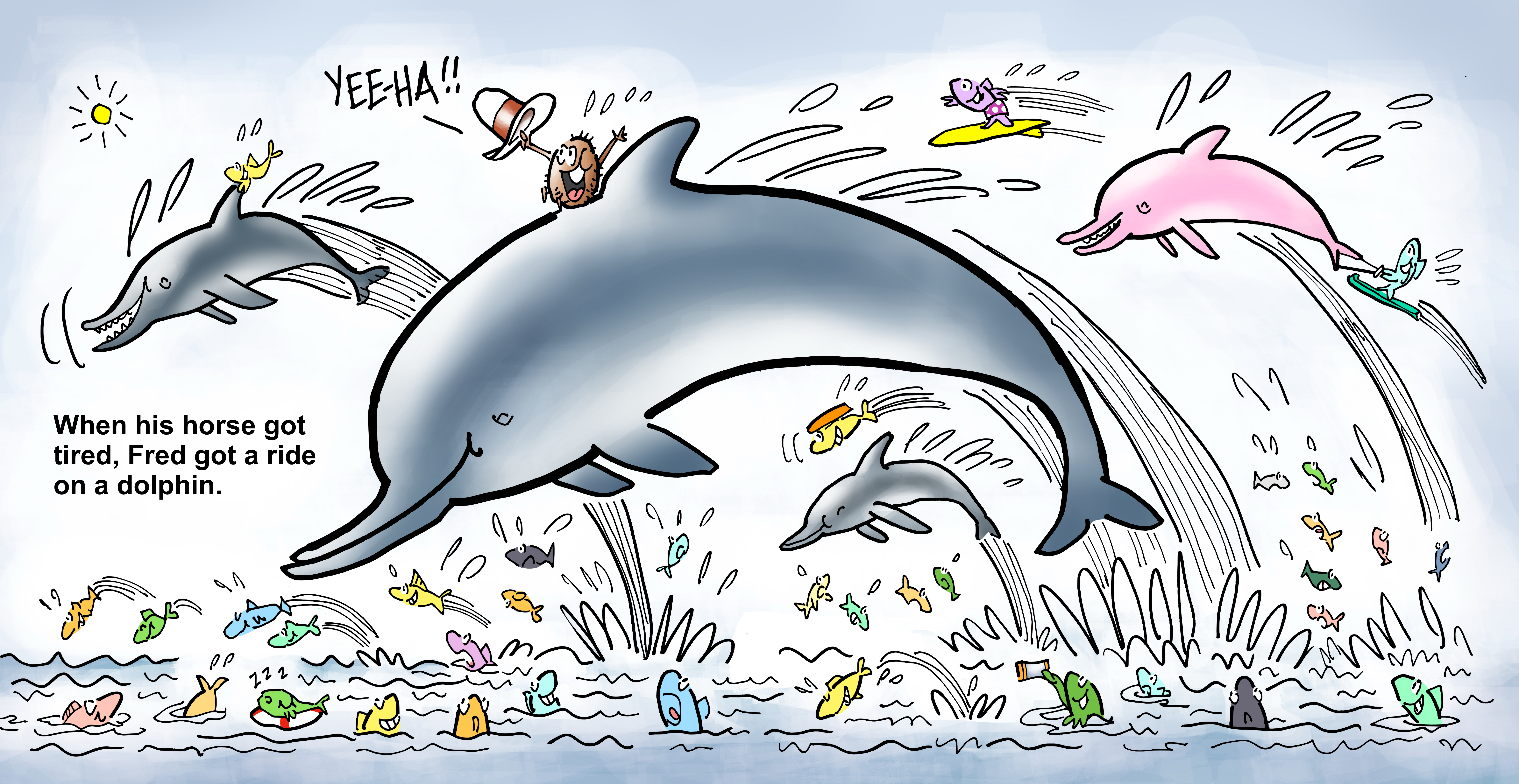
![]() The dolphins and the fish are from the following two-page spread:
The dolphins and the fish are from the following two-page spread:![]()
![]() You can see how this technique works to advantage. You’re giving the reader a taste of the adventure inside, without giving too much away.
You can see how this technique works to advantage. You’re giving the reader a taste of the adventure inside, without giving too much away.![]()
I’m sure many of my readers aren’t illustrators, but if you’re writing a children’s book, you’ll probably be working with an illustrator, and you might want to pass this idea along.![]()
Namely: Figure out a way to get your best interior page artwork on the cover where it can be seen. You want that energy out there working for you. You want it grabbing people’s attention and making them want to read the book.![]()
![]()
* * * * * * * ![]()
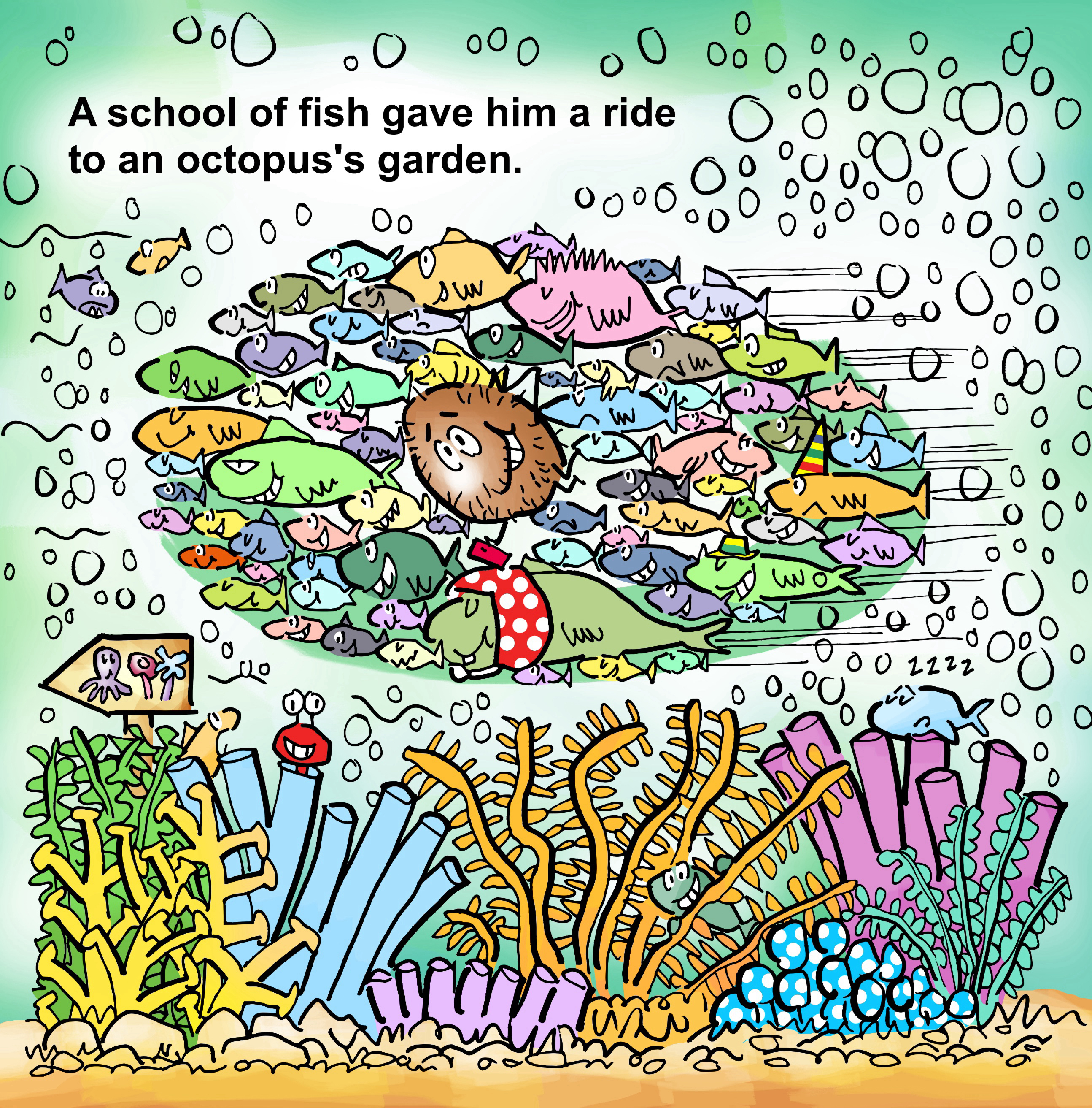
The same idea can be applied to your title page, which is the first inside page you see when you open the cover. Here’s mine:![]()
![]() The title page repeats the title and credits from the cover, and often includes the imprint, the publishing company, or both.
The title page repeats the title and credits from the cover, and often includes the imprint, the publishing company, or both.![]()
My title page illustration (above) is a steal from the interior page shown below. I had to copy and paste a lot of bubbles, but I think it was worth it. 👍😅![]()
![]() I also used an interior page (below) for my back cover.
I also used an interior page (below) for my back cover.![]()
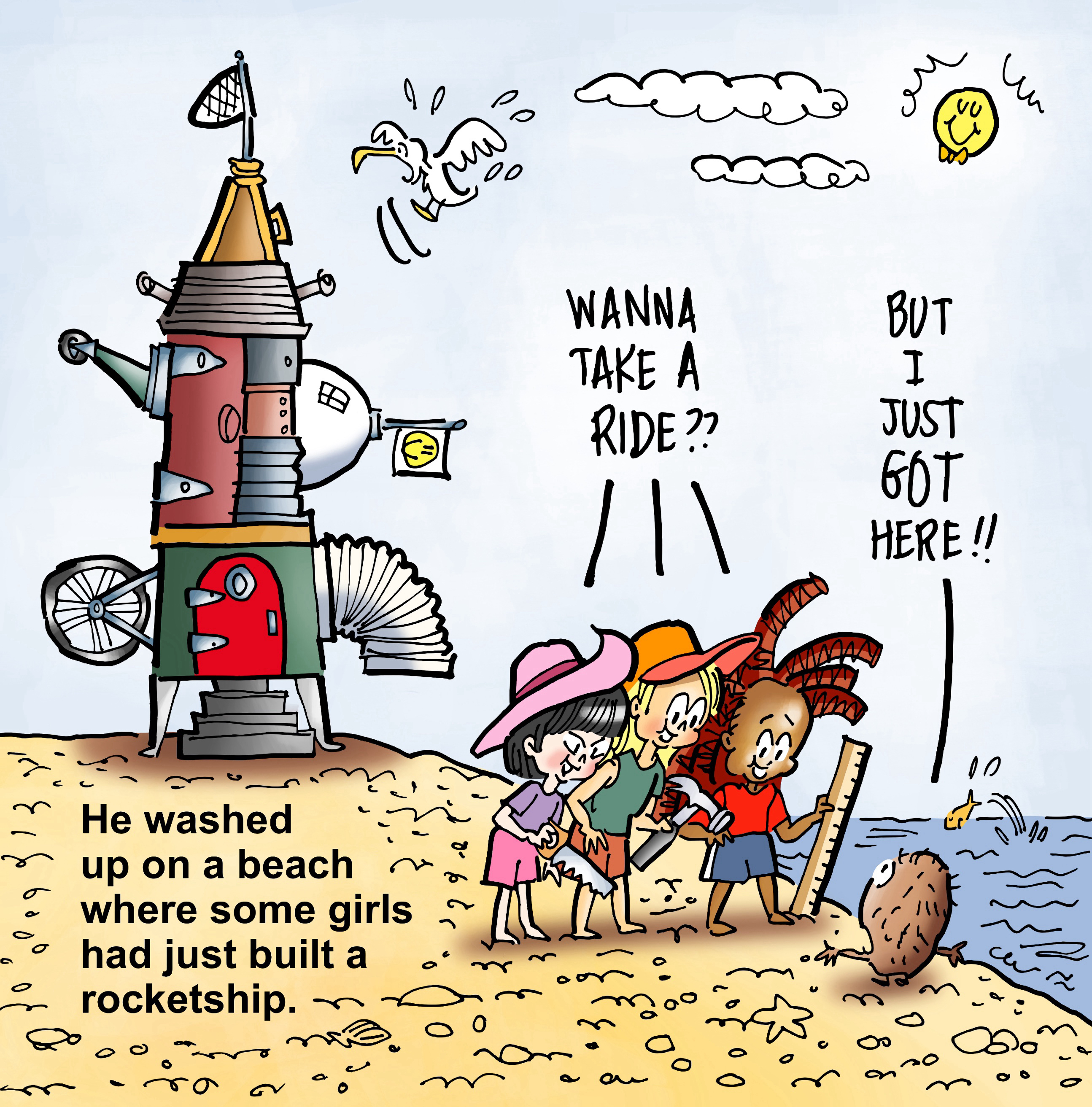
![]() I pasted in a new larger Fred, added a fish, resized the girls and repositioned them, and cleared out the upper-right area so I could add a book description. Here’s the result:
I pasted in a new larger Fred, added a fish, resized the girls and repositioned them, and cleared out the upper-right area so I could add a book description. Here’s the result:![]()
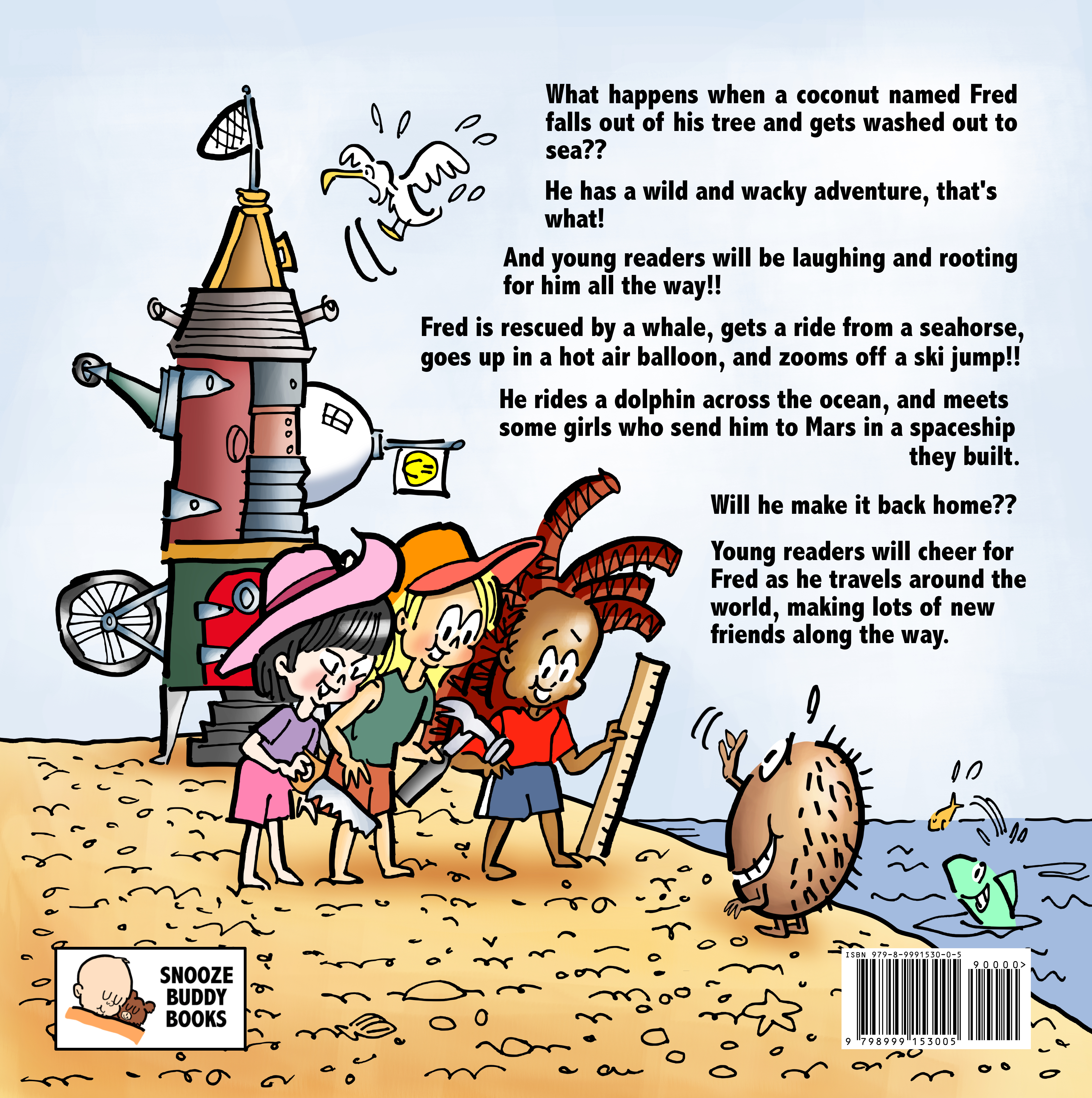
![]() Some of your interior pages are going to have great energy. Recycle that energy and use it to help sell your book.
Some of your interior pages are going to have great energy. Recycle that energy and use it to help sell your book.![]()
* * * * * * * ![]()
Hope you’ll hop over to Amazon on Friday, and do a search for Fred’s book page. I’d be very interested to know what you think. Thanks for all your support!! 🙏![]()
* * * * * * * ![]()
I’ve been writing about my self-publishing journey on the Substack platform. It’s a free newsletter, and I invite you to subscribe. Just click the banner below.![]()
![]()

![]()
![]()
* * * * * * *
* * * * * * * * * * * * * ![]()
About Mark: I’m an illustrator specializing in humor, branding, and content marketing. I write about marketing and visual communication.![]()
I also write humor, short fiction, and the occasional reflection. Fred The Coconut is my first children’s book.![]()
You can view my portfolio, and connect with me on X, Facebook, and LinkedIn.![]()
Questions? Send me an email.![]()
![]()


I can’t wait!! 🙂
LikeLiked by 1 person
Thank you, my friend!! You are in a class by yourself when it comes to kindness and support. You are a sustaining force for me, and that’s the truth. 🙏🙏🙏
Rest assured that I am eagerly anticipating your own new book, and I shall be bulling my way up to the front of the line!! Cheers, Matt, and thanks again!! 👍💪🙏🌴🥥😊
LikeLiked by 2 people
Congratulations to you, Mark!
Have a wonderful 4th of July!
Dianna Huff
LikeLiked by 1 person
Thanks a million, Dianna, I really appreciate that. Wishing you a lovely 4th as well, and thanks for all your good cheer and support!! 🙏😊
LikeLiked by 1 person