Inside Counsel asked me to illustrate a feature story on the United States’ new federal healthcare law. It’s officially titled the Patient Protection and Affordable Care Act. It is frequently referred as Obamacare, especially by its opponents.
Most of the major provisions of the law are scheduled to go into effect on January 1, 2014. The article focused on what the new law means for employers. In simplest terms: if you employ 50 or more people, you have to decide whether or not to provide (or continue to provide) healthcare insurance to your employees. If you decide not to provide coverage, you have to pay a $2000 penalty (per employee) to the federal government. In short: you have to decide whether to Play or Pay.
Here’s the page one illustration which set the tone for the article.

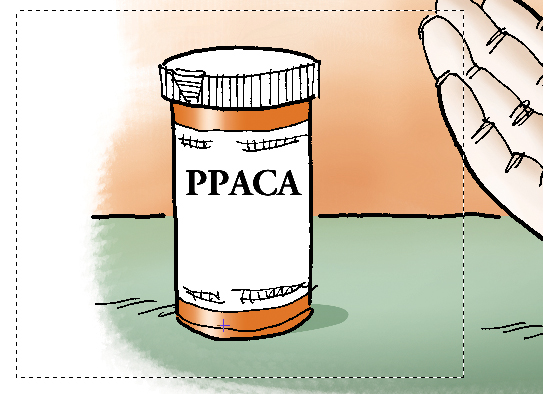
It’s the kind of assignment I do best: attract readers by adding humor and visual interest to a complex, rather boring subject. Here’s a slightly larger detail image. 
As you can see the illustration involves some text. The “Play” and “Pay” only required a slight rotation, but getting the text into position on the prescription label is trickier than it looks: the text has to fit the curve of the label– and the curve becomes more pronounced as you move toward the bottom of the label.
There are 4 lines of text. In a case like this, it is a huge mistake to try to “warp” all 4 lines into position as a group. There are too many things to control. Result: frustration. A much better strategy is to bend the lines one by one on separate layers, maximizing your control.
Another crucial step: rasterizing the text before you warp it.
What does that mean– rasterize the text?
Photoshop Text is vector-based: the smooth shapes of the letters are defined by paths. When you rasterize a Text layer, you convert the text to a bitmap image: the letters look just like they did before, but now they are just groups of pixels, rather than path-defined shapes.
Let’s take a quick look at why trying to warp text in Photoshop without rasterizing it first is a mistake. Here’s what the first line looks like if we just type it on the label. It clearly looks wrong, because it doesn’t follow the label’s curve.

It’s tempting to warp unrasterized text because all you have to do is hit a button. A little Warp Text dialogue window appears. You pick the kind of warp you want (the “style”) and adjust various settings to get the effect. In the Layers Window, a little Warp icon appears (circled in red below) to indicate that a warping effect is being applied to the
Text layer.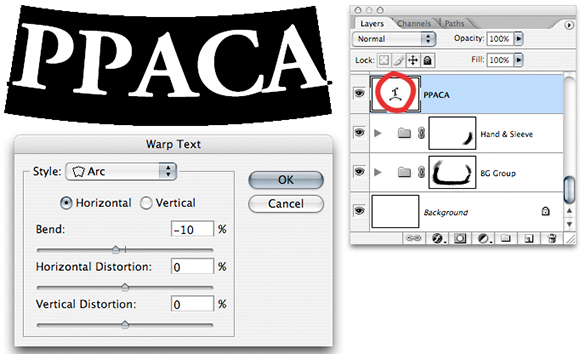
Our selected setting looks promising, but look at the result on the label. Definitely not right.
Time to rasterize the Text layer and try a different kind of warping.
Highly recommended: always duplicate your original Text layer first. If anything goes wrong, you’ll still have the original and all your settings: what font you used, the text size, etc– you will lose all that info when you rasterize the Text layer.
After duplicating: hide the original Text layer by clicking on the “eye” icon (circled in red below). Then select your copy, and choose Layer>Rasterize>Text from the drop-down menu. The “T” symbol disappears, indicating the copy is no longer a Text layer.
If you squint at the “PPACA copy” layer in the Layers Window (below), you’ll see a couple of black dots (red arrow): that’s our “PPACA,” now reduced to pixels, sitting all by itself on that layer.
Next step: use the Rectangular Selection tool to select a fairly wide area around the “PPACA.”
Believe it or not, this is the most important part of our “trick”: not just selecting the “PPACA” itself, but selecting it and a fairly large area of empty space around it.
Select Edit>Transform>Warp from the drop-down menu. A grid appears on top of the selected area.

You warp the selection (the pixels contained in the selected area) by tugging at points on this grid: position the cursor, click and hold, gently move the cursor and watch the effect on the text. Don’t release (unclick) until you like the result (you can always Edit>Undo each tug on the grid). Repeat, moving the cursor around the grid to gently nudge the text into position.
I’ve used red arrows below to indicate the approximate places where I “tugged on the grid.” Notice how far away I am from the text itself– I’m taking advantage of the empty space surrounding the text. If I tug near the edges of the grid, I get a much more delicate (nuanced) warping effect than if I tug close to the text itself. I’m using the empty space to maximize my control.

You might be able to nudge the text into position with just a few “tugs.” It might take a dozen or more. If the result is not quite right, you don’t necessarily have to Undo and start over: you can reselect the text and do a second Warp, using an additional few tugs to fine-tune text placement.
When do you stop? When it looks right. Then you repeat the process for any other lines of text. Here’s where I stopped for that first line:

Is it worth all the trouble? A quick compare (below):
L-R: Unwarped text; warped text without rasterizing the Text layer first; warped text after rasterizing the Text layer first and using the warping technique shown above.

Here’s the final again, with all 4 text lines finessed (warped) into position on the vial label, one at a time, each on a separate layer.
What do you think? Ever found yourself reading a very dry or technical article just because the illustration made it look interesting? Do you have to be a little warped to take an interest in digital warping techniques?? Hope you’ll leave a comment.
If you enjoyed this post, I invite you to get updates. Just click the Get Updates button in the sidebar below the Portfolio Thumbnails, or click + Follow in the blog menu bar.
Other Posts You Might Enjoy:
Paula Deen, Twinkies, And The National Debt
Steve “Adam” Jobs Offers Eve An Apple In A Previously “Gated” Community
Is It Too Late To Wish Everyone A Happy New Year??