Chocolate, Caramel Apples, And A Few Photoshop Tips
I picked up a delicious new client recently: the St. Croix Chocolate Company in lovely Marine on St. Croix, Minnesota— yum, yum!
They host an event in October called Caramelpalooza: a community day that includes a ragtime pianist, miniature animals to pet, bounce houses, face painters, pumpkin carving, and an appearance by– you guessed it– CaramElvis. The big attractions, of course, are SCCC’s caramel sauces, bacon caramelcorn, and homemade caramel apples.
Owner and chocolatier Robyn Dochterman asked me to do a promotional piece for the event. Here’s the final:
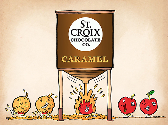
I like to experiment with different shading techniques when I do an illustration, especially when it comes to reflected light. And I often find myself wondering if certain colors should be darker or lighter. So I try to find non-destructive ways of tweaking things: applying changes on a new layer, while preserving my original color scheme on an underlying layer.
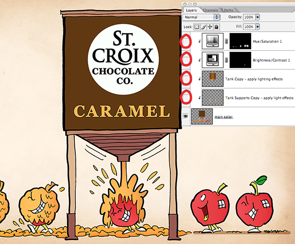
The image below shows part of my Photoshop Layers Window for the illustration. I used 4 different layers to adjust the color of the apples, and to apply reflected light to the tank and its supports. All 4 layers are “clipped” to the main color layer, meaning they will only affect that one layer. The “eyes” (circled in red) indicate all 4 layers (and their effects) are active and visible. 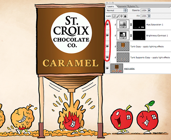
I used the first (top) adjustment layer to brighten the reds of the apples. The key here is selecting the part you want to change before creating the adjustment layer; that way, the change is applied only to the selected area. Everything else is masked out (the masked area is the black portion of the layer mask shown below).
The second adjustment layer uses the same technique to darken the open mouth area of the second apple from the right. The tiny speck of white visible in the corresponding layer mask indicates the selected (affected) area.
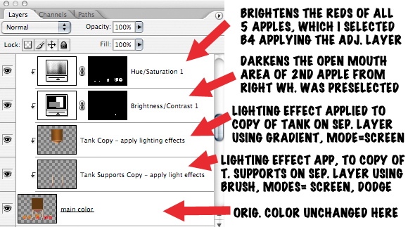
I created the third layer by selecting the tank’s flat colors, then pasting them into a new layer. I applied lighter colors to the new layer using both the Gradient and Brush tools, with Mode = Screen. The Screen setting will always lighten the existing colors of the underlying layer. If the lightening effect is too severe, reduce the tool’s Opacity setting as needed to compensate.
I used the same basic technique to add reflected light to the two tank supports: select them, paste their flat color into a new layer, then apply lighter colors using a soft Brush and experimenting with Brush Mode set to Screen, Color Dodge, and Linear Dodge, all of which will lighten the existing color of the underlying layer.
Here’s a condensed version of the above commentary next to the Layers Window.
Below, we see the image with the 4 adjustment layers turned off: the apples are paler, the colors of the tank and its supports are completely flat, with no reflected light. Scroll back up to see the image with the layers turned on– quite a difference.
One final step that may be of interest: my client requested the final as a vector file. What does this mean exactly?
Images created in Adobe Photoshop are called raster or bitmap images: they’re stored and displayed as pixels on a rectangular grid (bitmap = a map of colored bits). Images created in Adobe Illustrator are called vector images: they consist of mathematical points or paths which define geometric shapes; these shapes are filled with flat color.
Raster images allow for very smooth gradations of color, but if you try to enlarge them, they become jagged or “pixelated” (the individual pixels become visible). Anyone who’s ever tried to enlarge a small JPEG has had this experience.
Vector images aren’t as smooth, but they have one tremendous advantage: they’re scalable. You can enlarge a small vector image and put it on a teeshirt. Or a billboard. It will look exactly the same, and just as good, at any size.
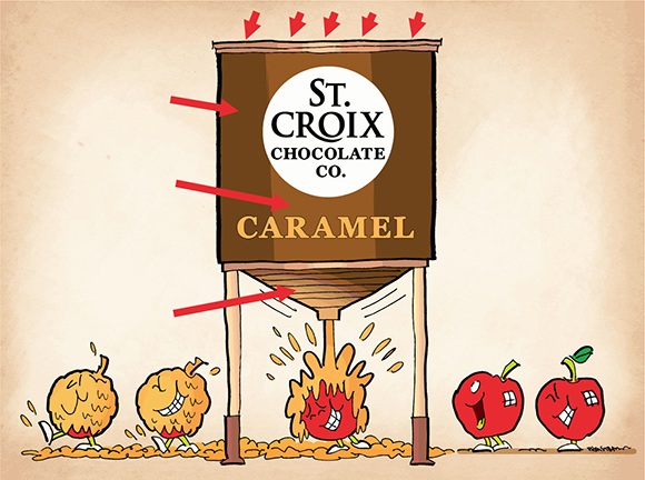
Here’s what the illustration looked like after I imported it into Adobe Illustrator and converted it to a vector (.ai) file. The smooth gradations have been replaced by bands of color, as indicated by the red arrows.
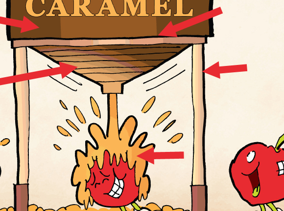
Here’s a close-up of the vector file. Bands of color are clearly visible. You can even see a slightly darker band of brown within the caramel splatter.
Funny, but we don’t usually notice this banded effect in a vector drawing. The human eye compensates, seeing gradations that aren’t really there. One could argue that losing fine color gradations is a small price to pay for being able to scale an image up or down with no loss of image quality.
What do you think? Are apples masochistic? Do they really enjoy getting covered with sticky goo?? Are you ready to buy into the idea that a vector image can be blown up to billboard-size and still look as good as it does on a postage stamp? Hope you’ll leavea comment.
If you enjoyed this post, I invite you to get updates. Just click the Get Updates button in the sidebar below the Portfolio Thumbnails, or click + Follow in the blog menu bar.
Other Posts You Might Enjoy:
Mark Armstrong And His 7 Dark Secrets
Look Out, Supe– That’s Taxregonite!!
Header Look Better When Color Picks Click