As mentioned in previous posts, I used to draw a lot of B&W gag cartoons on spec; that
is, on speculation, i.e., I hoped a magazine might like a cartoon well enough to buy it).
Here’s one that’s more than 20 years old. It predates my using Photoshop, and was all done by hand. Alas, it never sold. But I chanced across it recently, and it made me laugh. Nothing like enjoying your own work… : P
Several things bother me, however: 1) the drawing looks stiff and labored 2) the waiter’s legs, which I hid behind the table, are too short 3) the drawing has no depth because there’s no shading 4) it also looks static because there’s very little variation in line thickness 5) my signature’s too big and obvious, the sure sign of an amateur who is worried about getting credit.
Still, it makes me laugh. : )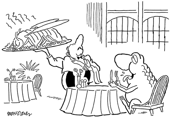
Have I learned anything in 20 years? Here’s a cartoon I did last year. (I thought it would be fun to retain the frog motif.)
It’s a bit sloppy, but it has more energy. The thick and thin lines give it some “pop.” The grayscale shading (added in Photoshop) mimics a tradition ink wash and adds some tone. The lines are more supple and assured. I inked it quickly and didn’t worry about following my rough pencil lines precisely.
The proportions look good. The frogs are bigger than they would be in real life, but that’s OK– it’s a difference that doesn’t really register, and they need to be seen and recognized as frogs. My signature is not competing for the reader’s attention.

But I’m asking myself: how clear is the joke? What exactly is the joke??
My original thought: a princess is marrying a frog; two frogs show up at the church where an usher is seating guests; the frogs tell the usher they’re “friends of the groom,” like it was the most natural thing in the world. It’s a funny gag if you share my frame of reference– but have I given the reader have enough information to infer what I was thinking?
The church setting seems clear, and the man is wearing wedding attire, complete with tails, cummerbund, and boutonniere. But if I had to do over, I’d include king and queen characters (wearing crowns) behind the frogs, looking down at them with disapproval. I think that would better communicate the idea of a “mixed marriage,” and help the reader get the joke.

 * * * * * * * * * * * * * * * * * *
What do you think? Is a cartoon funnier if it looks spontaneous and dashed-off? Did either of these cartoons make you laugh? Do we need more frog cartoons, or are you ready to support a ban on them?? Hope you’ll leave a comment.
If you enjoyed this post, I invite you to subscribe. You can leave a comment and click the box that says Notify me of new posts via email, click the Subscribe button below the Portfolio Thumbnails, or just click + Follow in the blog menu bar.
Other Posts You Might Enjoy:
Golf, Performing Seals & How Cell Phones Are Shrinking Magazine Covers
Look Out, Supe– That’s Taxregonite!!
Pen Light Sets Off Illustration Bomb!