How To Dye A Die Using Photoshop Blending Modes & Layer Masks
It’s been awhile since I posted a Photoshop tutorial. This one is short and sweet and highlights a couple of Photoshop features that can make an illustrator’s job a lot easier.
Photoshop lets you work in layers. If your illustration has 5 different objects, you can put them all on separate layers, work on them separately, then combine them all at the end by flattening the layers.
What’s less well known: layers have blending modes and opacity controls which allow them to blend with the layers below them in interesting ways. Simply duplicating a layer, giving it a different blending mode, and then reducing its opacity a bit can create some wonderful effects.
You can also create a mask on a layer which allows you to restrict a blending mode’s effect to very specific parts of the image: you mask out the effect where it’s not helpful.
The more you experiment with these features, the more intuitive they become– meaning you gradually develop an instinct about what might “work,” saving you a lot of time and effort.
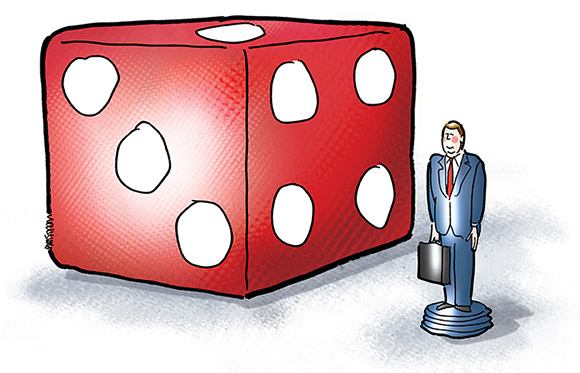
If it sounds confusing, fear not. Let’s look at an example. I recently did a spot illustration about the career paths of law school graduates. Here’s the final:
To start, I put the die on a separate layer, and use a large halftone brush to fill it with red. I imagine my light source coming from the left, and add a splash of white on the front face of the die, and a very small dab on the right. The Layers Palette shows the layer is in Normal mode.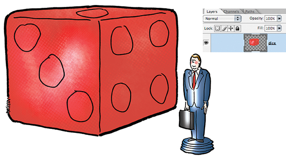
To maximize my options and give myself greater control, I create a new layer. I splash on more white and change the blending mode of the new layer from Normal to Screen. This causes it to blend with the previous layer in a way which brightens the effect (i.e., it makes the newly-applied white brighter than it would have been in Normal mode). 
I group the two layers together, create a new layer and apply a stroke of dark red on the right side of the die. Rather than continue to add brush strokes, I change the mode of the new layer from Normal to Multiply to see what the effect will be.
Multiply always blends layers in a way which makes dark colors darker. I like the effect on the right side of the die. I could reduce the effect by lowering the layer’s opacity setting, but I don’t– I leave it at 100%. The change to Multiply also causes the front face of the die to darken. That’s an effect I don’t want. So I add a layer mask and mask (reduce) the effect on the front face of the die; I thereby restrict most of the effect to the right face of the die.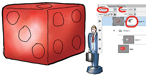
Now I’m having second thoughts: is the die a little too dark? There’s an easy way for me to find out: I duplicate the most recent layer and change the blending mode of the copy from Multiply to Screen. This lightens the overall image. But wait, I only want certain portions of the die to be a little lighter. Same solution: I create a mask for the new layer, and use a low-opacity brush to mask (reduce) the lightening effect in certain areas. 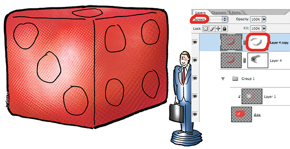
At this point, I’m freely experimenting because I’ve never had to create a realistic looking die before. I group all my layers together, and create a new layer. I apply a burst of white to the front face of the die using a spherical gradient, and add a stroke of red to the right side. I like the resulting effects. I leave the layer set to Normal mode. 
I decide the red has too much of an orange tint. I apply a Curves adjustment layer. I bypass the CMYK composite channel and instead adjust the four individual color channels (Cyan, Magenta, Yellow, Black) separately. Definitely better.
What if I made it darker? To see what the results might look like, I duplicate the Curves adjustment layer, then experiment with different blending modes for the duplicated layer. I like the effect of mode = Color Burn, and leave the layer opacity at 100%. I don’t want to burn (darken) the front face of the die, so I create a layer mask to restrict the burn to the right face of the die.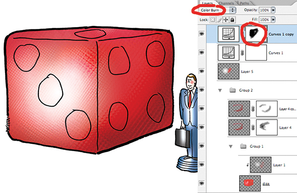
Decision time: I could continue to experiment, perhaps try to achieve a translucent look, but decide the die looks pretty good as is. I add another layer, and fill all the dots on the die with white. I debate whether to give the dots some depth by adding blue shading. It would be easy to do, but I decide against it: I know from experience that one can overwork a simple image. I leave well enough alone.

I ground the image by applying a soft blue-gray using two different brushes on separate layers– and I’m done. Here’s the final again:
What do you think? Do you use blending modes to experiment with color effects? Ever grappled with the problem of knowing when to stop working on a piece of art? Hope you’ll leave a comment.
If you enjoyed this post, I invite you to subscribe. You can either leave a comment and click the box that says Notify me of new posts via email, or click on the Subscribe button below the Portfolio Thumbnails in the sidebar at the top right of this page.
Other Posts You Might Enjoy:
Year-End Laffs Dept: Gag Cartoons That Won’t Make You Gag– I Hope!
Weinergate: Giving Hot Dogs A Bad Name
Creation + Evolution = Illustration