Summer Cookout: Boil That Hipster Down
I recently did an illustration for The Anvil, a very funny fake news site. It was for a post called Vegetarian Recipes for Memorial Day. Here’s the final.
Scroll down for a look at how the texture background was created.

Here’s the original B&W rough sketch: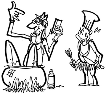
The sketch had a lot of energy so I decided to clean it up and use it for the final, rather than do a new drawing and risk losing the energy. I used the Eraser tool, I also used the Pen tool to redraw certain lines. I added certain photo elements to give the illustration a trendy look. Here’s what it looks like without the background: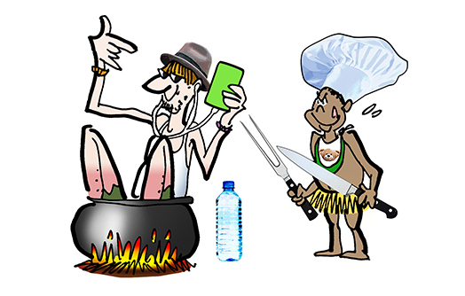
Speaking of trendy, many of today’s illustrations use textures for their backgrounds. I decided to experiment with this look. I began by downloading the following free texture from CGTextures. It can be found under Metal>Galvanized.
The sensible thing at this point would have been to insert the above texture behind my image, seen how it looked, and made color adjustments accordingly. But I was reckless. I applied a Hue/Saturation adjustment to the texture as is, without putting it in context. I experimented with different settings and finally settled on this result:
Then I posterized the image, Adjustments>Posterize: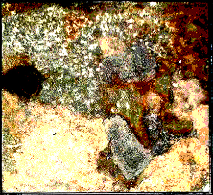
Finally, I chose Adjustments>Channel Mixer and mixed away until I had something that looked like a bad LSD trip. I remember thinking: cool!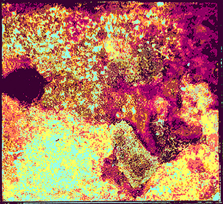
Then I inserted the texture behind my main image, and saw I’d painted myself into a pretty ghastly corner: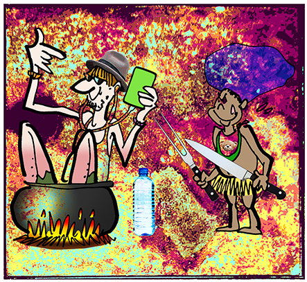
I was able to correct the situation by taking these steps, using trial and error all the way:
1) I applied a Hue/Saturation adjustment to both desaturate and lighten the garish colors; 2) I used the Liquify tool to stretch and distort the texture, in effect, “thinning” it out; 3) I cropped out the black box border, then used a soft spongy Eraser at low-opacity to dampened down the colors and create a soft semi-transparent edge; 4) I applied the Dodge tool to the area around the main figures, reducing the texture background there to near-transparency, making the figures easy to see:
Final steps: I used the Burn tool to create a bit of ground shadow to anchor the
image, and a soft Brush at low-opacity on a separate layer to create some smoke. (FWIW: I decided the smoke was a little too dark, so I applied a layer mask which allowed me to lighten the smoke by “whiting out” the overly dark spots with a soft,
low-opacity brush.) Here’s the final again:


