Header Look Better When Color Picks Click
Thanks to web designer Cheryl Boots of Designs of the 5 Domains, I recently learned how important colors are in designing a blog site. Here’s the story:
I had decided to change my blog header because I felt the original design (showing
a comic beaver) might be sending visitors the wrong message, namely: this guy only draws simplistic cartoons. I use the Vigilance Theme for my blog, which allows me to customize the background and border colors. I was using two different shades of green, and the blog originally looked like this: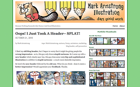
I designed a new header, one that displayed a greater range of styles. You can read about how I constructed the new header in this post. I uploaded the new header, but never considered the need to modify the original background and border colors. After uploading the new header, the blog looked like this: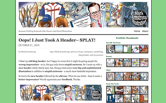
I asked blog visitors whether they thought the new header was an improvement. Web designer Cheryl Boots said she thought the new design was much more effective, but suggested replacing the green background colors. She even suggested two specific colors. I plugged them into the Vigilance Theme and was simply astounded at the transformation– here it is: 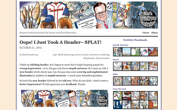
I’m extremely grateful to Cheryl for her kindness. If you’re looking for a great website designer, check out Cheryl’s work at Designs of the 5 Domains.


