Ring Around The Rosary, We All Stand Together
Every January, I get an annual assignment from the Holy Childhood Association.
The HCA encourages Catholic school children to help less fortunate children in foreign mission countries. The HCA asks me to do a campaign theme illustration. The theme for the upcoming 2011-12 school year is “We must love each other.” (1 John 4:7) Here’s the final illustration. Scroll down to see how it was put together.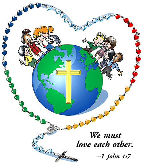
I submitted six ideas. The client chose my concept of a heart-shaped World Mission Rosary encircling the globe. They approved the rough with no changes. Here’s the original B&W sketch:
I decided to incorporate certain photographic elements into the final to give objects like the rosary a more credible look. I found a nice close-up of the principal parts of a rosary (crucifix, centerpiece, beads, chain links). I applied Photoshop’s Unsharp Mask filter, and Curves and Brightness/Contrast color adjustments to sharpen the photo. Then I used the Pen tool to select the pieces I would need.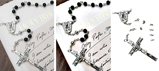
The extracted centerpiece showed an image of the Sacred Heart of Jesus. The client had given me a photo of a World Mission Rosary which showed the Virgin Mary on the centerpiece. So I converted the one to the other. You can see how I did it in this previous post. 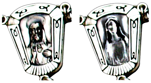
I found some heart-shaped beads on Stock.XCHNG. I applied the above-mentioned filter and color adjustments to sharpen the image and get rid of a yellowish tinge. I used the Pen tool to extract the best looking beads. To get the other three colors I needed (blue, yellow, green), I simply copied the white (clear) beads and applied a Hue/Saturation color adjustment (reminder: you have to check the Colorize box in the Hue/Saturation display window).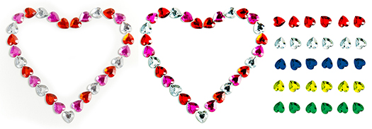
I decided to build the final on top of the approved rough. I copied and pasted in the beads. After much trial and error, I arrived at the heart-shaped configuration shown below. I also changed the orientation of the shorter segment of the rosary (which
ends with the crucifix), curving it toward the text. This strengthened the design.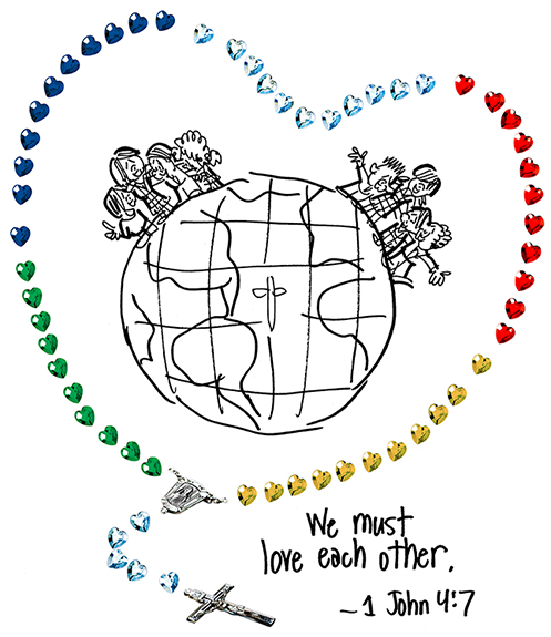
Next, I copied and pasted in the previously extracted bits of chain, using them to link
all the beads, the centerpiece and the crucifix. Yes, sometimes “creative” work becomes painstaking and somewhat laborious… : ) 
I found a nice globe image, but I didn’t like the 3-D effect with the land masses protruding above the globe’s “water edge.” I saw other problems as well. I decided to copy the globe and rebuild it. I used the Pen tool to simplify the land masses a bit more. I redrew the British Isles, since they looked completely wrong. I shrunk Greenland and modified the overall color scheme.
For the cross, I started with an image on Stock.XCHNG. I selected the white cross,
filled it with gold-yellow, and outlined it with a black stroke. I used the Line tool to
add additional inside lines, and a second darker yellow to give the cross some depth.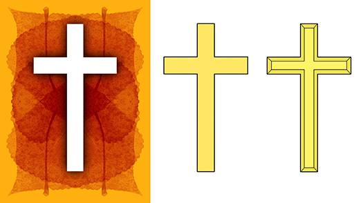
I used the Circular Gradient tool to apply more white and boost the reflected light on the globe. Then I merged the cross onto the globe, and pasted it into the main rosary image.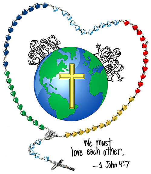
I did the two sets of kids separately, doing the line drawings by hand, then adding
the color in Photoshop. I lifted the plaids from photos (coats, dresses), then pasted
them in on separate layers to create the girls’ school uniforms.
Then I pasted the kids into the main image. 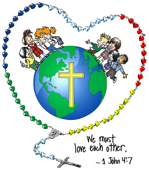
Final steps: Use the Text tool to enter the text. Add a soft stroke of blue beneath
the white (clear) rosary beads to make them more visible. Add a drop shadow to the globe to give it some depth. (I used a simple brushstroke.) Use the Hue/Saturation
color adjustment tool to change the yellow rosary beads to a less garish “orange-gold.” (This also prevents their printing with a greenish tinge.) Here’s the final again.


Absolutely brilliant! I must try something like this. Keep up the tutorial posts please.
LikeLike
Thanks, Ann. Glad you’re finding the posts helpful, and I appreciate your emphatic support! : )
LikeLike
I loved the walkthrough. I’m photoshop-useless but it’s still interesting to see the thought that goes into these works that often look so effortless. Well done on redrawing the UK/GB. Not that we dislike the Irish, but we’d be bloody irritated if they crashed their island onto the mainland (which is what it looks like in the original).
LikeLike
Always happy to perform a little cartographic surgery. I frown on island crashing, though I’m willing to make an exception for Robinson Crusoe… : ) Many thanks for the kind words, sir!
LikeLike