My, What Big Sand Traps You Have, Grandma: Mason Rudolph Tribute
A tribute to Mason Rudolph, one of the most consistent golfers on the PGA Tour during the 60s and early 70s. Here’s the final. Scroll down to see the step-by-step sequence.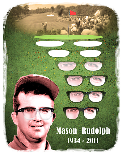
I started with a moody red pattern with noirish overtones. I’d recently read that if
you’re working in Photoshop, it doesn’t really matter what color you start with– you
can always change it easily later on using Photoshop’s adjustment tools.
And I’d just seen a Photoshop tutorial where clouds were used to great effect. I decided to add some using Filter>Render>Clouds: 
I needed a golf green, and found this photo by Swedish photographer Per Pettersson on Stock.XCHNG. 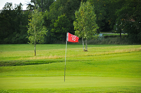
I had previously colorized and enhanced an old B&W photo of Mason Rudolph, and you can see how it was done in this earlier post. Here’s the before and after:
I used the Elliptical Marquee tool and the Pen tool to select out the green and flag. I lightened the green using a Hue/Saturation adjustment, and cloned out the “18” on the flag. Then I pasted the green and the enhanced photo of Mason Rudolph into my main document.
I also pasted in a pair of thick-framed glasses which I’d previously isolated as seen
in the earlier post. I copied the “whites” of the glasses, pasted them onto a new layer, and used the Transform tools to change them into a pair of sand traps.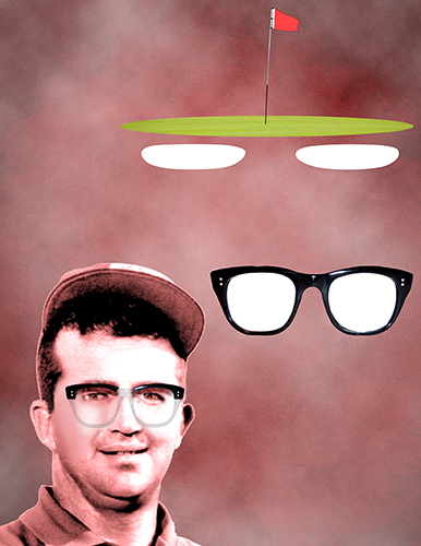
The “gimmick” here was to have the sand traps morph down into Mason’s glasses. I copied the original pair of glasses and pasted them onto new layers. I used the Free Transform tool to stretch them out, tweaking them as needed until the morphing progression looked right. I copied Mason’s eyes and began layering them beneath the glasses.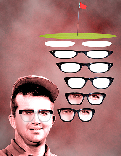
I thought the morphing effect would look more convincing if it emerged gradually.
I merged each set of eyes and glasses, and adjusted the opacity of the layers.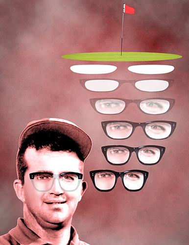
Clearly I needed to change the background– it looked terrible. I deleted the clouds,
and applied a Hue/Saturation adjustment to transform my original pattern from
red to green. I lightened it a little with a Curves adjustment. I decided to add some extra texture in the form of sidewalk concrete:
I pasted the concrete above what was now the green pattern, and set the blending mode of the concrete layer to Multiply to allow the green pattern to show through. I used a layer mask to reduce the concrete’s visibility in certain areas of the main document. Here’s how it looked in the Layers window: 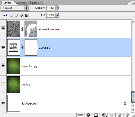
And here’s the combined effect: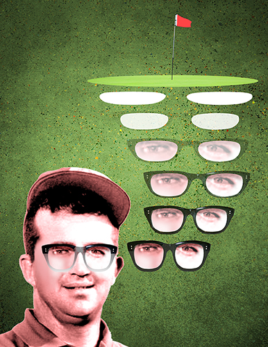
I found an old B&W photo showing some PGA tournament action circa 1965. 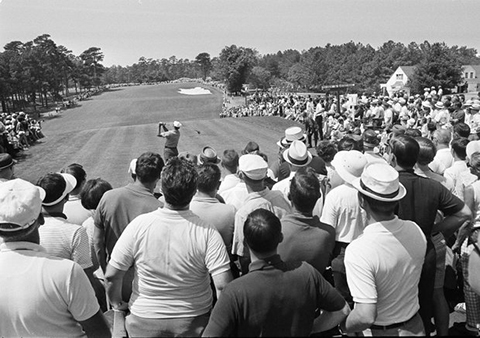
I applied a Gaussian Blur (2 pixels), added a bit of Film Grain, and applied a Photo Filter to give it a sepia tint. I pasted it into the main document, and used a layer mask to hide unwanted parts of the photo. The Layers window looked like this: 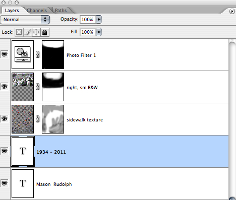
I also added my text at this point. Here’s the result in the main image: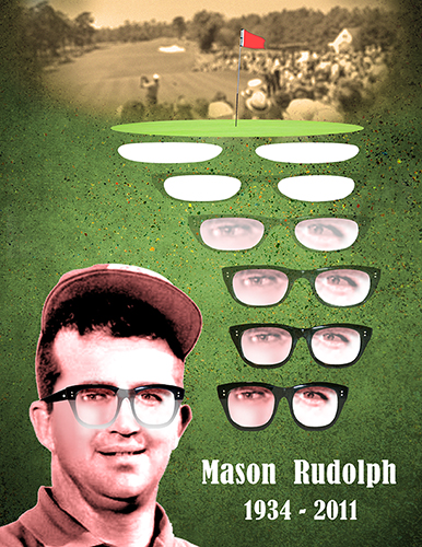
I noticed the bottom half of Mason’s glasses (the ones he’s actually wearing) looked grimy rather than translucent. I selected that part of the glasses and created a Gradient adjustment layer: color White, low opacity, applied bottom to top.
I accessed the Layer Style window and added a small drop shadow and bevel and emboss to help define the lower part of the glasses.
Finally I used the Eraser tool with a goofy, streaky brush to take the hard edges off the image border, and give it a little grungy character. Kinda looks like duct tape residue– a happy accident. Here’s the final result, all feedback welcome. 


Interesting what can be done to alter images with a computer! Although there are a lot of steps, can you imagine trying to achieve this with paper and glue!
LikeLike
I did try it with paper and glue– I’m still cleaning up here!! Just kidding… always appreciate your stopping by, Margie– thanks! : )
LikeLike