Once Upon A Time At Westminster Cathedral
A parody of Italian westerns. Just a funny idea I had. The title comes from Sergio Leone’s Once Upon A Time In The West. Westminster Cathedral in London
is where Prince William and Kate Middleton got married.
I’ve always wanted to do a movie poster. This was my chance. I was also looking for a project that would allow me to experiment with tricks and techniques learned by working my way through brilliant Photoshop tutorials written by Tom Ross and Nikola Lazarevic. They are masters of retro design.
I won’t pretend that this post is a tutorial. I experimented freely, worked out many of the details as I went along, and didn’t keep track of every step. However, I’ve included shots of the project at various stages, along with some comments. Scroll down to see the rough construction sequence.
Here’s the final:
I began with a solid base color, then added some texture (“Old Paper,” duplicate layers with Blend Modes set to Multiply and Soft Light, respectively). I pasted in some photos of the Royal Wedding, and used layer masks to blend them together.
I used Photoshop’s Pen tool to clip the gunslingers out of various movie stills. Here’s
what they looked like originally.
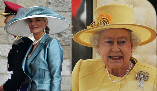
It was easy to find photos of all the famous wedding hats. Here are two examples. 
I used the Pen tool for the “hat surgery,” clipping away the cowboy hats, and extracting the wedding hats. I made the wedding hats fit their new owners with the help of the Liquify and Clone tools.
I pasted in the gunslingers on separate layers, again using layer masks to blend them together. I added my text, and darkened the poster borders. Using a soft brush at low opacity, I added some White on a separate layer, and set the Blend Mode to Overlay
to brighten the image a bit.

I created a new layer, and brushed in some brown (sampled from Clint Eastwood’s blanket) to help the white text stand out. I reduced the opacity of the layer to 85% to blend in the gunslingers underneath.
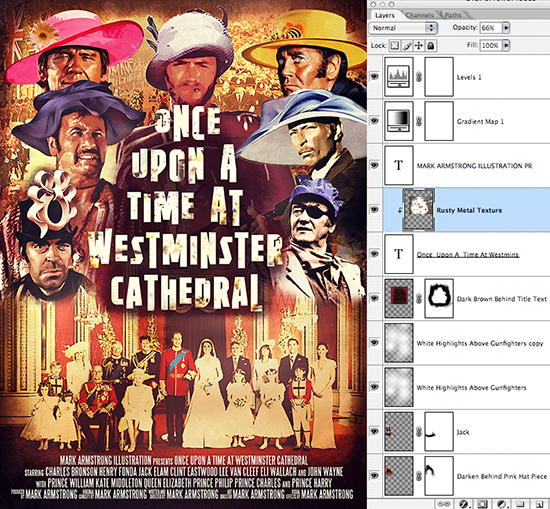
I pasted in a Rust texture and clipped it to my Text layer to gave the latter some grit.
I used the Dodge and Burn tools (on the Rust layer) to adjust the overall effect and restrict the grit to certain spots on the text.
I increased the Canvas Size, adding a little extra space at the bottom for the “movie credits.” 
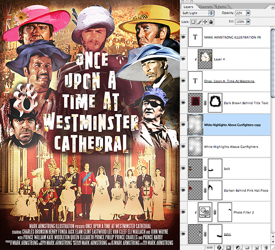
The original Lee Van Cleef and John Wayne photos were B&W. I added Photo Filter adjustment layers to give them both some color.
I duplicated my “brightening layer,” and set Blend Mode to Soft Light, Opacity = 22%,
to further lighten the image.
I added my movie credits at the bottom using the wonderful SteelTongs font.
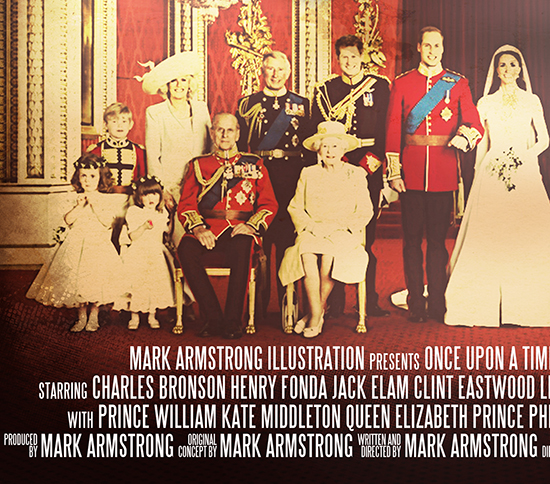
Here’s a closeup of the credits. Who’s this Armstrong guy?? He must be a genius… : )
I used the Burn tool to darken the gritty spots on the title text. The image looked a little hazy, so I added a couple of adjustment layers on top of all the other layers to brighten
the colors.
Finally, I grouped all the existing layers together, increased the Canvas Size by a quarter-inch on all sides, and added a border. I simply followed the steps outlined by Nikola Lazarevic in his superb tutorial, How To Make A Retro Space Themed Poster
in Photoshop.
Here’s the final again. Grab some popcorn and I’ll see you at the movies!


Aaaagh! This has me scuh-reeeaming with laughter!
LikeLike
Now that is what I call very gratifying feedback!! Thanks so much, Mia– glad you enjoyed it, and I sincerely appreciate your support!
LikeLike
hahahahahaahahahahahaha…that’s really funny! It made my day, LMAO!
LikeLike
You have a delightful laugh– I’m glad I had the sound turned up on my computer!! : )
Glad you enjoyed the fashion show, and thanks for joining us here at Cowboy Hats R Us!
LikeLike
woah! thoroughly enjoyed this one. pretty darn cool n funny 🙂
LikeLike
Ha!– many thanks, very glad you enjoyed it. No bad they didn’t wear those hats in some of the movies– I think it woulda helped!! Thanks a lot for stopping by. : )
LikeLike