How To Improve Your Facebook Ad Images And Why It Matters
I got the idea for this post after reading Will Mitchell’s 8 Questions Successful People Ask Themselves—That You Should, Too.![]()
One of those questions was: What Easy Thing Are You Doing Too Much?
i.e., What are you doing just because it’s easy, when you should be working on something more productive?
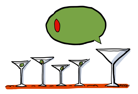
It conjured up a martini calling for an olive: boring, safe, and utterly predictable.![]()
![]() In my case, I spend too much time on social media. I tell myself I do it to stay visible, but I know I also do it because it’s easy: easy to share something on LinkedIn, send out tweets, post something to my Facebook Page.
In my case, I spend too much time on social media. I tell myself I do it to stay visible, but I know I also do it because it’s easy: easy to share something on LinkedIn, send out tweets, post something to my Facebook Page.
What I should be doing more of is researching and prospecting for clients.![]()
Speaking of Facebook: brands have seen huge declines in organic reach in recent years. Organic reach is how many people you can reach for free on Facebook just by posting to your page (as opposed to paying Facebook, i.e., buying ads, to promote your posts).
Hubspot’s Sophia Bernazzani lists some ways to maximize your organic reach on FB, but concedes that it’s “likely only a matter of time before organic reach hits zero, so you might as well hone your paid strategy now…”![]()
Many brands have taken the hint. According to Maddy Osman of Sprout Social, “93% of marketers use Facebook advertising regularly, which translates to about 3 million businesses.” (Interestingly, 70% of those businesses are outside the U.S.)![]()
Are Facebook ads basically the same as other ads?
No.![]()
Copy Hacker’s Joanna Wiebe says that with Facebook, images matter more than copy. She cites a Consumer Acquisition study that found that images are responsible for some 75 to 90% of a Facebook ad’s performance.
She notes that with traditional print ads, the copy usually comes first– then the art. Not so with Facebook ads, where the image is the most important thing. ![]()
Do Facebook ads actually reflect this? Are the images unique, compelling, attractive?![]()
I had a chance to find out thanks to another HubSpot post written by Ms. Bernazzani: 13 of the Best Facebook Ad Examples That Actually Work (And Why). The post also covers Facebook ad best practices, and the associated formats and templates.![]()
13 ads with 13 images: 10 photos, 1 illustration, 1 video, 1 animated GIF.
I found some of the images rather bland– that’s just my opinion.![]()
I’m going to look at 4 of the photos here, and suggest alternatives and/or improvements.
Finally I’m going to contrast 3 of the photos with the 1 illustration, and compare their visual impact.![]()
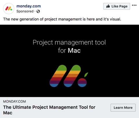
Here’s the first ad:![]()
![]()
![]()
![]() Critique: I’ve never liked white type on a black background. It’s difficult to read. And I jumped to the wrong conclusion: I thought I was looking at an ad for an Apple product. Not so. Monday makes a software product designed for Macintosh computers.
Critique: I’ve never liked white type on a black background. It’s difficult to read. And I jumped to the wrong conclusion: I thought I was looking at an ad for an Apple product. Not so. Monday makes a software product designed for Macintosh computers.
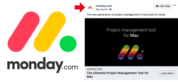
I’d never heard of Monday, and I’d never seen their logo. Here’s what it looks like:![]()
![]()
![]()
![]()
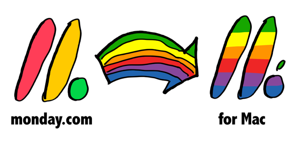
![]() My suggestion: use a white background to make the logo (and the company) stand out, and use an arrow to show it morphing to Mac colors. Adding monday.com and for Mac would help readers understand that it’s a Monday product designed for a Mac. Here’s a quick sketch of the idea:
My suggestion: use a white background to make the logo (and the company) stand out, and use an arrow to show it morphing to Mac colors. Adding monday.com and for Mac would help readers understand that it’s a Monday product designed for a Mac. Here’s a quick sketch of the idea:![]()
![]()
![]()
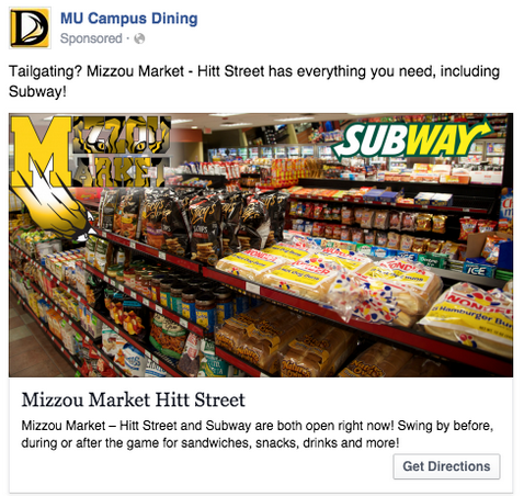
![]() Here’s another photo-based FB ad from HubSpot’s 13 Best FB Ad Examples:
Here’s another photo-based FB ad from HubSpot’s 13 Best FB Ad Examples:![]()
![]()
![]()
![]() Critique: the image is incredibly busy. Not really something you want to look at. You can hardly make out “Mizzou Market” in the upper-lefthand corner.
Critique: the image is incredibly busy. Not really something you want to look at. You can hardly make out “Mizzou Market” in the upper-lefthand corner.
My suggestion: use a photo, but restrict it to a single food item on a white background. Something “snack-ish.” Add a spot illo for entertainment value, and to show someone eating, sitting on a tailgate. A football provides context, and a plain backdrop to help the business names stand out. Like so:![]()
![]()
![]()
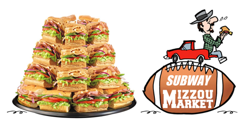
![]()
![]()
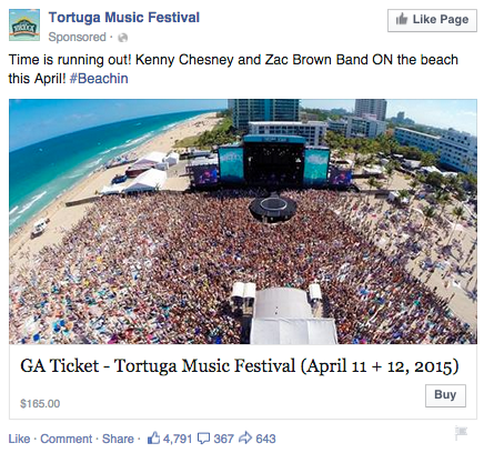
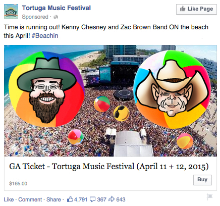
![]() A third photo-based FB ad from the same HubSpot post:
A third photo-based FB ad from the same HubSpot post:![]()
![]()
![]()
![]() Critique: it’s a very cool photo. I especially like the curved horizon– makes it look like the concert’s taking place at the end of the earth. But it misses an opportunity to show the two headliners, Zac Brown and Kenny Chesney. Showing their faces might be the extra “push” someone needs to shell out $165 for a ticket.
Critique: it’s a very cool photo. I especially like the curved horizon– makes it look like the concert’s taking place at the end of the earth. But it misses an opportunity to show the two headliners, Zac Brown and Kenny Chesney. Showing their faces might be the extra “push” someone needs to shell out $165 for a ticket.
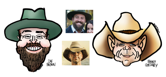
My suggestion: Add the two faces in a way that retains the energy and power of the photo. Caricatures would add a fun element, adding beach balls would help them blend in.![]()
![]()
![]()
![]()
![]()
![]()
![]() A fourth photo-based FB ad from the same HubSpot post:
A fourth photo-based FB ad from the same HubSpot post:![]()
![]()
![]()

![]() Critique: I admire the technological feat here: turning the Amazon logo into a neon sign. It’s a dark photo, however, with competing lines and elements. The most puzzling aspect: the ad is promoting a post about the odd things people buy on Amazon, but it’s passing up a chance to show one of those products– like that alarm clock that tracks your sleep patterns that’s mentioned in the text.
Critique: I admire the technological feat here: turning the Amazon logo into a neon sign. It’s a dark photo, however, with competing lines and elements. The most puzzling aspect: the ad is promoting a post about the odd things people buy on Amazon, but it’s passing up a chance to show one of those products– like that alarm clock that tracks your sleep patterns that’s mentioned in the text.
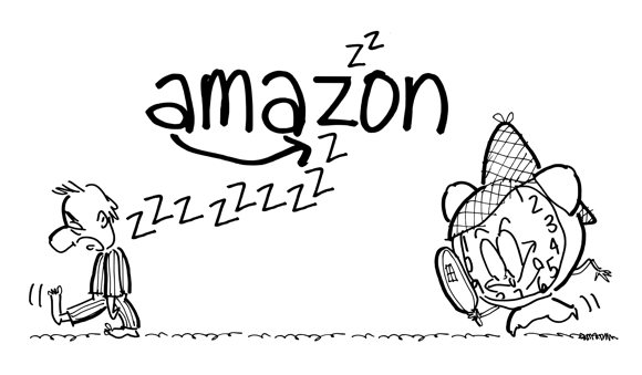
My suggestion: Have some fun with that to pique people’s interest. A cartoon illustration would be a great fit, and you could include the Amazon logo as well. Here’s a quick B&W sketch idea:
![]() As mentioned above, HubSpot’s 13 Best Facebook Ads included an ad that used an illustration. Here it is:
As mentioned above, HubSpot’s 13 Best Facebook Ads included an ad that used an illustration. Here it is:![]()
![]()
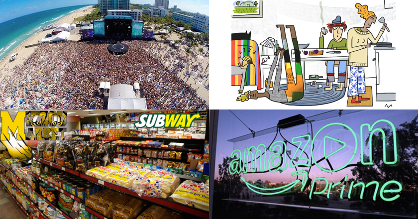
![]() Worth noting: it’s a custom illustration, done specifically for the story, which is aimed at Millennials. Bright colors, lots of white space. It’s a good example of how an illustration can grab your attention. It’s more eye-friendly than the photos.
Worth noting: it’s a custom illustration, done specifically for the story, which is aimed at Millennials. Bright colors, lots of white space. It’s a good example of how an illustration can grab your attention. It’s more eye-friendly than the photos.![]()
![]()
![]()
![]()
![]()
![]() Not all illustrations are good, not all photos are bad. They both have their place in marketing campaigns. You need to make wise choices if you want those campaigns to succeed.
Not all illustrations are good, not all photos are bad. They both have their place in marketing campaigns. You need to make wise choices if you want those campaigns to succeed.
![]() Summary:
Summary:![]()
1. What easy thing are you doing too much?– it’s a question worth pondering.
2. Images are responsible for some 75 to 90% of a Facebook ad’s performance. (source)
3. You can combine photos and illustrations to tap into the power of both.
4. An illustration with bright colors and white space is a powerful attention-getter.![]()
![]()
* * * * * * * * * * * * ![]()
![]() About Mark: I’m an illustrator specializing in humor, editorial, branding, social media, and content marketing. My images are different, like your brand needs to be.
About Mark: I’m an illustrator specializing in humor, editorial, branding, social media, and content marketing. My images are different, like your brand needs to be.
You can view my portfolio, and connect with me on Twitter, Facebook, and LinkedIn.
Questions? Send me an email.![]()
![]()


Thanks for the mention, Mark!
LikeLike
You’re very welcome, Maddy– thank you for being such an excellent resource! Cheers and all the best! 👍😊
LikeLike
I see what you mean by eye-friendly when you put all four together!
As for social media, I know what you mean by saying they are easy to spend time on. I didn’t think my Facebook page was doing anything beyond being an archive of things I might blog about – so I joined twitter. That sure is the ‘Now’ place for so many of the bloggers and writers I followed on Facebook or on media sites. A hot topic can appear, get explained, debunked or upheld and laid to rest, in a really short time. Fascinating.
LikeLike
Hi Margy, many thanks for your comment. It always amazes me how cluttered so many visuals are– not just photos, but illustrations and infographics, too. White space is crucial if you want your audience to focus on the key elements of a illustration. And customizing the image to fit the story makes sense, because it helps reinforce the point you’re trying to make.
I agree with you about Twitter: it’s my favorite social media platform. Perhaps it means I have a short attention span (!), but I think it ties back to my strong belief in brevity and white space. Most tweets are short and uncluttered. I see a lot of relevant links on Twitter, which has led me to some very helpful posts.
Always good to see you, thanks again!
LikeLike
I absolutely agree with the first add making me think of Apple. And I thought your alternative was much better!
LikeLike
This comment is music to my ears, my dear Malvika! => 🎶👂👂😊 Thank you!!
Your sudden dramatic appearance has put a big smile on my face. => 😃
Hope you are well, always a great honor to have you visit!! 👍😊
LikeLiked by 1 person
I don’t use FB nor Twitter. It’s just a personal choice, to keep my world less digitally cluttered with pressure to respond to others. For you, it’s different since part of it is a job tool.
LikeLike
Thanks, Jean– there’s a lot to be said for keeping one’s world free of digital clutter!! 😓💦
LikeLike
My niece uses Twitter and less so, FB as part of her overall marketing effort….for her romance novels that she writes. Sometimes I wish she would expand on the scope of her side topic tweets. Anyway…
LikeLike
Tell your niece to write one about a cyclist who finds love, thwarts a terrorist plot, solves an ancient riddle and finds a lost treasure, and rescues a cat from a tree, all while on a 2-week bicycle tour. I’m sure it would be a bestseller, and you could command a hefty fee as a consultant… 👍💰🚴😂
LikeLiked by 1 person
😀 Such imagination, Mark!
LikeLiked by 1 person
I completely agree with your critiques of those ads. Not a great assortment of photos there! A strong image on a white background, as you suggested, makes much more sense. Also, since it’s “Facebook,” not “Logobook,” adding more people to the ads would boost interest, as you did with the country music promo.
P.S. I also spend way too much time on social media!
LikeLike
Many thanks, Freddy, that means a lot coming from a marketing maven like yourself. Yes, it’s interesting how people and human faces make images more compelling and eye-friendly. I’m reminded of a guy who once showed me his vacation photos: page after page of mountains, lakes, sunsets. Not a single human being. The. Eyes. Glaze. Over… 😴
Another social media addict? We’ll form a club. Thanks so much for stopping by! 😊
LikeLike
Yes, yes, yes! 👏👏👏👏👏 So good! Your critiques and improvements are spot-on! And, as always, the message is clear. I think my fav is the Subway one. The original remnds me of one of those 5000 piece jigsaw puzzles meant to occupy a family for weeks. Waaaay to busy! You made it visually concise! (Just an FYI, not certain if you saw my tweet – I deleted my Twitter account. Thank you for the many times you retweeted & liked – I really appreciate it.😁)
LikeLike
Hi, RK! Many thanks for your lovely comment. I liked your jigsaw puzzle analogy. I’ve worked on a few of those behemoths– a great recipe for eyestrain and a splitting headache!! 😩💦
I’m a huge fan of white space– a crucial design element that seems to get no respect. I shall buckle on my armor and continue to campaign for it!! 💪
You’ve jumped ship from the S.S. Twitter?? I missed that and I’m very sorry to hear it. I enjoyed your tweets and thought you were enjoying the platform. A lot of tweets are highly partisan, of course, and all social sites have their trolls, but I have come across a lot of helpful info on Twitter. Ah, well. Anyway, never fear– I shall continue to promote your work whenever I can! Thanks as always for all your support!! 👍🏆😊
LikeLiked by 1 person