Giving The Supreme Court An Art Deco Makeover, And Why Sometimes A Little Blur Is A Good Thing
As mentioned in the previous post, I recently had to give the United States Supreme Court Building a makeover. Fortunately, this did not involve any scaffolding or heavy lifting, I could do it all in Photoshop… : )
So this post will be a little on the technical side, but I hope it will encourage you to experiment with your own image-editing software and try enhancing some of your own photos.
Let’s start with a Before and After comparison. That’s the original photo on the left, and the Photoshopped image on the right.
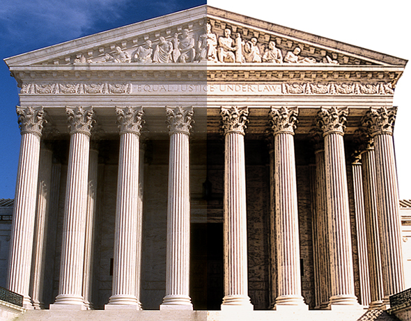
Here’s the original photo in its entirety. The sky looks oddly conflicted, and the building itself is dull and flat.
My first step was to use the Pen tool to select and delete the sky (I replaced it with a light, uniform blue later on). I used a simple Levels adjustment to brighten the entire building. It looks a lot better already.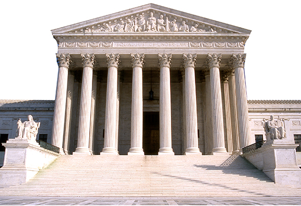
Before getting into the remaining steps, here’s the entire sequence, read from bottom to top, as seen in the Layers Window. In previous posts, I’ve included this window in each step, but I’ve had to reduce it down, making it hard to read. I think placing it here at full size will work better. Just scroll back up and check the Layers Window as needed, as we go through the steps below.
If you’re a Photoshop user, you know the Layers Window only displays the Blending Mode and the Opacity for the selected layer (the one you’re currently working in, which is highlighted in blue). You can see that the selected layer below has a blending mode of Overlay, and an opacity of 46%. I’ve noted the action taken, along with the blending mode and opacity settings for each of the layers in our sequence.
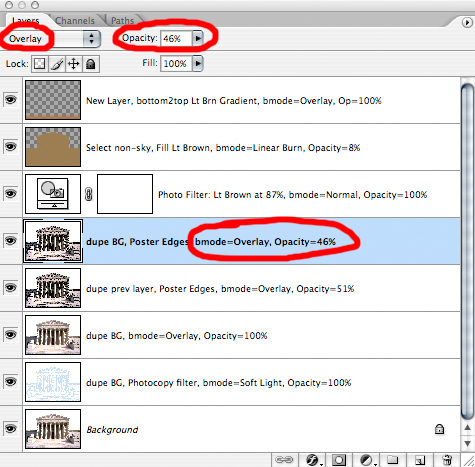
Second step: duplicate the background (starting) layer, apply Filter>Sketch>Photocopy, set the blending mode to Overlay, leave the opacity at 100%. This produces a lightening effect.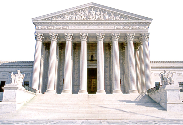
Third step: duplicate the background layer again and move the resulting copy above the layer we just applied the Photocopy filter to. Set the blending mode of this new layer to Overlay (i.e., change Normal, the default blending mode, to Overlay), leave the opacity at 100%. The result: a significant improvement in contrast.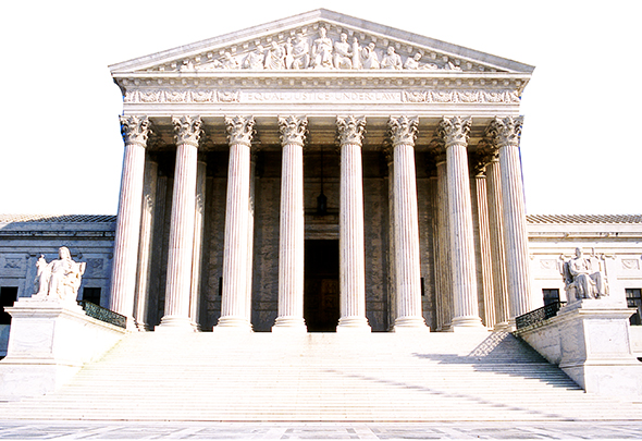
Fourth step: duplicate the 3rd layer (the one we just worked on), and apply the Poster Edges filter (Filter>Artistic>Poster Edges). Once again, set the blending mode to Overlay. The Poster Edges filter darkens the edges of an image, which gives it more of an illustrated look. In this instance, the combination of Poster Edges and Overlay darkened the image too much– so I reduced the opacity to 51%, stopping when things “looked right.”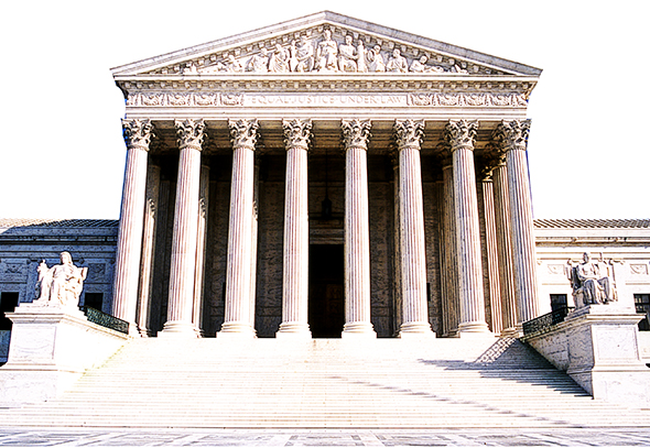
I should mention here that this whole process was guesswork. It was based on instinct and experience, true, but it was still guesswork. There’s no magic formula. I guessed a little bit on every step, and undid the things that didn’t work (and there are always plenty of things that don’t work, believe me).
Step 5: I played a hunch and duplicated my original background layer again, moved the new copy up to the top so it became the topmost layer, then applied the Poster Edges filter again. I set the blending mode to Overlay, and reduced the opacity, again stopping when things looked right (at opacity=46% this time). Result: a nice sharpening effect, especially for the sculpted figures.
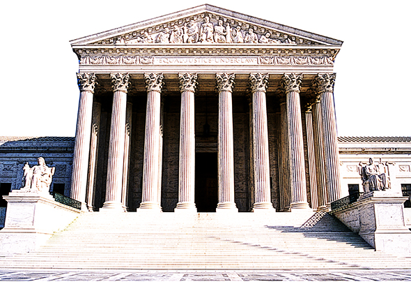
Sixth step: I applied a simple Photo Filter: a light brown to give the building and steps a warmer tone. Layer mode=Normal, opacity=100%.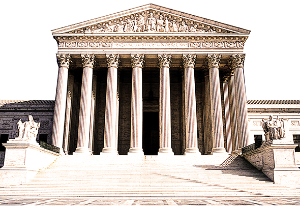
Step 7: Parts of the building and steps still seemed too pale to me. So I selected everything except the sky, filled the entire area with a warm brown, and experimented with layer modes. I finally opted for mode=Linear Burn, and reduced the opacity all the way down to 8%. The result is a slight darkening of building and steps, that’s felt more than it is seen.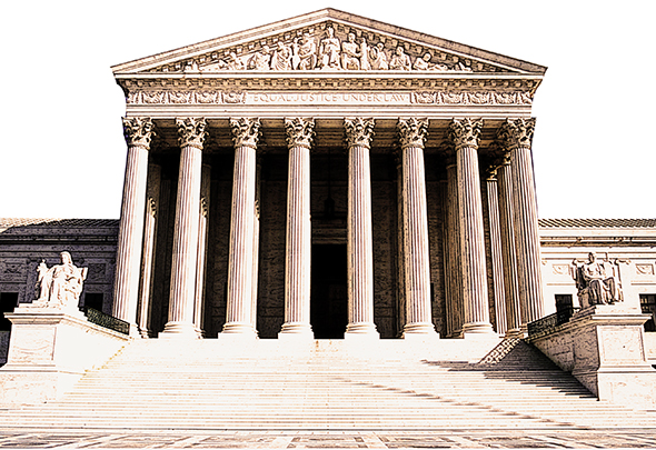
Finally (Step 8), the fussbudget in me decided the image needed a bit of extra color in the foreground. I used a color-to-transparent Linear Gradient, color=light brown, applied bottom to top. Layer mode=Overlay, opacity=100%. 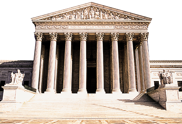
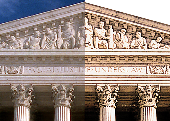
OK. Time to stop fussing and see what we’ve got. Here’s a Before and After compare of the sculpted figures at the top: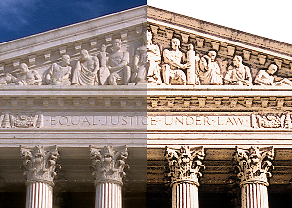
I did one last thing. Experience has taught me that adding a little blur can sometimes be helpful. The idea here was to give a photo an illustrated look. But filters and other post-processing techniques can leave edges that are a little too sharp. Softening them with a slight blur often enhances the hoped-for illustrated look.
Here’s the same detail compare after giving the right side image a 0.5 pixel Gaussian blur. Can you see a difference?
A larger compare, with no blurring applied to the right side image: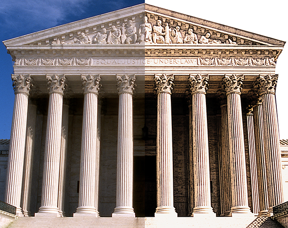
Same again, after applying a 1.2 pixel Gaussian blur to the right hand side. I think the blur is easier to pick up in this longer-range view.
What do you think? Do digital artists have it too easy nowadays? Did the blurring work to advantage? Hope you’ll leave a comment.
If you enjoyed this post, I invite you to subscribe. You can either leave a comment and click the box that says Notify me of new posts via email, or click on the Subscribe button below the Portfolio Thumbnails in the sidebar at the top right of this page.
Other Posts You Might Enjoy:
And For Her Birthday, Lola Wants… A Leg Lamp??
Once Upon A Time At Westminster Cathedral
How To Give An Image A Chrome Effect (Photoshop Tutorial)