I recently did a cover illustration for GottaGoGolf, an online golf magazine for women. The illustration was to support the feature article: it’s a great time to join a country club, or ask for extra perks if you’re already a member. Why? Clubs are hurting for members during these tough economic times, and they’re ready to deal.
It’s exciting to get a cover assignment, and I had visions of doing something elaborate. But I had to simplify the design considerably, for an unexpected reason– more on that below. Here’s the finished cover.
Click on the image below to view the issue. There are multiple viewing options. It’s a lovely magazine, well-written, first class production values. If you’re a woman golfer, it’s definitely worth a look. Subscription is free. (I’m not being compensated in any way to promote the magazine.)

One of my ideas was to have a woman golfer standing next to giant teed-up golf balls.
C.C. membership perks would be shown as logos on the balls, the “grass” would be paper money. Implied: look at all the extras your money can buy right now. Here’s
the rough sketch:

Or how about a country club so desperate for members, that it sets up a lemonade stand in the middle of a fairway? Buy a glass and get a membership at no extra charge…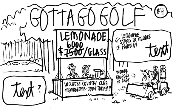
What about an enterprising membership recruiter who enlists gophers in his marketing efforts? They all pop up and tout membership benefits to the golfers playing through:
These ideas got some applause, but alas, they were unworkable. Why? GottaGoGolf is a digital-only magazine. It notifies subscribers electronically when a new issue is available. Many subscribers receive this message on their cell phones. They will view the magazine cover on their phone’s display screen. For the cover to be legible at all, the graphics have to be very simple.
I thought of magazines like Time and Reader’s Digest. Nowadays, their covers feature a single image with minimal detail. Are cell phones responsible for The Incredible Shrinking Magazine Cover Image? I haven’t actually read anything to that effect, but I suspect that may be the case. So the next time you’re asked to illustrate a magazine cover, be sure to ask if it has to legible when viewed on a cell phone.
I returned to the drawing board and developed some simpler concepts– like prospective members being in such a strong position as buyers, that they can make their local country club jump through hoops:

Or they can rub a magic lamp with paper money and conjure up a country club genii ready to grant their every wish:
Here’s the original sketch for the very obliging performing seal. His anatomy definitely needed some work! He also needed to assume a more vertical position so the text on his costume could be more easily read.
Here’s the final: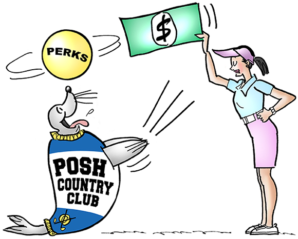
What do you think? Ever had a gopher try to talk you into joining a country club? Are cell phones “dumbing down” magazine covers? Hope you’ll leave a comment.
If you enjoyed this post, I invite you to subscribe. You can either leave a comment and click the box that says Notify me of new posts via email, or click on the Subscribe button below the Portfolio Thumbnails in the sidebar at the top right of this page.
Other Posts You Might Enjoy:
Why I Decided To Redesign My Blog’s About Page
Slideshow: Christmas Concert By The Manger Animal Band!
How To Add A Metallic Chrome Effect To A Photo