Roll Out The Guillotine: Time To Behead My Old Header
Yes, I was sick and tired of my old header. Time to give it the chop. Here’s the new one. Oh, that’s right, I guess you can see it up at the top… : )
I used bits and pieces of six different illustrations. I put them all on separate layers in Photoshop, then blended them together by painting on layer masks with low-opacity brushes. I added new text especially for the header.
I was pretty excited about using the business card to get my name up there. Here’s what the original looked like: an illustration for Inside Counsel Magazine about the career paths of new law school graduates. The card is a parody of the old Community Chest cards found in the famous board game, Monopoly.
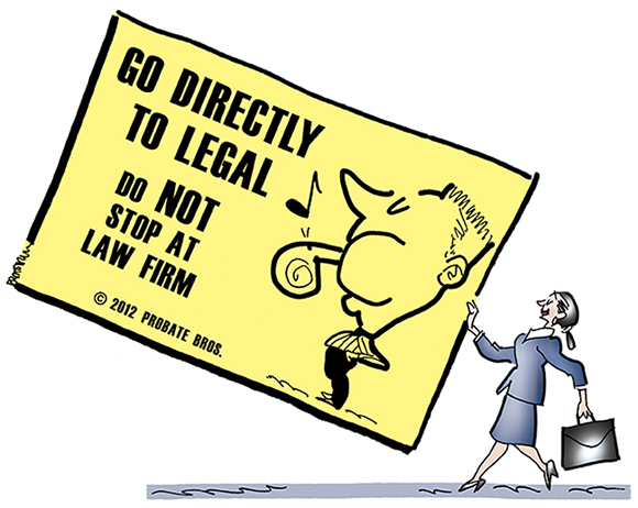
I decided that keeping the yellow would make the card harder to read, so I deleted it in favor of plain white, and added new text. I also deleted the strip of blue which grounded the original illustration. Now it looked like this:
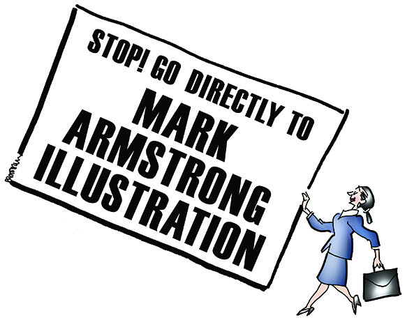
The actual header that you see at the top of this blog is quite small: 920 pixels wide by 180 pixels high. I was working on a much larger scale, but even so, the Card illustration was much taller than the header.
After pasting the Card into the header, I had to scale it down to make it fit. Since they’re connected, the woman holding the card was scaled down proportionately. The result was a serious visibility problem: the woman was much too small compared to the other images in the header. 
My first thought was to bang my head on the wall. Fortunately, my second thought was this is Photoshop– there’s always a workaround.
And it was fairly simple: go back to the original layered file, make a couple of copies, and reconstruct the card and the woman as two separate images. I’ve simulated the result below, showing the gap that now exists between them.
First I pasted in the card, and scaled it down just like I did before:
Then I pasted in the woman as a separate image. Here’s the result showing her at actual size: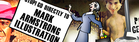
I just needed to reposition her so she wasn’t blocking Mr. Jobs and his vintage Apple:
Here’s the finished header again in its entirety:
What did it replace? Here’s my previous header. In retrospect, I’d say I tried to squeeze too much in. 
And here’s my original header when I first began blogging about two years ago. I still like it, but it conveyed a much more limited impression of what I can do. 
What do you think? Is the new header an improvement? Do headers create a crucial first impression of a blog? Have you ever changed your own header? Hope you’ll leave a comment.
If you enjoyed this post, I invite you to subscribe. You can either leave a comment and click the box that says Notify me of new posts via email, or click on the Subscribe button below the Portfolio Thumbnails in the sidebar at the top right of this page.
Other Posts You Might Enjoy:
Where The Steve Jobs Image In The New Header Comes From
Where The Charles Bronson Image In The New Header Comes From
How The Previous Header Was Constructed Using Photoshop Layers And Layer Masks