Roll Out The Guillotine: Time To Behead My Old Header
Yes, I was sick and tired of my old header. Time to give it the chop. Here’s the new one. Oh, that’s right, I guess you can see it up at the top… : )
I used bits and pieces of six different illustrations. I put them all on separate layers in Photoshop, then blended them together by painting on layer masks with low-opacity brushes. I added new text especially for the header.
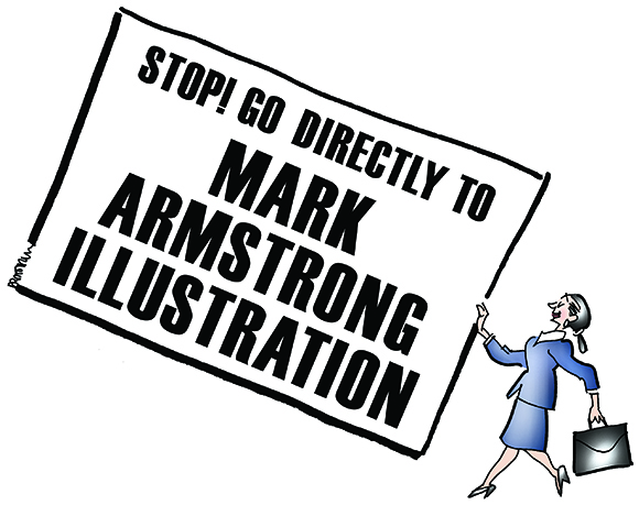
I was pretty excited about using the business card to get my name up there. Here’s what the original looked like: an illustration for Inside Counsel Magazine about the career paths of new law school graduates. The card is a parody of the old Community Chest cards found in the famous board game, Monopoly.
I decided that keeping the yellow would make the card harder to read, so I deleted it in favor of plain white, and added new text. I also deleted the strip of blue which grounded the original illustration. Now it looked like this:

The actual header that you see at the top of this blog is quite small: 920 pixels wide by 180 pixels high. I was working on a much larger scale, but even so, the Card illustration was much taller than the header.
After pasting the Card into the header, I had to scale it down to make it fit. Since they’re connected, the woman holding the card was scaled down proportionately. The result was a serious visibility problem: the woman was much too small compared to the other images in the header. 
My first thought was to bang my head on the wall. Fortunately, my second thought was this is Photoshop– there’s always a workaround.
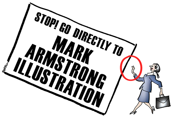
And it was fairly simple: go back to the original layered file, make a couple of copies, and reconstruct the card and the woman as two separate images. I’ve simulated the result below, showing the gap that now exists between them.
First I pasted in the card, and scaled it down just like I did before:
Then I pasted in the woman as a separate image. Here’s the result showing her at actual size:
I just needed to reposition her so she wasn’t blocking Mr. Jobs and his vintage Apple:
Here’s the finished header again in its entirety: 
What did it replace? Here’s my previous header. In retrospect, I’d say I tried to squeeze too much in. 
And here’s my original header when I first began blogging about two years ago. I still like it, but it conveyed a much more limited impression of what I can do. 
What do you think? Is the new header an improvement? Do headers create a crucial first impression of a blog? Have you ever changed your own header? Hope you’ll leave a comment.![]()
If you enjoyed this post, I invite you to subscribe. You can either leave a comment and click the box that says Notify me of new posts via email, or click on the Subscribe button below the Portfolio Thumbnails in the sidebar at the top right of this page.![]()
Other Posts You Might Enjoy:
Where The Steve Jobs Image In The New Header Comes From
Where The Charles Bronson Image In The New Header Comes From
How The Previous Header Was Constructed Using Photoshop Layers And Layer Masks


Creative!
LikeLike
Ah– I’m a sucker for praise from a Literary Lollipop! : )
Many thanks for your emphatic comment and for stopping by!
LikeLike
The header is crucial and it’s a perfect indication of how creative and talented you are! That’s cool how you took non-artists like myself, through your thought process of placing all the different pieces into a cohesive banner!
LikeLike
“… a perfect indication of how creative and talented you are!”
Hm… nope, nope, nope, there’s just no way I can improve on that expert analysis… : )
Thank you, dear Tracey, you’re too kind as always. I must dispute your characterization of yourself as a non-artist, however. You have the supreme gift of knowing what needs to be said and done to bring beauty and harmony to the world. And that’s just another way of describing an Artist.
LikeLike
A creative genius, expert, and a gentlemen. The more I get to know you Mark the more impressed and thankful I am. And that’s a real tribute to you:-)
LikeLike
That’s about the nicest compliment I’ve ever received. My sincere thanks, Tracey.
LikeLike
As a Canadian, I like the beaver header the best! The beaver and the chewed pencils are wonderful!
LikeLike
The Beaver gets a vote– awright!! I must admit he’s been an excellent pencil sharpener over the years, even though he refuses to vacuum up the chips. You’ve got us both showing our toothy grins here, and we thank you for, um, pelting us with that kind comment! : )
LikeLike
Me too! It’s my first choice for sure – ya know?
LikeLike
Your new header is more representative and colorful. It shows your incredible works and ability while at the same time shows your great sense of humor!
Excellent! I love it! 🙂
LikeLike
Blush, blush!! Is it hot in here, or is it me?? Oh, I see, my cheeks are on fire to hear such praise. Good thing I’m a strong man– I can take it!! : )
Thank you so much, Inge. Very glad to know you think it’s an improvement, that means a lot– as do your kind words and loyal support. Thanks again! : )
LikeLike
I noticed your new header as soon as I saw this page. My first thought was “Hey, Mark changed his header — it’s awesome!”
And indeed it is. I do agree with you about your previous header. Although I did like it, I remember looking at it with great inspection to see what was there. The new header still fluently shows what you do and your particular style =]
I like the strap-lines for both the old and new headers. A definite positive attitude ^-^
LikeLike
Ah, dear Fox, you certainly know how to make a Yank smile– thank you!
I trust your artist’s eye, and must agree: the previous header was definitely over-dense. The temptation to squeeze in more “stuff” must always be resisted– in illustrations, portfolios, gnome lawn decorations, whatever. Less is more!! (unless we’re talking chocolate or possibly Sailor Moon merchandise… : )
Thanks as ever for your kind support!
LikeLike
Ooooh, nice header Mark!! Lots of tasty morsels of your talents laid bare for all to enjoy. In fact I would go so far as saying you are on fire Mr Strong Arm!
Aptly enough I now invite you to bask in the flame of glory which is the Blog On Fire award, an accolade you most certainly deserve because you are brilliantly talented and not least because you make me almost wet myself with laughter on the Tube!
Please don’t feel any pressure to accept (we wouldn’t want you to explode afterall) I will still think you’re great, but if you do follow the link to find the treasure:
Enjoy!
Tan 🙂
LikeLike
Me?? On fire?? Nonsense! Why that hasn’t happened since someone bet me tuppence that I couldn’t eat a whole chicken while it was still on the barbecue grill… : (
Well, thank you, Tan, I accept with a profound lack of humility– and it’s certainly a lucky thing I happen to be wearing asbestos underwear today… : )
Sincere thanks for all your lovely comments and support.
Can’t say I’ve ever been a hit on YouTube, but it’s gratifying to know that I’ve come close to, er, making a splash on TheTube… : )
LikeLike
Dam good work … in fact, pure genius!
LikeLike
The beaver’s blushing, I’m blushing, now we’re dancing around making weird happiness sounds– thank you for that outrageously kind comment!! : )
LikeLike
Your new header is creative in terms of mixed media. Fun too.
But I think the talent of a real illustrator shows it in …pure drawing illustration. Yea, I’m a purist, in this age of photoshopping. Ok, maybe I should go somewhere and look for glaciers, considering the fact they are melting more quickly than we want.
LikeLike
I hear you, Jean. When I look at the work of people like Howard Pyle, Hal Foster, Alex Raymond, and so many others, and see what they did in the days before Photoshop, working entirely by hand on paper or canvas, well, my mind just boggles. That is, indeed, true artistry. They leave guys like me in the dust. Hey, it’s an honor just to be in their dust!!
Glaciers? We gotta bring ’em back– like print and nickel candy bars!! : )
LikeLike
When I first discovered you,I said to myself — now here’s a guy who will soon be in possession of a tuppence and next thing I know, you’ve got enough tuppences to place a bet! I’m just proud of myself and of you.
New banner–striking! And just right. Love the new picture of you in the hat! Love the backwards s in genius and a naked Jobs is a good call in any situation!
LikeLike
And I’m very proud of you for being proud of me! : P
Yes, that’s me up in the corner doing my famous Charles Bronson impression. It’s brilliant, but unfortunately, people see the hat with the flower and right away they know it’s me. And you picked up the symbolism– yes, I am a backwards genius. Steve Jobs… so it is! I didn’t recognize him without his blue jeans… : )
Thanks for your support, you wisenheimer, you!
LikeLike
Hello Mark, how’s my great boss doing… You really are so creative…but hey because of that your blog is on fire now and you are one of my top recent commenters, so please accept my humble token of appreciation for nominating you with these awards: http://allaboutlemon.com/2012/03/22/blog-on-fire-awardtop-recent-commenter-twice-and-i-am-it-again/
Congratulations!
Dolly xoxo
LikeLike
Alas! After seeing your latest Toothsome cartoons, I’m resigning as your boss. I’m not worthy. Your genius is too great. I shall become your humble assistant, carrying your digital toothbrushes and drills, and bringing you any leftover coffee after drinking most of it myself… : P
Thank you for my latest awards. I really can’t think of anyone who deserves them more than me. It means adding more display toilets, but it must be done.
I shall stop by the Lemons R Us Dental Clinic just as soon as I can charter a helicopter and pack a sandwich.
Again, my humble thanks. : )
LikeLike
Hi Mark,
I enjoyed the post and the clever way you shared your creation of a new header is a great little tutorial. The new header is hmmmm interesting but I’m a Canuck and the beaver header is my first choice vote — tails down! 😉
LikeLike
Ha! You and Margie are giving me gnawing doubts about my new header!! Viva La Beav!! : )
Tell you what: I’ve made a note to get the beaver back up there on July 1st– and we all know what that is, eh??
Loved the tails down bit– now that’s an emphatic vote– SLAP!! : )
LikeLike