Case Study: Theater Logo: The Prince & The Pauper
![]()
![]() One of my favorite clients is Children’s Stage Adventures run by Rob and Lorrie Gray. They’re based here in New Hampshire, and they travel throughout New England and Eastern Canada conducting one-week theater residencies. They coordinate with local schools, community groups, and summer camps.
One of my favorite clients is Children’s Stage Adventures run by Rob and Lorrie Gray. They’re based here in New Hampshire, and they travel throughout New England and Eastern Canada conducting one-week theater residencies. They coordinate with local schools, community groups, and summer camps.![]()
In short, they give kids a taste of theater, and a chance to perform in a real live show. They’ve been making kids and parents happy for 20 years now, and it’s a pleasure to be associated with them.![]()
They’ve asked me to create “logos” for a number of their shows. They use the term “logo” to mean: a single illustration that summarizes the story; one they can use on their website, on posters, for newspaper ads, and on merchandise (souvenir tee-shirts).![]()
They asked me to create a logo for their latest production: an adaptation of Mark Twain‘s famous The Prince And The Pauper. There were quite a few steps involved, and I thought it would make a fun and informative case study.![]()
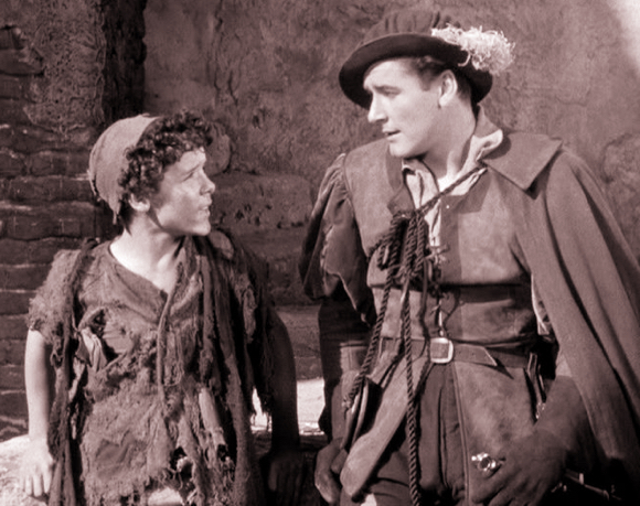
Theater means costumes. They’re a big part of creating the right look for a show. So I started by doing some online searches.![]()
I found some great stills from the 1937 Errol Flynn movie version.![]()
![]()
![]()
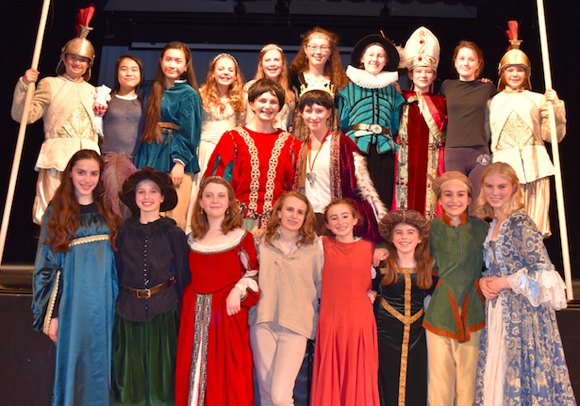
![]() I was also lucky enough to find some cast photos from other kids productions of the story.
I was also lucky enough to find some cast photos from other kids productions of the story.![]()
![]()
![]()
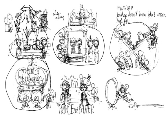
![]() Next comes the thinking part (ouch!) and the messy part: coming up with ideas and making little thumbnail sketches on scrap paper with a ball-point pen.
Next comes the thinking part (ouch!) and the messy part: coming up with ideas and making little thumbnail sketches on scrap paper with a ball-point pen.![]()
![]()
![]()
![]() I try to give clients 3 or 4 ideas to start with and react to. They can then ask for changes, mix and match ideas, suggest something else entirely, whatever they want.
I try to give clients 3 or 4 ideas to start with and react to. They can then ask for changes, mix and match ideas, suggest something else entirely, whatever they want.![]()
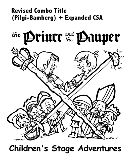
I knew from past experience that the logo needed to include the title, with “Children’s Stage Adventures” underneath.![]()
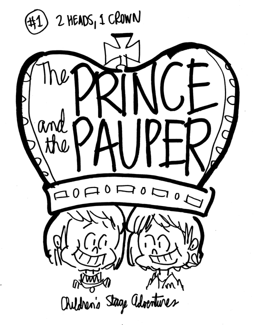
One idea: two heads wearing a single crown.![]()
![]()
![]()
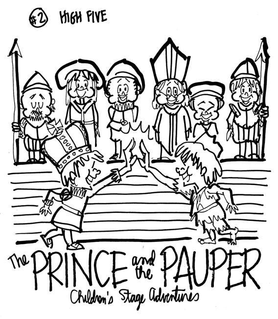
![]() The prince and the pauper giving each other a high-five, while various English court-related characters look on.
The prince and the pauper giving each other a high-five, while various English court-related characters look on.![]()
![]()
![]()
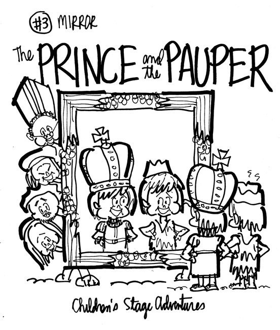
![]() The two main characters studying their identical appearance in a mirror (which I stole from one of the 1937 movie stills), with the other characters peeking out from behind it.
The two main characters studying their identical appearance in a mirror (which I stole from one of the 1937 movie stills), with the other characters peeking out from behind it.![]()
![]()
![]()
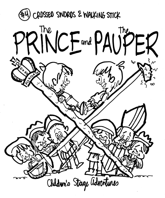
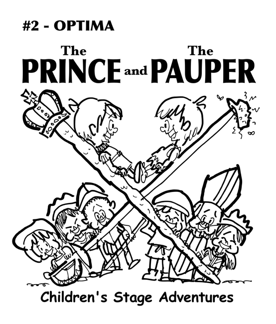
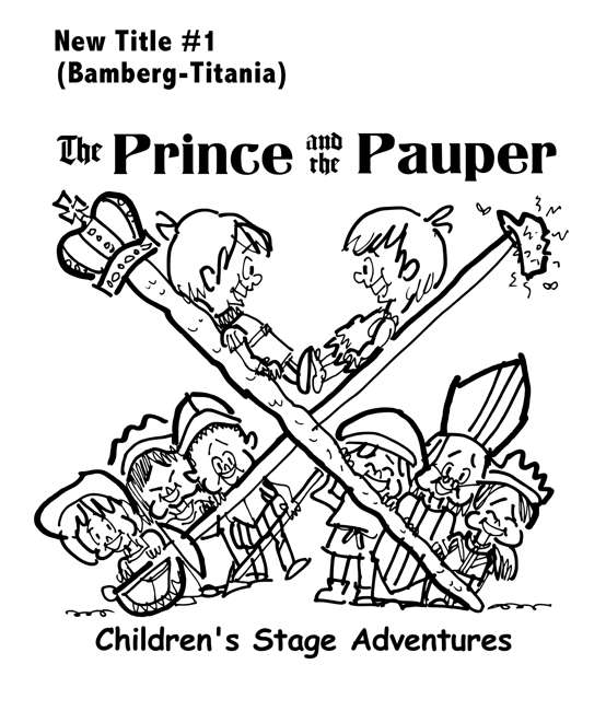
![]() The main characters propped up on a crossed sword and walking stick, with the other characters grouped below.
The main characters propped up on a crossed sword and walking stick, with the other characters grouped below.![]()
![]()
![]()
![]() Rob and Lorrie liked #4.
Rob and Lorrie liked #4.![]()
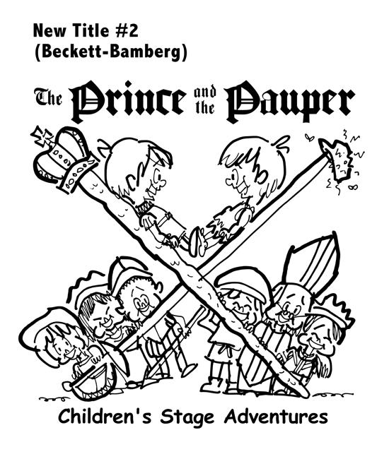
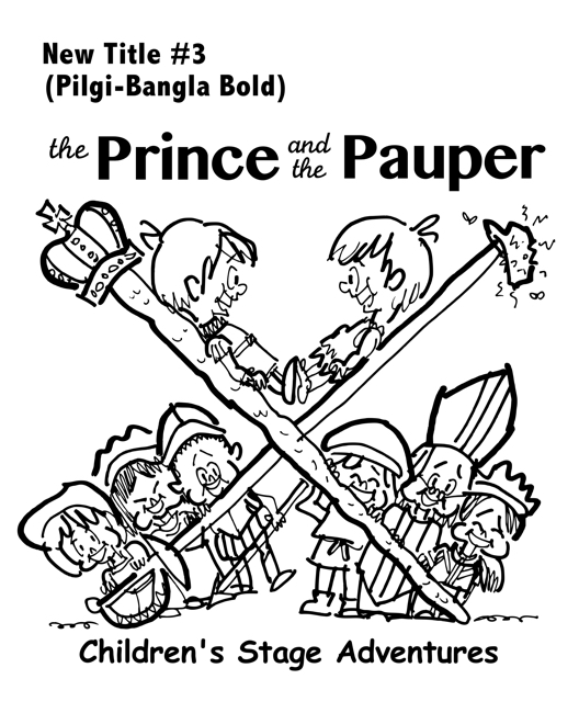
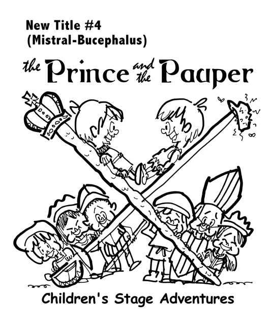
The next step was trying out various fonts for the title.
(No need to experiment with fonts for “Children’s Stage Adventures,” which has always been Comic Sans MS Bold.)![]()
![]() Something a bit plainer.
Something a bit plainer.![]()
![]() A bit fancier again.
A bit fancier again.![]()
![]() Bolder, easier to read, perhaps.
Bolder, easier to read, perhaps.![]()
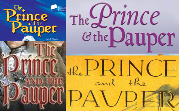
![]() Rob sent me feedback in the form of several images he’d pulled off the internet. He wanted typefaces more along these lines:
Rob sent me feedback in the form of several images he’d pulled off the internet. He wanted typefaces more along these lines:![]()
![]()
![]()
![]()
![]()
![]() I went through my collection of fonts and put together different combinations.
I went through my collection of fonts and put together different combinations.![]()
![]()
![]() I thought this one had a King Arthur vibe.
I thought this one had a King Arthur vibe.![]()
![]() This one is a little easier on the eyes.
This one is a little easier on the eyes.![]()
![]() Script combined with a semi-courtly font.
Script combined with a semi-courtly font.![]()
![]() Rob and Lorrie decided on a combo that pulled from
Rob and Lorrie decided on a combo that pulled from
two of the above ideas, and asked that “Children’s Stage Adventures” span the width of the drawing.![]()
![]()
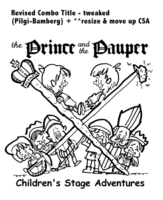
![]() On further reflection, we condensed “Children’s Stage Adventures” slightly, and moved it up closer to the drawing.
On further reflection, we condensed “Children’s Stage Adventures” slightly, and moved it up closer to the drawing.![]()
![]()
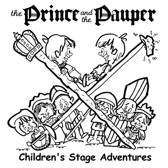
![]() Having finalized the type and text placement, it was time to refine the drawing.
Having finalized the type and text placement, it was time to refine the drawing.![]()
Years ago, I used to do finals from scratch. And they always lost something. They’d look stiff, forced. And I’d be frustrated.![]()
I finally figured out that my roughs (which tend to be fairly complete) had a certain energy, a spontaneity, because I do them quickly without worrying about every last detail. I lose that energy (and the art is poorer for it) when I try to recreate the rough from scratch.![]()
What I do now (in most cases) is clean up the rough: I correct mistakes, redraw certain things, and try to retain as much energy and spontaneity as I can.![]()
And that’s what I did here. If you study the drawing below, you’ll see that stray lines have been erased, the crown is different, the pauper’s cap is larger (more proportionate to his head), I redrew the pauper’s foot, the lines on the bishop’s mitre are more evenly spaced, the street urchin to the bishop’s right is hoisting himself up with his feet slightly off the ground, etc.![]()
![]()
![]()
![]() Which brings us to the funniest part of the assignment.
Which brings us to the funniest part of the assignment.![]()
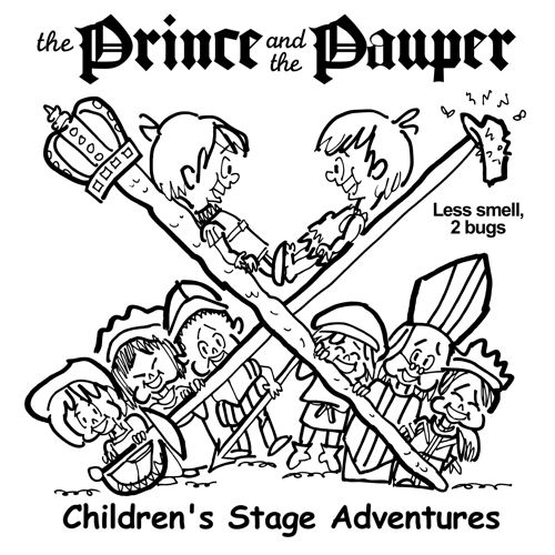
You may have noticed the pauper’s cap was rather smelly, with a couple of flies buzzing around it.![]()
Rob and Lorrie weren’t sure they wanted that much “realism.” They asked to see the cap “with no smell and
bugs, and one with fewer,” so they could do a compare.![]()
Which led to this amusing series of roughs:![]()
![]()
![]()

![]()
![]() One bug:
One bug:![]()
![]()

![]()
![]() Two bugs:
Two bugs:![]()
![]()
![]()
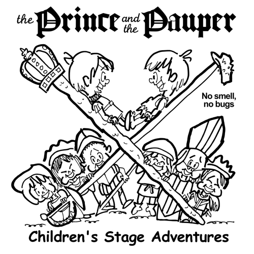
![]() And no smell, no bugs– which proved to be the winner:
And no smell, no bugs– which proved to be the winner:![]()
![]()
![]()
![]() There was one final tweak.
There was one final tweak.![]()
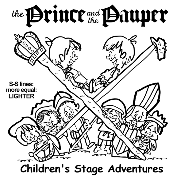
If you look closely at the sword and stick lines in the above drawing, you’ll see that they have contrasting weights: a heavier line, and a thinner line. Rob asked to see them with equal weights.![]()
Here’s the thinner version:![]()
![]()
![]()
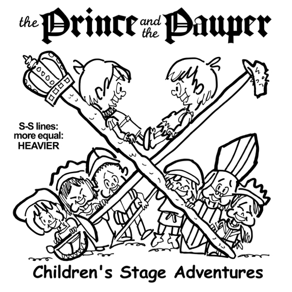
![]() And the thicker version:
And the thicker version:![]()
![]()
![]()
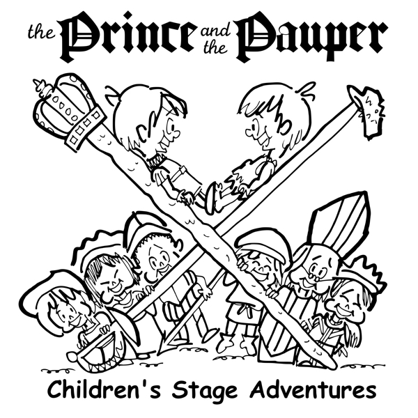
![]() Rob and Lorrie opted for lighter, equal weights. The experiment allowed me to correct something I’d missed:
Rob and Lorrie opted for lighter, equal weights. The experiment allowed me to correct something I’d missed:
the pauper’s arm was uneven.![]()
![]()
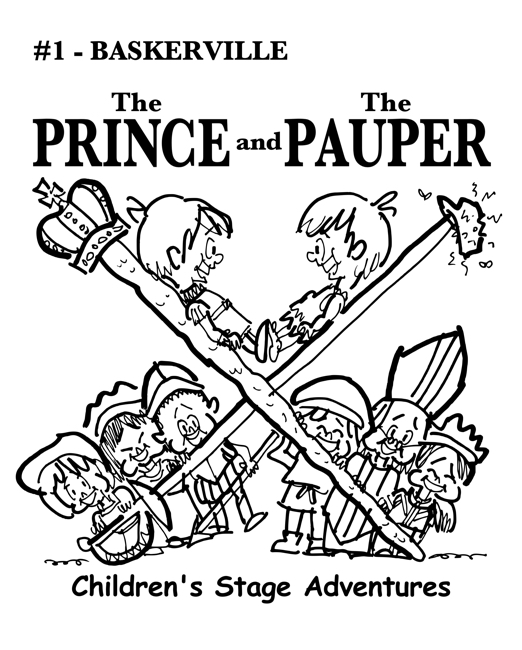
Here’s the final:![]()
![]()
![]()
![]() We tend to forget that trial and error is part of every creative project; you can’t think of everything in advance, and you have to figure out some things as you go along.
We tend to forget that trial and error is part of every creative project; you can’t think of everything in advance, and you have to figure out some things as you go along.![]()
This case study is a good example of that.![]()
It’s also a reminder of an important truth: it pays to work with creatives who are committed to collaboration, and who are willing to fully invest themselves in their clients’ success.![]()
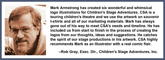
Rob wrote me a nice testimonial (below). He and Lorrie are a tremendous force for good here in New Hampshire. You can read more about them here.![]()
![]()
* * * * * * * * * * * * ![]()
![]()
![]() About Mark: I’m an illustrator specializing in humor, branding, social media, and content marketing. My images are different, like your brand needs to be.
About Mark: I’m an illustrator specializing in humor, branding, social media, and content marketing. My images are different, like your brand needs to be.![]()
You can view my portfolio, and connect with me on Twitter, Facebook, and LinkedIn.![]()
Questions? Send me an email.![]()
![]()


it was fascinating to follow your process here, and interesting too that I didn’t agree with several of your clients’ choices and yet still loved the finished product. Nice work.
LikeLiked by 1 person
Thanks so much, Alison, always a great pleasure to hear from you. Yes, it’s interesting to see what other people focus on– a good reminder of how different people’s perceptions can be. Hope all is well with you, and that you’re having a lovely summer– and thanks again for your very kind comment!! 😊
LikeLiked by 2 people
Hi Mark… a well rounded interaction with your clients… the best way to be and you offered them a ton of options. No wonder they always come back. Good work. Really enjoy your style.
LikeLiked by 1 person
Thanks, John. I have learned a few things over the years, and one of ’em is that listening to clients and trying to understand their point of view always makes for happier results, including customer loyalty. As always, thanks a million for all your support– it means more than I can say.
LikeLiked by 1 person
Truly cutting edge design is your crowning glory, mon ami! I take my cap (sans smell/ bugs) nay pagri nay bonnet nay Stetson nay beanie nay hat off to you! 🎩 🧢 😁
LikeLiked by 1 person
Cutting edge, indeed– no wonder I’m always covered with bandages and sticking plaster… 🚑
My big fantasy is to someday be in a Bollywood extravaganza. I’ll be the star, of course, the male romantic lead (I try to take advantage when I fantasize), and I’ll wear an elaborate pagri. And after about 237 takes, the poor exasperated director will finally cry: “OK, that’s a wrap!!!” 👳👍
Thank you for the nay-hat tip, my dear Radhika! Hope this finds you having a delightful summer, with an occasional starlit dinner on the terrace of the Ganges Club!! 🌟🌖🍔🍗🍹😊
LikeLiked by 2 people